What do significance levels and P values mean in hypothesis tests? What is statistical significance anyway? In this post, I’ll continue to focus on concepts and graphs to help you gain a more intuitive understanding of how hypothesis tests work in statistics.
To bring it to life, I’ll add the significance level and P value to the graph in my previous post in order to perform a graphical version of the 1 sample t-test. It’s easier to understand when you can see what statistical significance truly means!
Here’s where we left off in my last post. We want to determine whether our sample mean (330.6) indicates that this year's average energy cost is significantly different from last year’s average energy cost of $260.
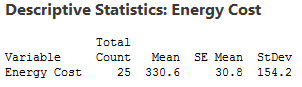
The probability distribution plot above shows the distribution of sample means we’d obtain under the assumption that the null hypothesis is true (population mean = 260) and we repeatedly drew a large number of random samples.
I left you with a question: where do we draw the line for statistical significance on the graph? Now we'll add in the significance level and the P value, which are the decision-making tools we'll need.
We'll use these tools to test the following hypotheses:
- Null hypothesis: The population mean equals the hypothesized mean (260).
- Alternative hypothesis: The population mean differs from the hypothesized mean (260).
What Is the Significance Level (Alpha)?
The significance level, also denoted as alpha or α, is the probability of rejecting the null hypothesis when it is true. For example, a significance level of 0.05 indicates a 5% risk of concluding that a difference exists when there is no actual difference.
These types of definitions can be hard to understand because of their technical nature. A picture makes the concepts much easier to comprehend!
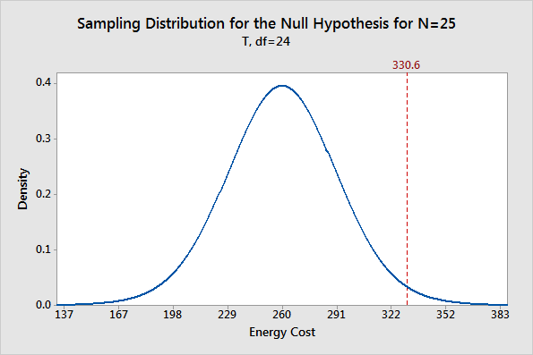
The significance level determines how far out from the null hypothesis value we'll draw that line on the graph. To graph a significance level of 0.05, we need to shade the 5% of the distribution that is furthest away from the null hypothesis.
In the graph above, the two shaded areas are equidistant from the null hypothesis value and each area has a probability of 0.025, for a total of 0.05. In statistics, we call these shaded areas the critical region for a two-tailed test. If the population mean is 260, we’d expect to obtain a sample mean that falls in the critical region 5% of the time. The critical region defines how far away our sample statistic must be from the null hypothesis value before we can say it is unusual enough to reject the null hypothesis.
Our sample mean (330.6) falls within the critical region, which indicates it is statistically significant at the 0.05 level.
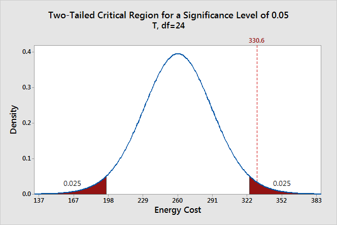
We can also see if it is statistically significant using the other common significance level of 0.01.
The two shaded areas each have a probability of 0.005, which adds up to a total probability of 0.01. This time our sample mean does not fall within the critical region and we fail to reject the null hypothesis. This comparison shows why you need to choose your significance level before you begin your study. It protects you from choosing a significance level because it conveniently gives you significant results!
Thanks to the graph, we were able to determine that our results are statistically significant at the 0.05 level without using a P value. However, when you use the numeric output produced by statistical software, you’ll need to compare the P value to your significance level to make this determination.
Ready for a demo of Minitab Statistical Software? Just ask!

What Are P values?
P-values are the probability of obtaining an effect at least as extreme as the one in your sample data, assuming the truth of the null hypothesis.
This definition of P values, while technically correct, is a bit convoluted. It’s easier to understand with a graph!
To graph the P value for our example data set, we need to determine the distance between the sample mean and the null hypothesis value (330.6 - 260 = 70.6). Next, we can graph the probability of obtaining a sample mean that is at least as extreme in both tails of the distribution (260 +/- 70.6).
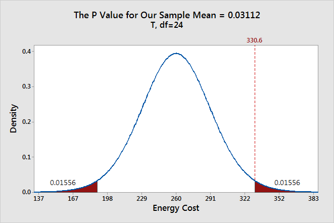
In the graph above, the two shaded areas each have a probability of 0.01556, for a total probability 0.03112. This probability represents the likelihood of obtaining a sample mean that is at least as extreme as our sample mean in both tails of the distribution if the population mean is 260. That’s our P value!
When a P value is less than or equal to the significance level, you reject the null hypothesis. If we take the P value for our example and compare it to the common significance levels, it matches the previous graphical results. The P value of 0.03112 is statistically significant at an alpha level of 0.05, but not at the 0.01 level.
If we stick to a significance level of 0.05, we can conclude that the average energy cost for the population is greater than 260.
A common mistake is to interpret the P-value as the probability that the null hypothesis is true. To understand why this interpretation is incorrect, please read my blog post How to Correctly Interpret P Values.
Discussion about Statistically Significant Results
A hypothesis test evaluates two mutually exclusive statements about a population to determine which statement is best supported by the sample data. A test result is statistically significant when the sample statistic is unusual enough relative to the null hypothesis that we can reject the null hypothesis for the entire population. “Unusual enough” in a hypothesis test is defined by:
- The assumption that the null hypothesis is true—the graphs are centered on the null hypothesis value.
- The significance level—how far out do we draw the line for the critical region?
- Our sample statistic—does it fall in the critical region?
Keep in mind that there is no magic significance level that distinguishes between the studies that have a true effect and those that don’t with 100% accuracy. The common alpha values of 0.05 and 0.01 are simply based on tradition. For a significance level of 0.05, expect to obtain sample means in the critical region 5% of the time when the null hypothesis is true. In these cases, you won’t know that the null hypothesis is true but you’ll reject it because the sample mean falls in the critical region. That’s why the significance level is also referred to as an error rate!
This type of error doesn’t imply that the experimenter did anything wrong or require any other unusual explanation. The graphs show that when the null hypothesis is true, it is possible to obtain these unusual sample means for no reason other than random sampling error. It’s just luck of the draw.
Significance levels and P values are important tools that help you quantify and control this type of error in a hypothesis test. Using these tools to decide when to reject the null hypothesis increases your chance of making the correct decision.
If you like this post, you might want to read the other posts in this series that use the same graphical framework:
If you'd like to see how I made these graphs, please read: How to Create a Graphical Version of the 1-sample t-Test.