


In my previous post, we identified the distribution of the body fat data. Today, we're going to explore several benefits of knowing the distribution, with a special emphasis on creating informative graphs! After all, if you are not sure what a specific distribution with such and such parameters looks like, a graph gives you the picture!
Using the Distribution Information
So far, we have identified the distribution and the parameter values for the body fat data from 14-year-old girls.
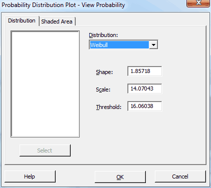
3-Parameter Weibull Distribution:
- Shape = 1.85718
- Scale = 14.07043
- Threshold = 16.06038
How does that help us? What does this even look like? And where do important health ranges fall within this distribution? You can't tell just by looking at the parameter values. However, I'll answer all of these questions with just one cool graph!
It is always a good practice to know the distribution of your data before analyzing them. Certain analyses require certain distributions. For example, it could be a costly mistake to use an analysis that strictly requires a normal distribution with nonnormal data. However, I'm not going to focus on choosing alternative analyses. Instead, I'll focus on the graphs and what we can do just by knowing the distribution.
Because we have identified the best-fitting distribution, we are no longer limited to graphing the raw sample data, like we did with the histogram. We can now make inferences about the population. We can graph the best estimate for what the entire population looks like and calculate probabilities for values that fall in certain ranges. So, let’s do that.
Probability Distribution Plot
To answer all of our questions, we'll use Minitab's Probability Distribution Plot. I’m a huge fan of these plots. If you want to show your boss what an unusual distribution with inscrutable parameter names actually looks like, use this graph. You can highlight the effect of changing distributions and parameter values, show where target values fall in a distribution, and view the proportions that are associated with important regions. These simple plots clearly and easily communicate these advanced concepts to a non-statistical audience.
Probability Distribution Plots don't use any data. Instead, you specify the distribution and enter the parameter values. You can also specify regions of interest to you.
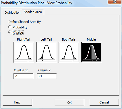
We'll use the population parameters that we've already identified. For our region of interest, I found a Web site that recommends that girls between the ages of 14-19 should have a body fat percentage between 20%-24% for health reasons. That range sounds very tight to me, but let’s see where it falls in our population distribution for 14-year-old girls.
In Minitab, I’ll go to Graph > Probability Distribution Plot > View Probability and enter our distribution information in the main dialog like this:
Then, I’ll click the Shaded Area tab and fill it out like this:
After we click OK, Minitab displays the following graph:
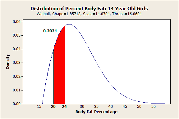
All in one shot you can see both the shape of the distribution and how a range of interest fits within it. I’m no health expert, but I can see that the Web site's range for ideal body fat percentages doesn’t reflect where most of the girls fall. Only 20% fall within the ideal range and it falls below the curve's peak. Already, we know something interesting is going on.
Probability Plots to Calculate Percentiles
Probability Plots have a similar name to Probability Distribution Plots. They are related, but Probability Plots are particularly good at determining whether the data fit a distribution (check, we did that already) and calculating percentiles based on that distribution. In general, the nth percentile has n% of the population below it, and (100-n)% of the population above it.
Percentiles are extra important for nonnormal distributions because you use them to find the center and spread of your distribution. Here's why.
Intuitively we think of the mean and standard deviation as the center and spread for a normal distribution. Further, a good rule of thumb for normal distributions is that two-thirds of the population falls symmetrically within 1 standard deviation from the mean. About 95% fall within 2 standard deviations.
However, none of this is true for non-symmetric distributions. The mean is not at the center and the general rule of thumb for the spread no longer works. However, once you identify your distribution you can calculate percentiles in order to find the center and spread of the population.
For example, if you want to find the middle value (median) and the range in which the middle 95% of a nonnormal population falls, calculate the 2.5th, 50th, and 97.5th percentiles (97.5 - 2.5 = 95). The median is the 50th percentile; half of the population are above the median and half are below.
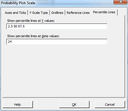
We'll calculate the body fat percentages that correspond to the 2.5th, 50th, and 97.5th percentiles. Also, let's see what percentile corresponds to the upper limit of the supposed ideal body fat range: 24%.
To do this, you'll need to open the data, which you can find here.
- In Minitab, go to Graph > Probability Plot > Single.
- In the main dialog, enter %Fat as the Graph Variable.
- Click the Distribution button and choose 3-parameter Weibull. Click OK.
- Click the Scale button, and uncheck the Adjust x-scale for threshold . . . checkbox. This produces a curved distribution fit line but allows the percentiles to be read straight off the graph.
- Still under Scale, click the Percentile Lines tab, and fill it out as shown below to produce our desired percentiles. Click OK in all dialogs.
We get the following graph:
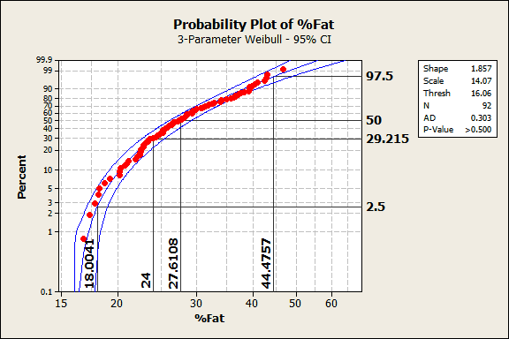
We already knew that these data follow this distribution from before, and the output reconfirms it. The data points follow the center line and the p-value in the legend is greater than 0.500, which is greater than any common alpha value. Hence, these data follow the 3-parameter Weibull distribution.
In the graph, the data values are on the X-axis and the percentiles are on the Y-axis. For this population, the 50th percentile (the median) corresponds to a body fat percentage of 27.6%. 95% of the population should fall between the 2.5th and 97.5th percentiles, which correspond to 18.0% and 44.5% body fat. Because of the non-symmetric shape of the distribution, the median (27.6) is closer to the low value than the high value.
24% body fat corresponds to the 29th percentile. 24% is the top end of the ideal range recommended by the Web site but it is a fairly low percentile for this population. Said another way, 71% of the population exceeds the upper limit of the range. Yikes!
Closing Thoughts
For the issue relating to the ideal body fat range, it's fairly clear that something is going on here. I'm not a health expert, so I don't know the answer. However, it appears that either the range is incorrect or a large majority (71%) of 14-year-old girls exceed the recommended range. Only 20% actually fall within the range. However, with a few simple tools in Minitab, we have brought the implications of these data to life! Just as important, we can easily present these results to others in an easy-to-understand manner.
I hope after reading this you're more comfortable with nonnormal distributions and can see the advantages of identifying your data's distribution. I’ve shown how you can transcend your raw sample data and make useful inferences about the larger population that your data represent. You can safely embrace your nonnormal data!