


In my last post, I used U.S. Census Bureau data and correlation to reveal that people living in colder, more crowded states typically make more money. I’m sure there is some rationale to support this conclusion, but I’ll leave that explanation up to the economists. Meanwhile, let's you and me move on to more statistics…
Once I discovered there was correlation between income and other census data, I decided to use Minitab Statistical Software to find a regression model and further examine the relationship. Easy, right?
That’s what I thought, too.
In fact, I wasn't even planning on writing about the model—been there, done that with other examples. Trying to find a good model was just something I wanted to do for the fun of it. However, I discovered something that was worth writing about, should you run into this with your own data and become stumped as I initially did.
To recap, I collected data on the following for all 50 states:
- Median household income
- Percentage below poverty line
- Unemployment rate
- Population – used to calculate population-per-square mile
- State land size (square miles)
- Average winter temperature (°F)
Automatic Regression Model Selection
I then used Minitab’s stepwise regression to instantaneously tell me which variables provide the best model.
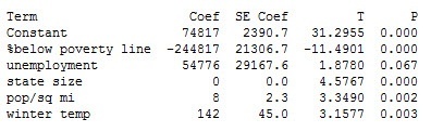
With an R-squared of 89% (not shown), I thought I was well on my way to calling it a day. But here's where my analysis went from the usual cheetah-like speed of stepwise regression and slowed to the virtual standstill of a 3-toed sloth. 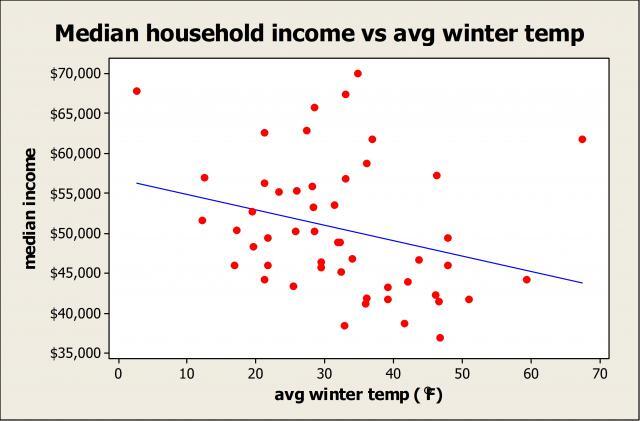
Take a look at the coefficient for average winter temperature (Coef=142). It's positive...but when I previously ran correlation to explore the relationship between temperature and income, the coefficient was negative—the warmer the state, the lower the income. And a scatterplot clearly reveals a negative relationship.
So what is going on?
I walked down the hall to chat with my coworker Eduardo Santiago since I knew he'd have the answer. He asked me if I'd looked at the correlation. I said I did—and income is correlated with multiple variables.
Then he asked me about the correlation between the X's themselves. Aha! I guess I hadn't had enough caffeine that day, because once I returned to my office, the answer to my statistical conundrum was right there in front of me.
What Multicollinearity Did to My Statistical Model
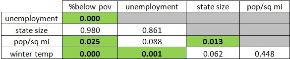
Using correlation, you can see from the highlighted p-values that some of the X’s, including temperature, are significantly correlated with other X’s. Enter multicollinearity.
Correlation P-Values
According to Neter, Kutner, Nachtsheim and Wasserman's Applied Linear Statistical Models [1]:
“When the predictor variables are correlated among themselves, multicollinearity among them is said to exist…The fact that some or all predictor variables are correlated among themselves does not, in general, inhibit our ability to obtain a good fit.”
Therefore, we can use the regression model as a whole for prediction, especially when the values we're predicting for are within the range of the data used to create the model (alternatively, some statisticians may prefer to remove certain X's causing the collinearity). However, the authors caution, we should be wary of interpreting the coefficients individually since the
“common interpretation of a regression coefficient as measuring the change in the expected value of the response variable when the given predictor variable is increased by one unit while all other predictor variables are held constant is not fully applicable when multicollinearity exists.”
The textbook also states that a regression coefficient “with an algebraic sign that is the opposite of that expected” indicates “the presence of serious multicollinearity.” So this confirms why the temperature coefficient was positive even though a negative relationship exists between it and income.
If you're now shouting at your computer screen, "Michelle, you should have checked the variance inflation factors when you first ran the regression," be assured that I did. For those of you who aren’t familiar with VIFs, a value larger than 10 is typically used as a rule of thumb to indicate the presence of multicollinearity. However, all VIFs for my model above were less than 3, so I didn’t see any red flags…until I noticed the positive temperature coefficient.
Could There Be a Better Model?
I then got to thinking, could there be an even better model? So I added interaction and polynomial terms. Here are the stepwise regression results:
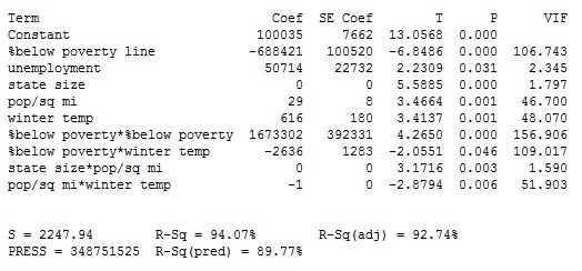
Check out those VIFs! They scream multicollinearity, and so does the positive temperature coefficient. We can also see that many of the two-way interactions are in fact significant and the R-squared values are high.
In conclusion, we found a decent model for household income despite the multicollinearity. As you can see, though, things may not always be as they seem when looking at a regression model. So whether you’re analyzing a manufacturing process, a transactional process, a healthcare process, or something else entirely, the next time you fit a multiple regression model and arrive at coefficients that aren’t what you expected, take a look at the correlation between the predictors themselves—and the VIFs—to see if multicollearity is your culprit.
[1] M. Kutner, C.J. Nachtsheim, W. Wasserman, and J. Neter (1996). Applied Linear Statistical Models, 4th edition, WCB/McGraw-Hill.