


In response to a previous post, a reader asked about the best way to represent variation in data. The reader was specifically asking about error bars, which are sometimes displayed on graphs as standard deviation (SD), standard error (SE), or confidence intervals (CIs).
I'd like to broaden the implications of this excellent question. What does each estimate of variation tell you—and what doesn’t it tell you?
Kick back, put on your headphones, and pour yourself some tea. Let's explore this topic using one of the world's most popular and enduring musical formats—the theme and variations.
(If you're in a hurry, you can skip the music and scroll down to the Coda section to get a quick summary.)
____________________________________________________
Theme: The Range (R)
If you’ve ever played or listened to variations on a theme, you know that the piece typically starts with a simple, basic statement of the theme. This unadorned motif is very easy to hear and understand.
To represent variation in your data, the simplest form is the range: the maximum data value minus the minimum data value.
Before statistical software like Minitab, the range was utilized much more than it is now, because it was so quick and easy to calculate. It still comes in handy, at times. But it has serious limitations.
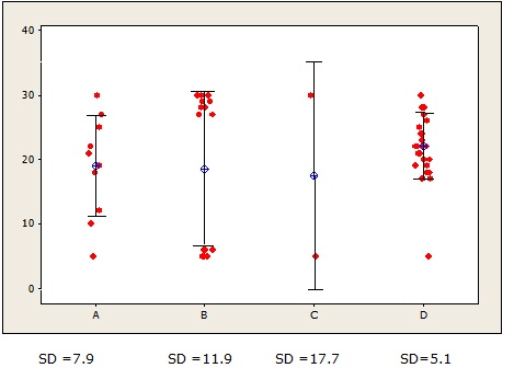
For example, based on only the range, you’d conclude that the four data sets below exhibit the same variation.
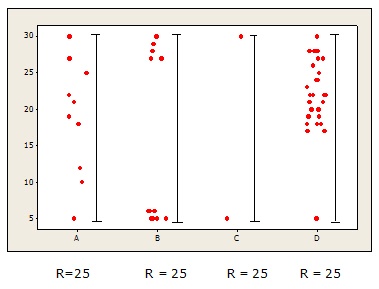
That leaves a lot unsaid, doesn’t it?
So there’s a need to elaborate on this simple theme.
____________________________________________________________
1st Variation: The Variance (V)
One big drawback of the range is that it doesn’t tell you how your data are scattered in relation to their central value—the mean.
The variance, however, is designed to do just that. To measure the spread of the data about the mean, it calculates the difference between each data point and the mean and then squares that difference.
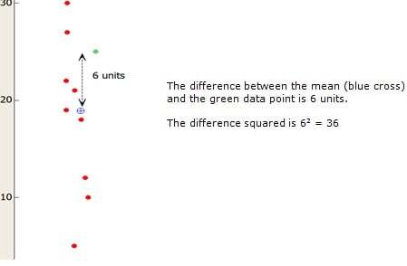
 The squared difference from the mean is calculated for every data point in the sample. Then all the squared differences are added together and divided by the sample size (n) minus 1.
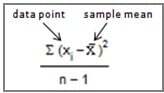
The formula for the sample variance is shown on the right, if it helps. (If it just triggers indigestion or heartburn, feel free to ignore it.)
Now, let’s examine the variances of the four data sets that all had the same range.
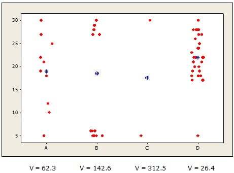
See how the variance reflects the differences in scatter that the range couldn’t? The variance is smallest for group D (26.4), which makes sense because its values are more tightly clustered about the mean. The variance is largest for groups B and C, whose data points are scattered farther from the mean.
So what's the down side? Because the variance is calculated using squared values, it can get quite large. That makes it difficult to understand intuitively—especially because it’s expressed in squared units.
For example, if these data represent the number of pounds people lost on a four different diets, you’d say the variance of the weight loss on diet B is 142.6 pounds2.
What the heck does "142 squared pounds" mean? Ever gain or lose a square pound?
We need a more intuitive way to represent the variation about the mean...
____________________________________________________________
2nd Variation: The Standard Deviation (SD)
 If we simply calculate the square root of the variance, we get yet another variation on variation—the standard deviation.
Here’s where the music gets sublime. Because with that tiny tweak, some beautiful things happen.
First off, the value of the SD shows about much the data deviate, on average (figuratively—it’s not a true average), from the mean, using the same units as the data.
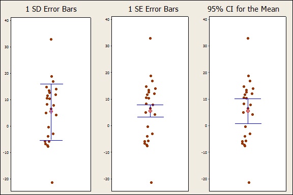
For example, error bars were added to the plot below to show the calculated standard deviation for each group. Each bar represents 1 SD in each direction from the mean.
Now, if these data represent the number of pounds people lost on a different diets, you can say the mean weight loss on diet D was about 22 pounds, with weight losses in the group deviating from that, on average, by roughly 5 pounds.
Much more intuitive to interpret, isn’t it?
What’s more, if your data are normally distributed, you get a “special bonus” when you order the SD: You can easily estimate the percentage of data values that fall within each unit of SD.
- About 68% of data fall within 1 standard deviation from the mean (the 1-SD error bar)
- About 95% of data fall within 2 standard deviations of the mean.
- About 99.7% of data fall within 3 standard deviations of the mean.
No wonder this variation of variation is so popular!
____________________________________________________________
3rd Variation: The Standard Error (SE)
Suppose your study focuses on estimating a parameter, such as the mean of a population, rather than simply describing the general variability of your data.
To quantify how precise or how certain your estimate of the mean is, you need a statistic that tells you how much sampling variability affects that estimate.
 You need…you want…you crave…the standard error (SE) of the mean!
Again, feel free to ignore the formula, other than to note that a larger sample size (n) will decrease the SE, while a larger standard deviation will increase the SE. This reflects the greater confidence you have in your estimate as you collect more data or as your data exhibit less variability.
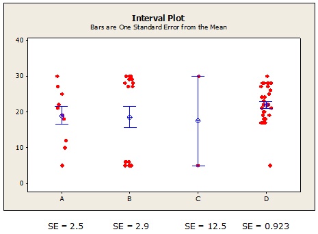
For diet C, the tiny sample size and large variability produces a whopping SE. Now that’s a mean estimate you just can’t trust! You'd be much wiser to put your money on the mean estimate for diet D (21.9), with its very tight SE bars.
The SE is very useful, but it can feel a bit abstract to people who aren't statisticians. Suppose you report that the patients on diet D lost a mean of 21.9 pounds, with a SE of 0.923. The clinical implications of that SE probably won't resonate with many dieticians--and certainly won't make any sense to patients!
____________________________________________________________
4th Variation: The Confidence Interval (CI)
So how can you communicate the precision of your estimate to a wider audience?
 What? I'm sorry. I couldn't hear your answer with all this infernal music in the background!!!
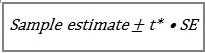
Did you say, "Multiply the SE by a t-value associated with a level of confidence that corresponds with a given probability from a t distribution?"
Yes, indeed! That mathy maneuver gives you a very practical measure of precision: the confidence interval (CI).
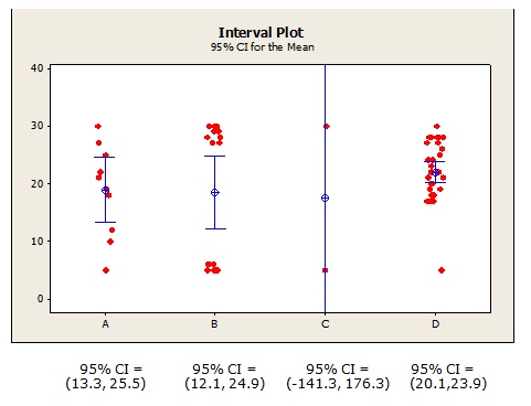
Now you can interpret the certainty of the mean estimates more intuitively. For example, based on the 95% CI for diet D, you can say that you're 95% confident that the mean weight loss for the entire population of diet D dieters falls between 20.1 and 23.9 pounds. The CIs for diets A and B are wider, so those mean estimates of weight loss are somewhat less certain.
For diet C, note that we can't assert with 95% confidence that the mean change in weight is actually a weight gain, a weight loss, or no change in weight at all (0)! That makes perfect sense because two data values is hardly a sufficient sample to base an estimate on (Note: the full CI isn't shown on the plot because I wanted to keep the Y scale consistent with the other plots).
Another perk of the CI: you can use it to directly evaluate your results in relation to a benchmark value.
Suppose you know from previous studies that to provide clinical benefits for this population of patients, weight loss must be at least 15 pounds. Then you cannot be 95% confident that diets A, B, or C will provide clinical benefit, because the lower limits of those confidence intervals are all less than 15. You can, however, assert with 95% confidence that diet D provides clinical benefit, because its lower confidence limit is greater than 15.
_______________________________________________________________
Coda
Are you still awake? Have you nodded off and started blowing bubbles in your tea yet?
Let's quickly wrap things up with the Coda, which means "tail" in Italian. This section is sometimes tacked onto the end of a musical piece as a short, zippy summary and finale.
Here's the short answer to the reader's original question:
- SD : Indicates general variability within your sample data. Descriptive in nature. Use to assess overall variation and to estimate percentiles of normally distributed data.
- SE: Indicates variability between samples of data. More technical and inferential in nature. Use to assess the precision of your sample estimate of the mean or other population parameter.
- % CI: Indicates a likely range of values for a population parameter. Use to intuitively assess the certainty of an estimate and to compare with benchmarks.
Always label error bars clearly. The SEM is always less than the SD, so you want to avoid giving the misimpression that it represents the general variability of your data. Similarly, for sufficiently large samples, the 95% CI is about twice as large as the SE for the mean, so always indicate which one you're showing. (Minitab does this by default on the interval plot.)
Of course, your choice of how to represent error also depends on the conventions in your field of research, as well as the specific guidelines and audience of the journal you're publishing in. When in Rome...
For additional guidelines on using error bars in scientific publications, check out this helpful article in the Journal of Cell Biology.
(Thanks to the reader for his great question!)