


Being a fan of both baseball and statistics is a special kind of joy. I’m sure many of you have noticed the same appeal that Leonard Koppett did when he wrote that "Statistics are the lifeblood of baseball. In no other sport are so many available and studied so assiduously by participants and fans. Much of the game's appeal, as a conversation piece, lies in the opportunity the fan gets to back up opinions and arguments with convincing figures.”
I recently got interested in the ways that different websites are reporting park factors. Park factors are supposed to give you an idea of whether a particular stadium produces better statistics for pitchers or for hitters.
ESPN.com provides data about park factors going back to 2001, though you have to be careful with the early years because they duplicate some rows. A good first step is to explore the data graphically to see what stands out.
Here’s the ESPN data based on the number of runs scored. Values greater than 1 indicate that the team that plays its home games in that stadium scored more runs at home than on the road, indicating a hitter’s park. Values less than 1 show pitcher’s parks.
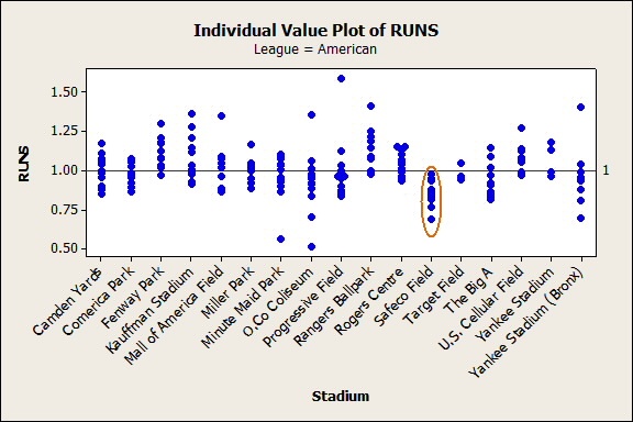
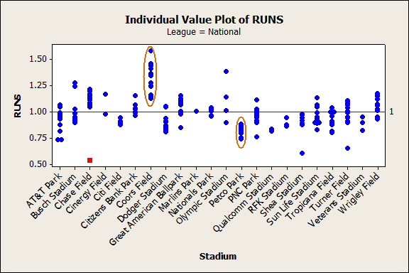
The first thing that stands out to me from the data is the small number of parks that are exclusively hitters parks or pitchers parks from the perspective of the number of runs scored. The American League has one: Safeco Field in Seattle, where conventional wisdom holds that high humidity keeps batted balls from going as far or as fast. The National League has more stadiums that are exclusively hitters’ or pitchers’ stadiums, but several stadiums have only a few data points. Of the National League stadiums that are currently in use and have at least 9 points of data, only Coors Field and Petco Park have been exclusively hitters’ or pitchers’ stadiums. As with Safeco Field, the physical properties of these stadiums that affect baseball are thought to be well-understood. The high altitude at Coors Field makes the air thin and dry. Petco Park is near sea level, has large dimensions that limit home runs and make more foul balls outs, and some sources also note that the orientation of the park minimizes wind effects.
The next thing that stands out is the stadiums that seem like they should be exclusive but have a few anomalous years. The most striking is at Chase Field, home of the Arizona Diamondbacks, which is typically a hitter's park. The 2002 season where ESPN records a park factor with respect to runs of 0.540 is the second-lowest data point since 2001.
It’s possible I’m wrong, but in this case I think the easiest explanation is correct: the number in the data is wrong. Because I'd like to have good data before I do any more extensive analysis, I decided to check the numbers. Here’s how ESPN gives the formula:
((homeRS + homeRA)/(homeG)) / ((roadRS + roadRA)/(roadG))
- homeRS is the number of runs the Diamondbacks scored at home.
- homeRA is the number of runs opposing teams scored against the Diamondbacks at home.
- roadRS is the number of runs the Diamondbacks scored on the road.
- roadRA is the number of runs opposing teams scored against the Diamondbacks on the road.
- homeG is the number of games the Diamondbacks played at Chase Field.
- roadG is the number of games the Diamondbacks played away from Chase Field.
I used baseball-almanac.com and Minitab to get the following numbers for the 2002 Arizona Diamondbacks:
(454 + 350)/81 / (365 + 324)/81
(804/81) / (689/81)
9.925926 / 8.506173
1.166909
So for a season when ESPN.com is reporting that the park factor was 0.540, I’m actually calculating a value of 1.167, good for the 6th highest park factor in 2002. Although clearly not the same as the ESPN formulas, the value of 1.167 is consistent with the hitters’ park effect values reported for the 2002 Arizona Diamondbacks by baseball-almanac.com and baseball-reference.com.
That’s the lesson for the day—when there’s a lot of recorded data, the chance that some of it is wrong is higher. In a 2008 paper on data errors in clinical research databases, Goldberg, Niemierko, and Turchin found that the double-entry method of detecting data found error rates between 2.3 and 26.9%.
It’s surprising how big that maximum is, so it’s good to know that graphs can help you find data errors. You can also save time and eliminate data entry errors with formulas in Minitab. Prevention is the best cure!