


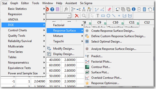
If you've used our software, you’re probably used to many of the things you can do in Minitab once you’ve fit a model. For example, after you fit a response to a given model for some predictors with Stat > DOE > Response Surface > Analyze Response Surface Design, you can do the following:
- Predict the mean value of the response variable for new combinations of settings of the predictors.
- Draw factorial plots, surface plots, contour plots, and overlaid contour plots.
- Use the model to find combinations of predictor settings that optimize the predicted mean of the response variable.
But once your response has that little green check box that says you have a valid model, there’s even more that you can do. For example, you can also use conditional formatting to highlight two kinds of rows:
- Unusual combinations of predictor values
- Values of the response variable that the model does not explain well
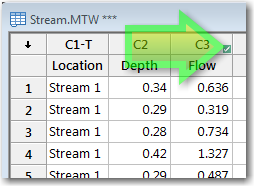
Want to try it out? You can follow along using this data set about how deep a stream is and how fast the water flows. Open the data set in Minitab, then:
- Choose Stat > Regression > Regression > Fit Regression Model.
- In Response, enter Flow.
- In Continuous Predictors, enter Depth.
- In Categorical Predictors, enter Location. Click OK.
Once you’ve clicked OK, the green checkbox will appear in your worksheet to show that you have a valid model.
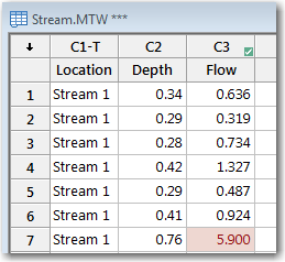
To show unusual combinations of predictors, follow these steps:
- Choose Data > Conditional Formatting > Statistical > Unusual X.
- In Response, enter Flow. Click OK.
The text and background color for the response value in row 7 changes so that you can see that it’s unusual to have a depth of 0.76 in the first stream.
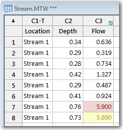
You can indicate values that aren’t fit well by the model in a similar fashion.
- Choose Data > Conditional Formatting > Statistical > Large Residual.
- In Response, enter Flow.
- In Style, select Yellow. Click OK.
Now, in the worksheet, the unusual combinations of predictors are red and the values that aren’t fit well by the model are yellow:
Not all of the ways that Minitab can conditionally format depend on the model. If you’re ready for more, take a look at the online support center to see examples of these other uses of conditional formats:
- Example of formatting cells that contain missing observations
- Example of formatting cells that contain values greater than the specified value
- Example of formatting cells that contain the lowest values
- Example of formatting cells that contain the least frequent values
- Example of formatting cells that contain outliers
- Example of formatting cells that contain out-of-control values