


All processes have variation, some of which is inherent in the process, and isn't a reason for concern. But when processes show unusual variation, it may indicate a change or a "special cause" that requires your attention.
Control charts are the primary tool quality practitioners use to detect special cause variation and distinguish it from natural, inherent process variation. These charts graph process data against an upper and a lower control limit. To put it simply, when a data point goes beyond the limits on the control chart, investigation is probably warranted.
Traditional Control Charts and False Alarms
It seems so straightforward. But veteran control chart users can tell you about “false alarms,” instances where data points went outside the control limits, and those limits fell close to the mean—even though the process was in statistical control.
The attribute charts, the traditional P and U control charts we use monitor defectives and defects, are particularly prone to false alarms due to a phenomenon known as overdispersion. That problem had been known for decades, until quality engineer David Laney solved it by devising P' and U' charts.
The P' and U' charts avoid false alarms so only important process deviations are detected. In contrast to the traditional charts, which assume a defective or defect rate remains constant, P' and U' charts assume that no process has a truly constant rate, and accounts for that when calculating control limits.
That's why the P' and U' charts deliver a more reliable indication of whether the process is really in control, or not.
Minitab's control chart capabilities include P' and U' charts, and the software also includes a diagnostic tool that identifies situations where you need to use them. When you choose the right chart, you can be confident any special-cause variation you're observing truly exists.
The Cause of Control Chart False Alarms
When you have too much variation, or “overdispersion,” in your process data, false alarms can result—especially with data collected in large subgroups. The larger the subgroups, the narrower the control limits on a traditional P or U chart. But those artificially tight control limits can make points on a traditional P chart appear out of control, even if they aren't.
However, too little variation, or “underdispersion,” in your process data also can lead to problems. Underdispersion can result in artificially wide control limits on a traditional P chart or U chart. Under that scenario, some points that appear to be in control could well be ones you should be concerned about.
If your data is affected by overdispersion or underdispersion, you need to use a P' or U' chart will to reliably distinguish common-cause from special-cause variation.
Detecting Overdispersion and Underdispersion
If you aren't sure whether or not your process data has over- or underdispersion, the P Chart or U Chart Diagnostic in Minitab can test it and tell you if you need to use a Laney P' or U' chart.
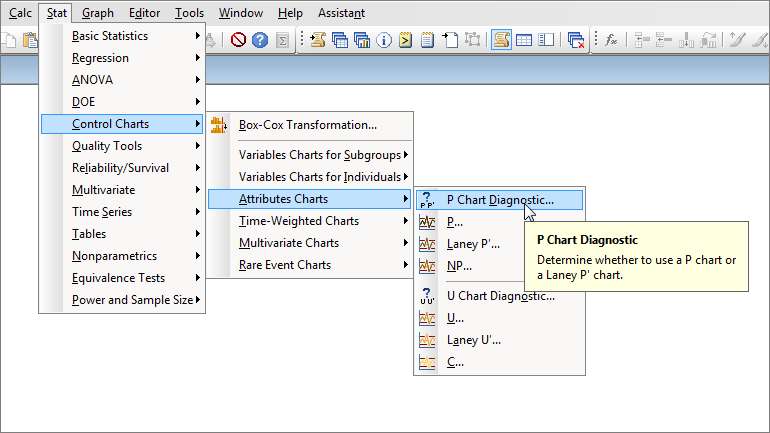
Choose Stat > Control Charts > Attributes Charts > P Chart Diagnostic or Stat > Control Charts > Attributes Charts > U Chart Diagnostic.
The following dialog appears:
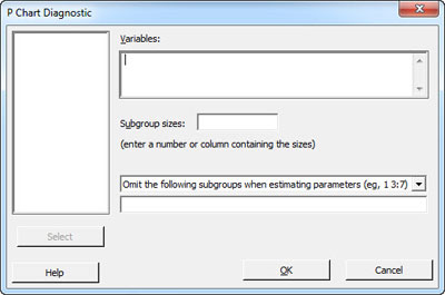
Enter the worksheet column that contains the number of defectives under "Variables." If all of your samples were collected using the same subgroup size, enter that number in Subgroup sizes. Alternatively, identify the appropriate column if your subgroup sizes varied.
Let’s run this test on the DefectiveRecords.MTW from Minitab's sample data sets. This data set features very large subgroups, each having an average of about 2,500 observations.
The diagnostic for the P chart gives the following output:
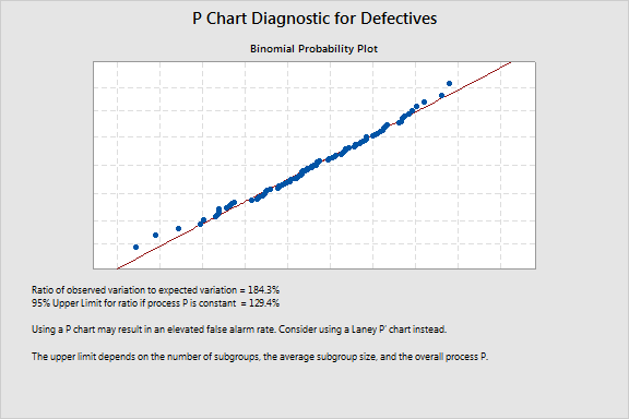
Below the plot, check out the ratio of observed to expected variation. If the ratio is greater than the 95% upper limit that appears below it, your data are affected by overdispersion. Underdispersion is a concern if the ratio is less than 60%. Either way, a Laney P' chart will be a more reliable option than the traditional P chart.
Creating a P' Chart
To make a P' chart, go to Stat > Control Charts > Attributes Charts > Laney P'. Minitab will generate the following chart for the Defectives.MTW data.
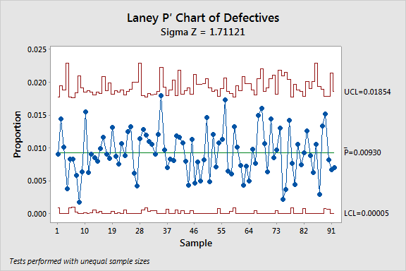
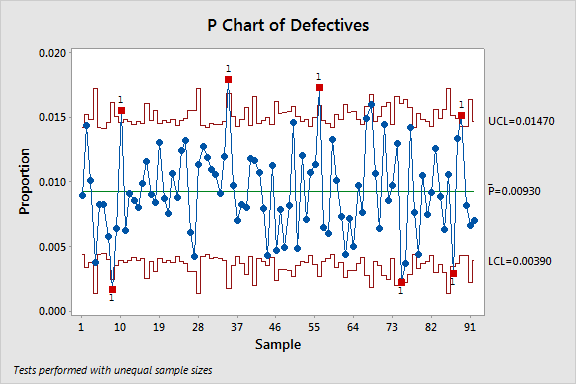
This P' chart shows a stable process with no out-of-control points. But create a traditional P chart with this data, and several of the subgroups appear to be out of control, thanks to the artificially narrow limits caused by the overdispersion.
So why do these data points appear to be out of control on the P but not the P' chart? It’s the way each defines and calculates process variation. The Laney P' chart control limits account for the overdispersion when calculating the variation and eliminate these false alarms.
The Laney P' chart calculations include within-subgroup variation as well as the variation between subgroups to adjust for overdispersion or underdispersion.
If over- or underdispersion is not a problem, the P' chart compares to a traditional P chart. But the P' chart expands the control limits where overdispersion exists, ensuring that only important deviations are identified as out of control. And in the case of underdispersion, the P' chart calculations result in narrower control limits.
To learn more about the statistical foundation underlying the Laney P' and U' charts, read On the Charts: A Conversation with David Laney.