


One of the most memorable presentations at the inaugural Minitab Insights conference reminded me that data analysis and quality improvement methods aren't only useful in our work and businesses: they can make our home life better, too.
The presenter, a continuous improvement training program manager at an aviation company in the midwestern United States, told attendees how he used Minitab Statistical Software, and some simple quality improvement tools, to reduce his phone bill.He took the audience back to 2003, when his family first obtained their cell phones. For a few months, everything was fine. Then the April bill arrived, and it was more than they expected. The family had used too many minutes.
The same thing happened again in May. In June, the family went over the number of minutes allocated in their phone plan again, for the third month in row. Something had to change!
Defining the Problem
His wife summed up the problem this way: "There is a problem with our cell phone plan, because the current minutes are not enough for the family members over the past three months."
He wasn't sure that "too few minutes" was the real problem. But instead of arguing, he applied his quality improvement training to find common ground. He and wife agreed that the previous three months' bills were too much, and they were able to agree that the family went over the plan minutes—for an unknown reason. Based on their areas of agreement, they revised the initial problem statement:
There is a problem with our cell phone usage, and this is known because the minutes are over the plan for the past 3 months, leading to a strain on the family budget.
They further agreed that before taking further action—like switching to a costlier plan with more minutes—they needed to identify the root cause of the overage.
Using Data to Find the Root Cause(s)
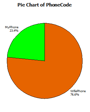
At this point, he downloaded the family's phone logs from their cell phone provider and began using Minitab Statistical Software to analyze the data. First, he used a simple pie chart to look at who was using the most minutes. Since he also had a work-provided cell phone, it wasn't surprising to see that his wife used 4 minutes for each minute of the family plan he used.
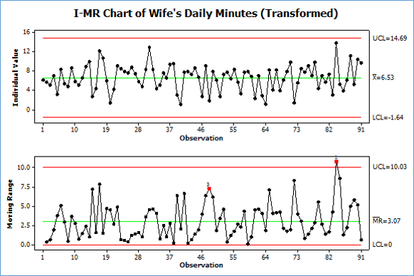
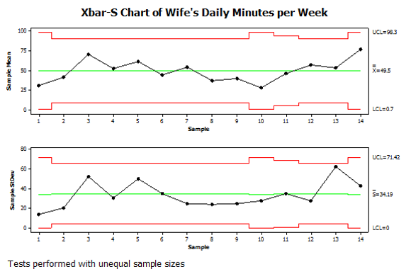
Since his wife used 75% of the family's minutes, he looked more closely for patterns and insights in her call data. He created time series plots of her daily and individual call minutes, and created I-MR and Xbar-S charts to assess the stability of her calling process over time.
He also subgrouped calls by day of the week and displayed them in a boxplot.
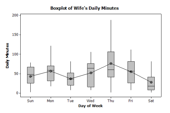
These analyses revealed that daily minute usage did contain some "special cause variation," shown in the I-MR chart. They also showed that, compared to other days of the week, Thursdays had a greater average daily minutes and variance.
Creating a Pareto chart of his wife's phone calls provided further insight.
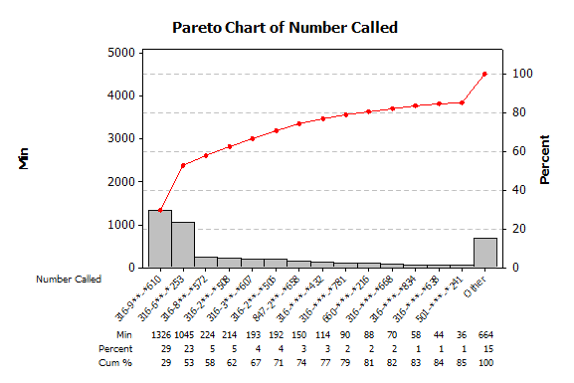
The Minitab analysis helped them see where and when most of their minutes were going. But as experienced professionals know, sometimes the numbers alone don't tell the entire story. So the family discussed the results to put those numbers in context and to see where some improvements might be possible.
The most commonly called number belonged to his wife's best friend, who used a different cell phone provider than the family did. This explained the Thursday calls, because every weekend his wife and her friend took turns shopping garage sales on opposite sides of town to get clothes for their children. They did their coordination on Thursday evenings.
Calls to her girlfriend could have been free if they just used the same provider, but the presenter's family didn't want to change, and it wasn't fair to expect the other family to change. But while a few calls to her girlfriend may have been costing a few dollars, the family was saving many more dollars on clothes for the kids.
Given the complete context, this was a situation where the calls were paying for themselves, so the family moved on to the next most frequently called number: the presenter's mother's land line.
His wife spoke very frequently with his mother to arrange childcare and other matters. His mother had a cell phone from the same provider, so calls to the cell phone should be free. Why, then, was his wife calling the land line? "Because," his wife informed him, "your mother never answers her cell phone."
Addressing the Root Cause
The next morning, the presenter visited his mother and eventually he steered the conversation to her cell phone. "I just love using the cell phone on weekends," his mother told him. "I use it to call my old friends during breakfast, and since it's the weekend the minutes are free!"
When he asked how she liked using the cell phone during the week, his mother's face darkened. "I hate using the cell phone during the week," she declared. "The phone rings all the time, but when I answer there's never anyone on the line!"
This seemed strange. To get some more insight, her son worked with her to create a spaghetti diagram that showed her typical movements during the weekday when her cell phone rang. That diagram, shown below, revealed two important things.
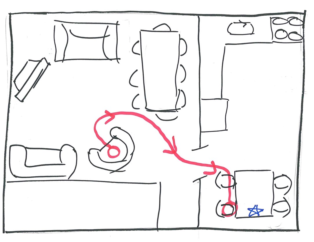
First, it showed that his mother loved watching television during the day. But second, and more important when it came to using the cell phone, his mother needed to get up from her chair, walk into the dining room, and retrieve her cell phone—which she always kept on the dining room table—in order to answer it.
Her cell phone automatically sent callers to voice mail after three rings. But it took his mother longer than three rings to get from her chair to the phone. What's more, since she never learned to use the voice mail ("Son, there is no answering machine connected to this phone!"), his mother almost exclusively used the cell phone to make outgoing calls.
Now that the real root cause underlying this major drain on the family's cell phone minutes was known, a potential solution could be devised and tested. In this case, rather than force his mother to start using voicemail, he came up with an elegant and simple alternative:
Job Instructions for Mom:
When receiving call on weekday:
- Go to cell phone.
- Pick up phone.
- Press green button twice.
- Wait for person who called to answer phone.
After a few test calls to make sure his mother was comfortable with the new protocol, they tested the new system for a month.
The Results
To recap, solving this problem required four steps. First, the presenter and his wife needed to clearly define the problem. Second, they used statistical software to get insight into the problem from the available data. From there, a spaghetti chart and a set of simple job instructions provided a very viable solution to test. And the outcome?
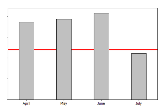
As the bar graph shows, July's minutes were well within their plan's allotment. In that month's Pareto chart, what had been the second-largest bar dropped to near zero. His mother enjoyed her cell phone much more, and his wife was able to arrange child care with just one call.
And to this day, when the presenter wants to talk to his mother, he:
1. Calls her cell phone.
2. Lets it ring 3 times.
3. Hangs up.
4. Waits for her return call.
Happily, this solution turned out to be very sustainable, as the monthly minutes remained within the family's allowance and budget for quite some time...and then his daughter got a cell phone, and texting issues began.
Where could you apply data analysis to get more insight into the challenges you face?