Your Lean Six Sigma project resulted in tremendous process improvement. It's time to share the results. To help people understand your data quickly and clearly -- especially if they don’t know statistics -- you need graphs.
Statistical software lets us use a wide array of graphs to display data, depending on what we want to convey. So why restrict yourself to pie or bar charts, when there are many options available? Depending on what you need to show, another option may help you convey nuances and aspects of your analysis that the good ol' pie chart, valuable as it is, just can't reveal.
Below are some alternatives you can use to visualize comparisons such as:
- Mean quarterly sales of multiple products, by region
- The viscosity of paint, by mixing method
- The amount of pizza bought by different neighborhoods, by month
Boxplot
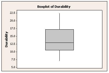
Use a boxplot (also called a box-and-whiskers diagram) to compare sample distribution characteristics and to screen for outliers. By default, a boxplot made with Minitab shows the median, interquartile range, range, and outliers for each group. Display options include symbols for the mean and boxes for the median confidence interval.
Interval Plot
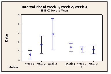
Use an interval plot to compare means and confidence intervals, which let you assess the differences between group means in relation to within-group variance.
Individual Value Plot
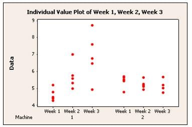
Use an individual value plot to assess individual data points. This graph plots each data point for each group, making it easy to spot outliers and see distribution spread.
Line Plot
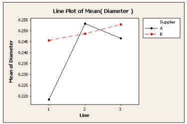
Use a line plot to compare response patterns for two or more groups. This type of graph is ideal for showing interactions between two factors or groups.
Dot Plot
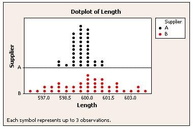
By plotting values along a number line, dotplots make it easy to compare distributions. The x-axis is divided into small intervals, or bins. Data values within each bin are represented by dots.
Probability Plot
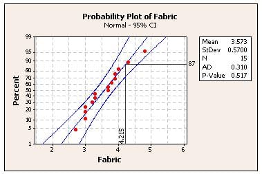
Use probability plots to show how well a distribution fits your data. You also can compare distributions of different samples by displaying them on the same probability plot.
Contour Plots and 3D Surface Plots
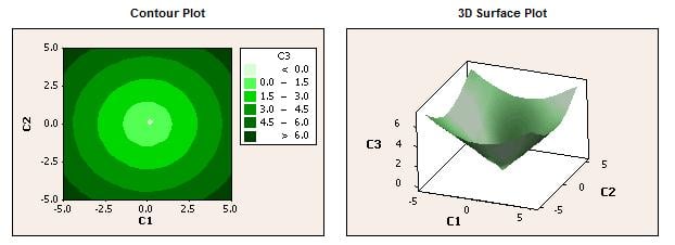
Use these plots to show relationships among three variables. A contour plot is like a topographical map in which x-, y- and z-values are plotted instead of longitude, latitude, and altitude. Surface plots display the three-dimensional relationship in two dimensions, with predictor variables on the x- and y-scales, and the response (z) variable represented by a smooth surface.
Other Types of Graphs
Of course there are many other ways to use graphs to show the results of an analysis, and many different options for doing your analysis, too. Minitab Statistical Software provides a flexible suite of graphs to support a variety of analysis needs. Minitab also makes it easy to perform all of the data analysis necessary for Six Sigma and other data-driven quality improvement methods. If you’re not already using it to analyze your data, download a free 30-day trial of Minitab Statistical Software today.


