


Choosing the right graph is one of the most important steps in data visualization and communication. Whether you're deciding between a scatter plot, histogram, box plot, or Pareto chart, the right selection is key to ensuring your audience understands your message.
Different graphs are good for different things, and while you may have a preference for a certain type of graph, there are others that objectively convey data better and more accurately.
I've divided the many uses for graphs into four broad categories:
- Examining relationships between variables
- Comparing groups
- Assessing how the parts comprise the whole
- Looking at how values are distributed
Let's explore how understanding these categories can help you determine which of Minitab's many graph functionalities will communicate your data best.
Examining relationships between variables
 Is your scrap rate higher on days with higher humidity? Do hospital admissions increase or decrease when the weather gets warmer? Does your pulse pound faster the more trips you make to the coffee machine?
Questions like these involve examining pairs of measurements. By plotting paired observations, you can quickly assess whether a meaningful association exists, identify potential trends, and spot observations that deviate from the broader pattern.
For example, you might record the high temperature each day as well as the number patients admitted to a hospital and then use one of the following graphs to look for a pattern.
Graphs to Use to Examine Relationships:
1. Scatter Plot and Fitted Line Plot
A scatter plot shows the raw relationship between two continuous variables. By plotting every observation, it reveals patterns that summary statistics can miss, including correlations, clusters, outliers, gaps, and potential non-linear relationships.
A fitted line plot builds on a scatter plot by adding a regression line that models the relationship between the variables.
Best to Use When:
- Exploring whether a relationship exists between variables
- Assessing relationship shape and strength
- Communicating overall trends and estimating outcomes
2. Matrix Plot
What if you want to evaluate several different pairs of variables? Instead of creating a bunch of separate scatterplots, you can use Minitab's convenient Matrix Plot functionality.
A matrix plot extends the concept of a scatter plot by displaying paired relationships among multiple variables in a single view. This broader perspective helps analysts uncover relationships that might be overlooked when reviewing individual scatter plots.
Best to Use When:
- Comparing multiple variable relationships at once
- Needing a single view of many scatter plots
- Identifying potential correlations quickly
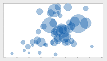
3. Contour Plot, 3D Scatterplot, 3D Surface Plot, and Bubble Plot
Minitab also includes several graphs that allow you to explore the relationships beyond two variables.
Contour plots, 3D scatter plots, 3D surface plots, and bubble plots help communicate complex multivariable relationships that would be difficult to identify using simpler two-dimensional charts.
Best to Use When:
- Evaluating process settings and outcomes
- Visualizing response surfaces or optimization results
Comparing groups
 Which shift produces the most scrap? Is it the same every day of the week, or does the first shift generate the most scrap on Mondays, and the last shift generates the most scrap on Fridays?
Which wing of a hospital has the most empty beds? Is that the same for all four seasons of the year, or is the ER most crowded in the winter, while the maternity ward is most crowded in the spring?
These are the kinds of questions you can answer by comparing measurements across groups. Group comparison graphs make it easier to identify differences in performance, resource utilization, or outcomes across categories, while also revealing whether those differences remain consistent or change under different conditions.
Graphs to Use When Comparing Groups:
1. Bar Chart
Bar charts are effective for comparing groups because they make differences in magnitude easy to see across discrete categories. They allow analysts to quickly determine where performance, outcomes, or resource utilization differ most, as well as spot and communicate disparities in a clear format.
Best to Use When:
- Comparing values across categories
- Needing to demonstrate visible differences
2. Line Plot
Another way to visualize differences between groups is with a line plot. Line plots are effective for comparing groups when the goal is to understand how measurements change across an ordered sequence, like process changes or operating conditions.
Best to Use When:
- Showing change over time
- Comparing trends across groups
Want to see how these charts are created in practice? Learn how to get started in Minitab Statistical Software.

Assessing how the parts comprise the whole
 Are scratches, chips, and blisters all equally likely to mar the surface of a new car that rolls off your assembly line? Or is one defect more common than the others?
Do customers seem to call for help with each of your products equally often? Or does one of the products prove more troublesome than the others?
The following graphs can help you breakdown a variable into its constituent categories.
Graphs to Use When Assessing Parts/Wholes:
1. Pie Chart, Stacked Bar Chart, Pareto Chart
These graphs emphasize composition rather than focusing on relationships or differences. Using a pie chart, stacked bar chart, or pareto chart allows viewers to see where the largest contributions originate, how categories are distributed, and which components have the greatest influence on the overall result.
Best to Use When:
- Wanting to communicate proportions quickly
- Showing both total and category contributions
- Identifying the most significant contributors to a problem
2. Area Graph
An area graph is a great way to view multiple time series when each series is part of one whole. They emphasize both the overall magnitude of the total and the changing contribution of each component.
Best to Use When:
- Visualizing cumulative growth
- Highlighting changing proportions
Still unsure of which graph will suit your data best? Use the Minitab Assistant to help you choose and guide you through an analysis.

Looking at how values are distributed
 What is the range of values in my sample? Are the data distributed the same way this time as they were last time? Are there any unusual points that I should investigate?
The following graphs can help you answer these questions.
Graphs to Use to Visualize Value Distribution:
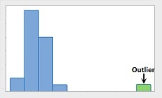
1. Histogram and Dot Plot
For continuous data, you can use a histogram or a dot plot to look at the distribution. Both graphs reveal the shape, spread, and concentration of the data. These visualizations help analysts understand where values tend to occur or whether the data follows an expected distribution before moving on to more advanced statistical analysis.
Best to Use When:
- Examining variation
- Identifying skewness, gaps, and clusters
- Identifying outliers
2. Box Plot
Box plots are effective for understanding data distributions because the summarize the center, spread, and variability of a dataset in a compact visual form. Box plots highlight the distribution of data without displaying every observation.
Best to Use When:
- Comparing variability and median values
- Analyzing multiple categories simultaneously
These are just some possibilities of how you can use the many graphs available in Minitab Statistical Software to learn about your data and help present what you learn to others.
Start your free trial of Minitab Solution Center and explore how Minitab's graphs can help best communicate your data.
