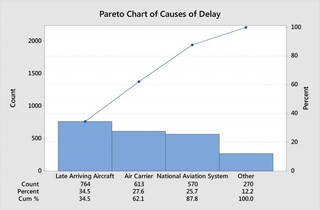
You have a column of categorical data. Maybe it’s a column of reasons for production downtime, or customer survey responses, or all of the reasons airlines give for those riling flight delays. Whatever type of qualitative data you may have, suppose you want to find the most common categories. Here are three different ways to do that:
1. Pareto Charts
Pareto Charts easily help you separate the vital few from the trivial many. To create a Pareto chart in Minitab Statistical Software, choose Stat > Quality Tools > Pareto Chart, then enter the column that contains your data and click OK. If you can’t easily read the chart because there are too many bars displayed, go back to the Pareto Chart dialog (hint: use Control-E to reopen the last dialog) and change the default percent from 95 to something less, say 50. You can keep playing with this percent until you arrive at the chart that tells the best story.
2. Tally

To create a table of all categories and their respective counts, use Minitab’s Stat > Tables > Tally Individual Variables. Just like the Pareto Chart, you can simply enter your column of data and click OK. Or you can use some of the other options within the dialog depending on what you need.
For example, you may want to calculate both the count and percent for each category, and also store your results in the worksheet so you can sort the data with the most common category first, or highlight the data, etc.
3. Conditional Formatting
Speaking of highlighting the data, you can also identify the most common categories in a column using conditional formatting. In Minitab, simply click anywhere in the column, then Right-click > Conditional Formatting > Pareto and select either:
- Most Frequent Values – Suppose you want to look at the 5 most common categories. Enter the number 5 and click OK.
- Most Frequent Percentage – Similar to the Pareto Chart, suppose you want to look at the most common categories that represent 80% of all the data. Enter 80 and click OK.
After you use conditional formatting to identify cells of interest, you can also create new data sets that either include or exclude the highlighted cells by right-clicking and selecting Subset Worksheet.
Trying to summarize large amounts of categorical data isn’t always easy, but these 3 tools are a good place to start. And if there’s ever a case where you want to see all categories, you can use some of the same tools as above, or simply create a good old Pie Chart.


