I received a comment on my last post from Robb Richardson, a business process professional in the financial services industry who is also a Type 2 Diabetic. In the comments, Robb mentioned that like Bill Howell, he too uses Minitab to analyze a variety of data relating to his diabetes diagnosis.
When I followed-up with him to learn more, he told me our diabetes post prompted him to send an email to some peers outlining how he uses Minitab to keep his diabetes in check. I found the email really interesting, and I got Robb's permission to share it with you in this post. Check it out below:
Happy Friday –
In reading Minitab’s Blog today (highly recommended), yesterday’s article was on using Minitab for measuring diabetes. The author highlighted some interesting things regarding the measurement of blood sugars. Within that section, he also used a dot plot chart that was stratified by month to show distribution. You can read the article from this link: Minitab and Diabetes
With my being (a) a nerd/geek and (b) a Type II diabetic, I loved this article since it shows how very foundational data can be analyzed in far more meaningful ways. To that point, I also track my data using Excel and Minitab – but I employ some additional approaches that I wanted to share ... they may be helpful for you as you work with Minitab on your projects/initiatives.
Some of the other ways that I look at my data are shown here:
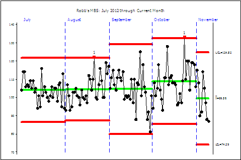
Staged Control Charts – Because tightly controlled and reasonable blood sugars are a key to avoiding some rather unpleasant conditions, I try to stay on top of my monthly data. In the chart below, you can see that the mean Morning Blood Sugar was stable for the Q3-2012, but the UCL/LCL widened a bit. October’s mean increased a bit (with a very slight tightening of the UCL/LCL) and November is moving lower.

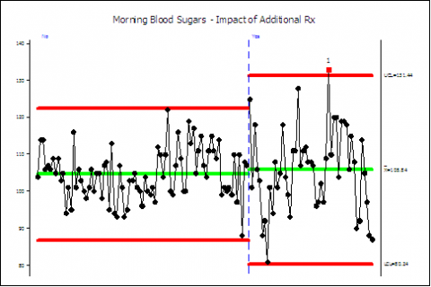
However, there is a story within the story. That is, beginning in the middle of September, additional medications were introduced. It began with antihistamines (which increase blood sugars), then the first round of antibiotics for my pneumonia (which also increase blood sugars) and now a second round with a different antibiotic for pneumonia (which lowers blood sugars. The second chart shows how the mean went up just a little bit – but the UCL/LCL grew.

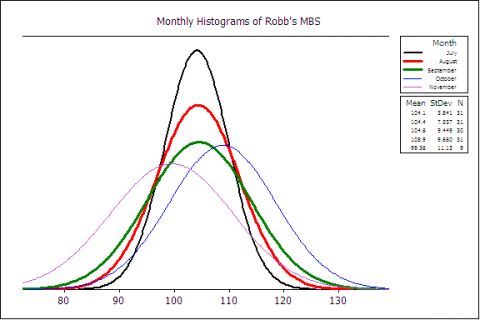
Monthly Histograms – this (below) is just a different view on the first staged chart. But, instead of using control charts and telling me what the UCL/LCL was, it simply shows the shape, center, and spread over a fixed set of bins.

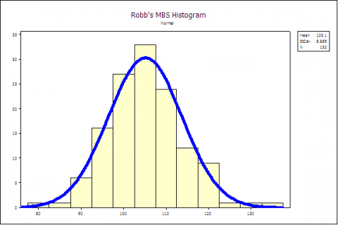
Histogram for the Entire Period – nothing earth shattering here ... but this chart simply reflects the normal distribution of morning blood sugars that I’ve had since 07/01/2012.

As each of you go further down your journey and skills development with Minitab, I’d urge you to find something you care greatly about to build/enhance your skills with it.
Respectfully,
Robb
Thanks to Robb for sharing his story with us! Keep checking back to the blog for more diabetes-related posts, which we're writing in honor of American Diabetes Month. If you'd like to share your story, please submit it at http://blog.minitab.com/blog/landing-pages/share-your-story-about-minitab/n.
About Robb Richardson
Robb has been working in the continuous process improvement arena of the financial services industry since 1997. He's an ASQ Certified Manager of Quality/Organizational Excellence and a Certified Quality Auditor. Robb was diagnosed in 2004 as a Type 2 Diabetic, and has been a member of the Central Florida American Diabetes Association's Community Leadership Board for the past five years.


