


When I chose a full factorial design for my gummi bear experiment, I was using traditional design of experiments practice to try to learn the most from the least amount of data. I wanted to see if I could save myself the 10 or more data points I would need to add to the design to estimate nonlinear effects. Now that I have some data, the first thing I’m going to learn is: Do I need to collect more data?
I hope I don't, because I would have to go buy more gummi bears. I already ate the bears I didn’t throw away.
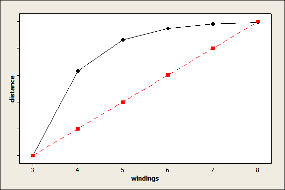
I talked about the role of center points in design of experiments earlier. When we look at the test for center points, we want to know whether the factors in the experiment have linear effects. For example, does distance change by the same amount every time you wind the rubber band? If the relationship is nonlinear as shown in the black line, the 4th and 5th windings make a lot of difference, but successive windings make less difference. The red line shows a linear relationship.
Typically, we look at the center point effect first, before we reduce the model. In Minitab, you can look at the ANOVA table, which looks like this for my data:
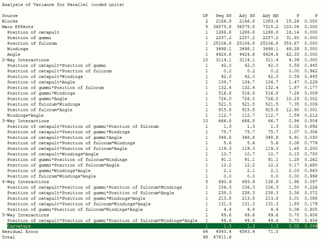
Minitab uses the sums of squares to calculate the F statistic, which in turn yields the p-value. The p-value highlighted in green above is extremely high, which suggests that there is no evidence of curvature.
This interpretation of the p-value makes a lot of sense for most of the effects. Move the catapult or the gummi bear back and forth, and it’s easy to see how the distance would change by about the same amount.
The angle factor, however, presents a difficulty. Traditional theory in physics holds that if you launch from a nonhorizontal position, the cosine of the angle should figure into your equation. Cosine is a wave, not a line, so we could expect to see a nonlinear effect for angle.
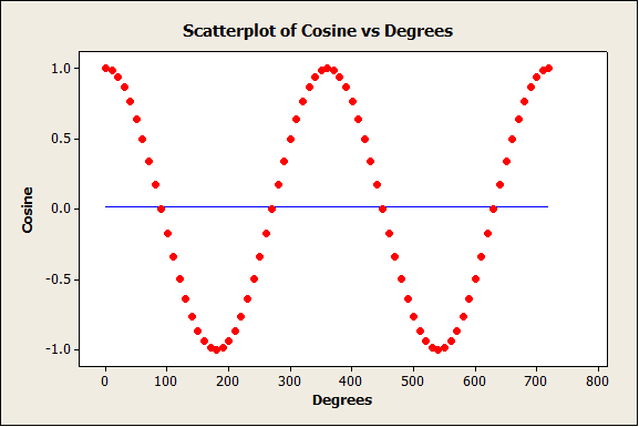
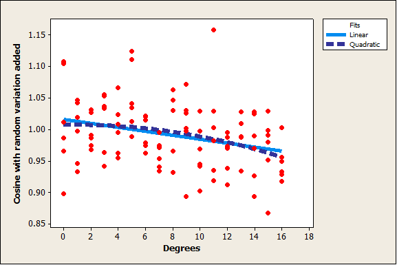
I’m guessing that, in this case, the change in angle is so small that a line is a good approximation of the cosine curve. While the cosine wave is obvious over 720 degrees, the change is much smaller from 0 to 16. The cosine of 0 degrees is 1 and the cosine of 16 degrees is about 0.96. The correlation between degrees and the cosine of degrees over the range from 0 to 16 is -0.965, which indicates that the points of the curve never fall far from the line, even though the pattern is nonlinear.
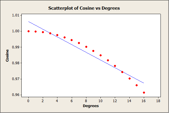
If we add some random variation to the relationship, the practical difference between the curve and the line is even harder to distinguish.
What does this mean for the model that we just made? The variation in the distances is so great that we would expect the data to scatter around the theoretical curve enough that the predictions are just as good—from a practical standpoint—whether we use a linear or a nonlinear effect for angle. The data analysis reassures us that we don’t have to consider curvature in the model, for angle or for any other factor.
What does this mean from a design of experiments perspective? It means that the factorial design was a good choice. If we had selected a response surface design to model curvature, we would have had to collect more data or reduce the resolution of the design. Instead, we learned the most we could from the least amount of data. That’s a pretty good result.