It’s finally March, which means it’s almost time for the NCAA basketball tournament. I’ve spent my last two posts finding a regression model that predicts the probability that a college basketball team has of beating another team. But our data analysis shouldn't stop once we have our model. Just like in any quality improvement situation, we should test our model to ensure that it actually works!
In our case, the model depends on a ranking system. I've used the LRMC Rankings since they have correctly predicted the most NCAA tournament games since 2003. But we shouldn't just take them at their word. I’ve tracked over 1,000 college basketball games in the past few weeks, so let's use Minitab and put the model and the rankings to the test!
Testing the Regression Model
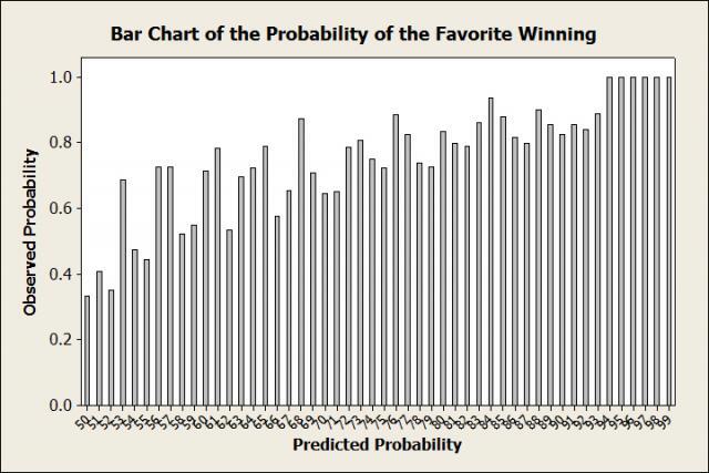
So how should we test the model? Common sense says to compare the model's predictions to the actual results. For example, if there were 100 games for which the model predicted the favorite had a 50% chance of winning, we should look at the results from those 100 games and see if the favorite actually won 50 times (or close to it). We can do the same thing for every probability from 50% all the way to 99%. The bar chart below shows the results.

Well, this doesn’t look very good. In games where the model said the favorite would win 50% of the time, they actually won only 33% of the time! A lot of the other probabilities look off too. Things look as shaky as Bruce Weber's job security. What's going on here?
The problem is the sample size. There were only 6 games for which the model said the favorite would win 50% of the time. We can’t accurately make any conclusions based on 6 games! So instead of looking at each probability individually, let’s group them together and see what the results look like.

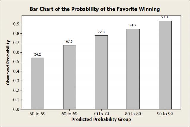
Ah, this looks much better. We see that in all the games where the favorite was predicted to win between 50 and 59% of the time, they actually won 54.2% of the time. In fact, each observed probability falls within the range of the predicted probabilities. But what was the average of each group? The 67.6% is impressive if the average predicted probability of the group was 67%, but not so much if the average was, say, 60%. The table below shows the average predicted probability of each group, plus the number of games.
| Probability Group |
Average Predicted Probability |
Observed Probability |
Number of Games |
| 50 to 59 |
55.0 |
54.2 |
190 |
| 60 to 69 |
65.2 |
67.6 |
244 |
| 70 to 79 |
74.7 |
77.8 |
234 |
| 80 to 89 |
85.1 |
84.7 |
242 |
| 90 to 99 |
93.7 |
93.3 |
135 |
So in the 190 games for which the model predicted the favorite to win between 50 and 59% of the time, the average was 55%. And we see that the favorite actually won 54.2% of those games. That’s pretty close! In fact, all of the observed probabilities are close to the average predicted probability of each group. I’d say our model and the rankings work pretty well!
Testing the Regression Model with the RPI
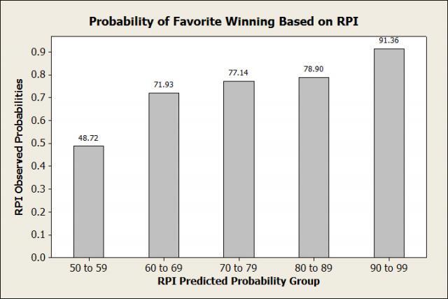
Now, all of these numbers are based off of the LRMC Rankings. But remember, we can use our model with any kind of rankings. So let’s test the model with the Ratings Percentage Index (RPI), since it’s often used to compare teams. Then we can compare it to the LRMC rankings and see if one is better than the other at predicting games. Below is a bar chart of predicted probabilities based on the RPI.
NOTE: I didn’t start tracking RPI until the middle of February. Because of this, there are only 487 games in this sample (instead of the 1,045 used above). Because of the smaller sample size, this bar chart shouldn’t be directly compared with the one above.

So in this bar chart, we see that 3 of the observed probabilities actually fall outside the range in the predicted probability group. So it appears that the RPI is worse than the LRMC rankings. But because of the smaller sample size, let’s compare the RPI and LRMC rankings for just these 487 games.
| Probability Group |
RPI Average Predicted Probability |
RPI Observed Probability |
RPI Number of Games |
LRMC Average Predicted Probability |
LRMC Observed Probability |
LRMC Number of Games |
| 50 to 59 |
54.9 |
48.7 |
78 |
54.6 |
55.9 |
84 |
| 60 to 69 |
64.7 |
71.9 |
114 |
65.4 |
71.0 |
114 |
| 70 to 79 |
75.1 |
77.1 |
105 |
74.7 |
78.0 |
118 |
| 80 to 89 |
84.3 |
78.9 |
109 |
84.9 |
81.0 |
100 |
| 90 to 99 |
93.8 |
93.0 |
81 |
93.7 |
91.4 |
71 |
We see that with the smaller sample size, the LRMC isn’t quite as close as to the average probability of each group as it was with the larger sample. But it’s still pretty accurate, with the largest discrepancy being 5.6% for the 60 to 69% range (and as we saw, this gets a lot closer with a larger sample of games). Meanwhile, the RPI predictions are off by at least 5% in 3 of the 5 categories. When it comes to predicting winners in the NCAA tournament, it's pretty clear that our model should ignore the RPI and use the LRMC rankings.
Looking Ahead to the Tournament
Now, this model still accounts for home court advantage, which we know won’t exist in the NCAA tournament. Luckily, there are numerous conference tournaments in early March that will give us a bunch of neutral-court games from which to build a suitable model. I’ll use the Pomeroy Rankings just like I did before to create another model for when there isn’t a home team. Then it's just a matter of having the NCAA release the brackets, and we’ll be all set to start predicting which teams (Belmont!) will be creating the madness in March.


