Control charts are simple but very powerful tools that can help you determine whether a process is in control (meaning it has only random, normal variation) or out of control (meaning it shows unusual variation, probably due to a "special cause").
In an earlier post, I wrote about the common elements that all control charts share: upper and lower control limits, an expected variation region, and an unexpected (or special cause) variation region. But there are many different types of control charts: P charts, U charts, I-MR charts...how can you know which one is right?
Which Control Chart Matches Your Data Type?
The first step in choosing an appropriate control chart is to determine whether you have continuous or attribute data.
Continuous data usually involve measurements, and often include fractions or decimals. Weight, height, width, time, and similar measurements are all continuous data. If you're looking at measurement data for individuals, you would use an I-MR chart. If your data are being collected in subgroups, you would use an Xbar-R chart if the subgroups have a size of 8 or less, or an Xbar-S chart if the subgroup size is larger than 8.

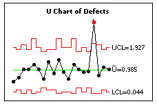
A U-chart for attribute data plots the number of defects per unit.
If you have attribute data, you need to determine if you're looking at proportions or counts. If it's proportions, you'll typically be counting the number of defective items in a group, thus coming up with a "pass-fail" percentage. In this case, you would want to use a P chart. If you're measuring the number of defects per unit, you have count data, which you would display using a U chart.
Of course, we're just scratching the surface here -- there's a lot more to finding the right control chart for each individual situation than we can fit in a simple blog post.
But if you're using Minitab Statistical Software, you can choose Assistant > Control Charts... and get step-by-step guidance through the process of creating a control chart, from determining what type of data you have, to making sure that your data meets necessary assumptions, to interpreting the results of your chart.
If you're not using it yet, you can download Minitab and download a free trial. In addition to guidance for control charts, the new Assistant menu also can guide you through Regression, Hypothesis Tests, Measurement Systems Analysis, and more. As a person who needs to use statistics but isn't naturally inclined toward numbers and math, I find it pretty cool to be able to get that guidance right from the software.


