At the inaugural Minitab Insights Conference in September, presenters Benjamin Turcan and Jennifer Berner discussed how to present data effectively. Among the considerations they discussed was choosing the right graph.
Different graphs are good for different things. Of course, opinions about which graph is best can, and do, differ. Dotplot devotees might decide that they are demonstrably advantageous for all applications. On the other hand, determined dotplot detractors might beg to differ, and declare that they are decidedly good for nothing. (The dotplots that is, not the devotees. But I digress.)
In their presentation, Turcan and Berner divided the many uses for graphs into four broad categories:
- Examining relationships between variables.
- Comparing groups.
- Assessing how the parts comprise the whole.
- Looking at how values are distributed.
In this post I'll explore some examples of how Minitab's many marvelous graphs match up with this matrix.
Examining relationships between variables
 Is your scrap rate higher on days with higher humidity? Do hospital admissions increase or decrease when the weather gets warmer? Does your pulse pound faster the more trips you make to the coffee machine?
Questions like these involve examining pairs of measurements. For example, you might record the high temperature each day as well as the number patients admitted to a hospital, and then use one of the following graphs to look for a pattern.
Scatterplot and Fitted Line Plot
The following post shows how to use both a scatterplot and a fitted line plot to good effect, March Madness…with Minitab.
Matrix Plot
What if you want to evaluate several different pairs of variables? Instead of creating a bunch of separate scatterplots, you can use Minitab's convenient Matrix Plot functionality as discussed in this fine post, The Matrix, It's a Complex Plot.
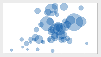
Contour Plot, 3D Scatterplot, 3D Surface Plot, and Bubble Plot
Minitab also includes several graphs that allow you to explore the relationships among three variables at the same time, such as those discussed in 3 Ways to Graph 3 Variables in Minitab and Introducing the Bubble Plot.
Comparing groups
 Which shift produces the most scrap? Is it the same every day of the week, or does the first shift generate the most scrap on Mondays, and the last shift generates the most scrap on Fridays? Which wing of a hospital has the most empty beds? Is that the same for all four seasons of the year, or is the ER most crowded in the winter, while the maternity ward is most crowded in the spring?
These are the kinds of questions you can answer by comparing measurements across groups. The following graphs are well suited for this purpose.
Bar Chart
The following post shows how to use a bar chart to compare the means of different groups: Investigating Starfighters with Bar Charts: Function of a Variable.
Fun fact: Did you know that Minitab's Bar Chart feature can create both a bar chart and a column chart? By default, Minitab orients the bars vertically. But you can easily flip (or "transpose") the axes to display the bars horizontally. Just double-click an axis and choose Transpose value and category scales. (For more helpful information on customizing axes, see Modifying graph scales.)
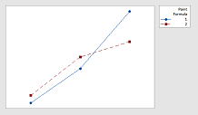
Line Plot
Another way to visualize differences between groups is with a line plot, as shown in this post: How to Explore Interactions with Line Plots.
Assessing how the parts comprise the whole
 Are scratches, chips, and blisters all equally likely to mar the surface of a new car that rolls off your assembly line? Or is one defect more common than the others?
Do customers seem to call for help with each of your products equally often? Or does one of the products prove more troublesome than the others?
The following graphs can help you breakdown a variable into its constituent categories.
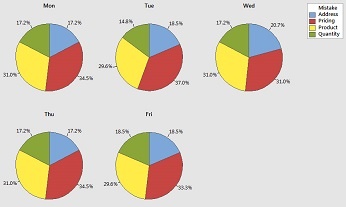
Pie Chart, Stacked Bar Chart, Pareto Chart
The post Analyzing Qualitative Data, part 1: Pareto, Pie, and Stacked Bar Charts does a good job of comparing the relative merits of these useful plots.
Area Graph
As the post Area Graphs: An Underutilized Tool describes, an area graph is a great way to view multiple time series when each series is part of one whole.
Looking at how values are distributed
 What is the range of values in my sample? Are the data distributed the same way this time as they were last time? Are there any unusual points that I should investigate?
The following graphs can help you answer these questions.
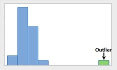
Histogram and Dotplot
For continuous data, you can use a histogram or a dotplot to look at the distribution. For examples, check out 3 Things a Histogram Can Tell You and Managing Diabetes with Six Sigma and Statistics, Part I.
Bar Chart
For discrete data, you can use a bar chart to look at the relative frequencies for each category. For example, see Analyzing Data about Lost Baggage: It’s All Relative (Frequency).
What Are Your Go-To Graphs?
These are just some possibilities of how you can use the many graphs available in Minitab Statistical Software to learn about your data and help present what you learn to others. You can find many other great examples on the Minitab Blog.
What are the graphs you like to use when presenting different kinds of data? Let us know in the comments!


