When I first got interested in looking at baseball park factors, I only wanted to know which parks benefited hitters and which benefited pitchers. Once I got started, I got interested in the difference between ESPN's published formula and its results and whether there were obvious reasons for the variation in park factors from year-to-year.
But today I’m returning to the original question: which parks are hitters’ parks, and which are pitchers’ parks?
We already know that the mean and median are inadequate by themselves. For example, consider AT&T Park, where the mean suggests a pitchers’ park but the median suggests a hitters’ park. So we want to use an analysis that also takes into account how variable the park factors are.
Two closely related analyses in Minitab Statistical Software that consider variation are the analysis of variance (ANOVA) and the analysis of means (ANOM). Let’s take a look at these two analyses to understand the difference in what they do.
Analysis of Variance (ANOVA)
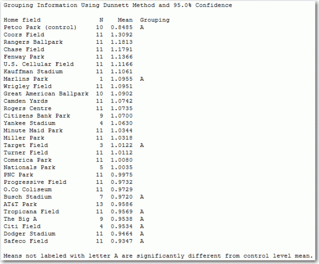
One-way ANOVA tests whether all of the group means are equal to each other. One way to go deeper into this kind of analysis is to choose particular comparisons of interest. For example, you might compare all of the parks to the park with the lowest park factor: Petco Park.

The results show which parks are, statistically speaking, better hitters’ parks than Petco Park. The list of better hitters' parks includes most of the parks with factors as high as AT&T Park's. Some parks that have only a few years of service are hard to distinguish statistically, including Busch Stadium, Target Field, and Marlins Park.
The ANOVA information is very useful. But if we want to classify parks as hitters' parks, neutral parks, and pitchers' parks, ANOVA doesn't give us exactly what we want. We wouldn't really say that AT&T Park is a hitters' park just because it's a better hitters' park than Petco Park.
Analysis of Means (ANOM)
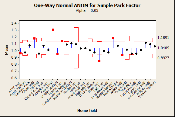
Instead of testing whether means are equal to each other, ANOM tests whether the means are equal to the overall mean. Minitab makes a graph so that the results are easy to understand.

The points on the graph are the mean park factors. The green line represents the overall mean. The red lines are decision limits that show which parks are different from the overall mean.
These parks are pitchers' parks:
- AT&T Park
- Dodger Stadium
- Petco Park
- Safeco Field
These parks are hitters' parks:
- Chase Field
- Coors Field
- Fenway Park
- Rangers Ballpark
If I think that the requirements to be a hitters’ park or a pitchers’ park are too stringent in the analysis of means, I could redo it with a higher alpha level. This decreases the amount of evidence that I require to classify a park as a hitters’ park or a pitchers’ park.
I think the case of Citi Field is interesting. Citi Field looks like a pitchers’ park, but it’s not classified as a pitchers' park statistically because the park has been in use for only 4 seasons. The variation has been too high to provide statistical evidence that Citi Field will always be a pitchers park.
The uncertainty is true from a more practical standpoint too. The center-right field fence moved in about 6 meters and came down halfway in height for the beginning of the 2012 season. Changes to the park dimensions could make it play very differently from how it was before.
Statistical analysis improves decisions
When I looked at the individual value plots earlier, I guessed that Dodger Stadium and AT&T would be neutral parks, conventional wisdom notwithstanding. Statistical analyses like ANOVA and ANOM provide the clarity that we need to make more better decisions from data. Want to see more results for comparing groups? Check out how Riverview Hospital Association identified specific patient groups that gave lower satisfaction scores than other groups so that the association could direct their improvement processes properly.


