Everyone loves Minitab’s Assistant. My favorite bit, as I’ve shown with the Gage R&R Study, is the way that the Assistant puts all the results you need into reports that are easy to understand and present. But it’s also pretty neat that before you ever choose what to do in Minitab, the Assistant is ready to help you. Let’s take a closer look at the Assistant's Graphical Analysis tools.
Help Me Choose
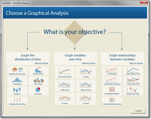
Choose Assistant > Graphical Analysis and the most prominent thing you’ll see is a question:

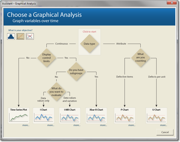
But you’re not left with just the three objectives. Select "graph variables over time," and before you have to pick one of the 6 possible charts, the Assistant offers to help you choose.
Clicking "Help me choose" takes you to a full flow chart that reveals important considerations in choosing which chart to make:

But it gets even better.
Chart characteristics explained
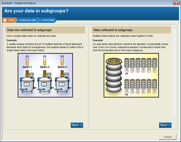
Each decision point on an Assistant flow chart is clickable. So if you click “Do you have subgroups?” you get helpful content with an example to help you decide whether you have subgroups or not. Click “Next” to go to the next decision on the flow chart or click “Cancel” to go back to the entire flow chart.

Guidelines for collecting your data and using your chart
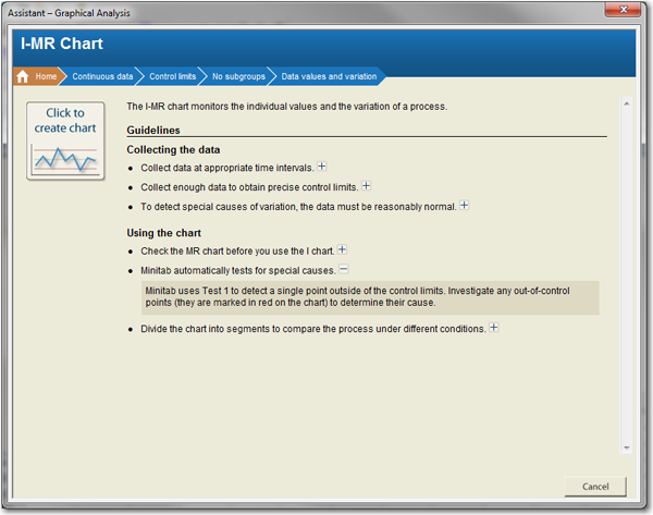
Under each chart on the flow chart is the word “more.” Click “more” and you get a set of guidelines for collecting your data and for using your chart. By clicking the arrows at the top, you can get more information on any of the characteristics that would lead you to choose this chart. But if you’re ready to go, you can click the image of the chart so that you can get started telling Minitab about your data!

The Assistant in Minitab Statistical Software provides a lot of great tools and information. So much that you wouldn’t want to miss out on any of it. So the next time you need a refresher for choosing a measurement systems analysis, capability analysis, graph, hypothesis test, or control chart, remember, Minitab is ready to assist!


