


My colleague Cody Steele wrote a post that illustrated how the same set of data can appear to support two contradictory positions. He showed how changing the scale of a graph that displays mean and median household income over time drastically alters the way it can be interpreted, even though there's no change in the data being presented.
When we analyze data, we need to present the results in an objective, honest, and fair way. That's the catch, of course. What's "fair" can be debated...and that leads us straight into "Lies, damned lies, and statistics" territory.
Cody's post got me thinking about the importance of statistical literacy, especially in a mediascape saturated with overhyped news reports about seemingly every new study, not to mention omnipresent "infographics" of frequently dubious origin and intent.
As consumers and providers of statistics, can we trust our own impressions of the information we're bombarded with on a daily basis? It's an increasing challenge, even for the statistics-savvy.
So Much Data, So Many Graphs, So Little Time
The increased amount of information available, combined with the acceleration of the news cycle to speeds that wouldn't have been dreamed of a decade or two ago, means we have less time available to absorb and evaluate individual items critically.
A half-hour television news broadcast might include several animations, charts, and figures based on the latest research, or polling numbers, or government data. They'll be presented for several seconds at most, then it's on to the next item.
Getting news online is even more rife with opportunities for split-second judgment calls. We scan through the headlines and eyeball the images, searching for stories interesting enough to click on. But with 25 interesting stories vying for your attention, and perhaps just a few minutes before your next appointment, you race through them very quickly.
But when we see graphs for a couple of seconds, do we really absorb their meaning completely and accurately? Or are we susceptible to misinterpretation?
Most of the graphs we see are very simple: bar charts and pie charts predominate. But as statistics educator Dr. Nic points out in this blog post, interpreting even simple bar charts can be a deceptively tricky business. I've adapted her example to demonstrate this below.
Which Chart Shows Greater Variation?
A city surveyed residents of two neighborhoods about the quality of service they get from local government. Respondents were asked to rate local services on a scale of 1 to 10. Their responses were charted using Minitab Statistical Software, as shown below.
Take a few seconds to scan the charts, then choose which neighborhood's responses exhibit the most variation, Ferndale or Lawnwood?
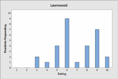
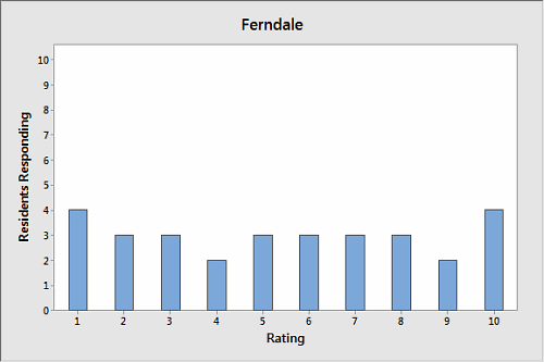
Seems pretty straightforward, right? Lawnwood's graph is quite spiky and disjointed, with sharp peaks and valleys. The graph of Ferndale's responses, on the other hand, looks nice and even. Each bar's roughly the same height.
It looks like Lawnwood's responses have the most variation. But let's verify that impression with some basic descriptive statistics about each neighborhood's responses:
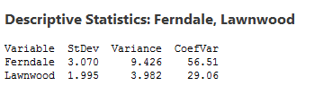
Uh-oh. A glance at the graphs suggested that Lawnwood has more variation, but the analysis demonstrates that Ferndale's variation is, in fact, much higher. How did we get this so wrong?
Frequencies, Values, and Counterintuitive Graphs
The answer lies in how the data were presented. The charts above show frequencies, or counts, rather than individual responses.
What if we graph the individual responses for each neighborhood?
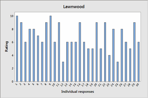
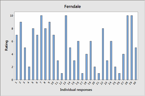
In these graphs, it's easy to see that the responses of Ferndale's citizens had much more variation than those of Lawnwood. But unless you appreciate the differences between values and frequencies—and paid careful attention to how the first set of graphs was labeled—a quick look at the earlier graphs could well leave you with the wrong conclusion.
Being Responsible
Since you're reading this, you probably both create and consume data analysis. You may generate your own reports and charts at work, and see the results of other peoples' analyses on the news. We should approach both situations with a certain degree of responsibility.
When looking at graphs and charts produced by others, we need to avoid snap judgments. We need to pay attention to what the graphs really show, and take the time to draw the right conclusions based on how the data are presented.
When sharing our own analyses, we have a responsibility to communicate clearly. In the frequency charts above, the X and Y axes are labeled adequately—but couldn't they be more explicit? Instead of just "Rating," couldn't the label read "Count for Each Rating" or some other, more meaningful description?
Statistical concepts may seem like common knowledge if you've spent a lot of time working with them, but many people aren't clear on ideas like "correlation is not causation" and margins of error, let alone the nuances of statistical assumptions, distributions, and significance levels.
If your audience includes people without a thorough grounding in statistics, are you going the extra mile to make sure the results are understood? For example, many expert statisticians have told us they use the Assistant in Minitab Statistical Software to present their results precisely because it's designed to communicate the outcome of analysis clearly, even for statistical novices.
If you're already doing everything you can to make statistics accessible to others, kudos to you. And if you're not, why aren't you?