


The line plot is an incredibly agile but frequently overlooked tool in the quest to better understand your processes.
In any process, whether it's baking a cake or processing loan forms, many factors have the potential to affect the outcome. Changing the source of raw materials could affect the strength of plywood a factory produces. Similarly, one method of gluing this plywood might be better or worse than another.
But what is even more complicated to consider is how these factors might interact. In this case, plywood made with materials obtained from supplier “A” might be strongest when glued with one adhesive, while plywood that uses material from supplier “B” might be strongest when you glued with a different adhesive.
Understanding these kinds of interactions can help you maintain quality when conditions change. But where do you begin? Try starting with a line plot.
The Line Plot Has Two Faces
Line plots created with Minitab Statistical Software are flexible enough to help you find interactions and response patterns whether you have 2 factors or 20. But while the graph is always created the same way, such changes in scale produce two seemingly distinct types of graph.
With just a few groups…the focus is on interaction effects. In the graph below, a paint company that wants to improve the performance of its products has created a line plot that finds a strong interaction between spray paint formulation and the pressure at which it’s applied.
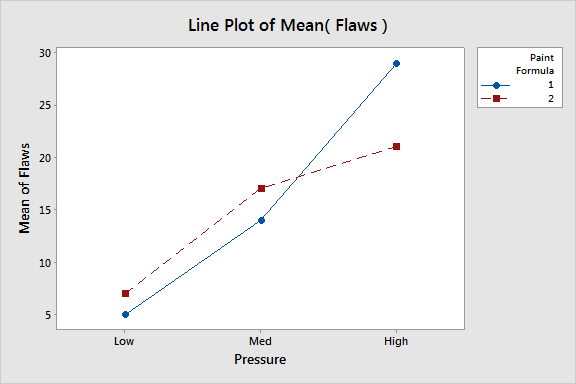
An interaction is present where the lines are not parallel.
With many groups…the focus is on deviations from an expected response profile. (That's why in the chemical industry this is sometimes called a profile graph.) The line plot below shows a comparison of chemical profiles of a drug from three different manufacturing lines.
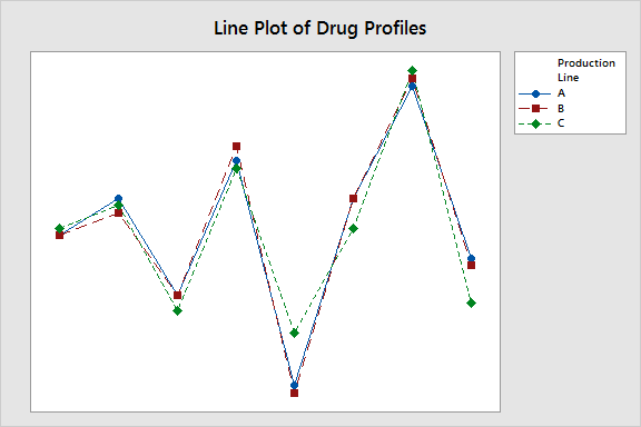
Any profile that deviates from the established pattern could suggest quality problems with that production line, but these three profiles look quite similar.
More Possibilities to Explore
If you’re an experienced Minitab user, these examples may seem familiar. In its various incarnations, the line plot is similar to the interaction plot, to "Calculated X" plots used in PLS, and even to time series plots that appear with more advanced analyses. But the line plot gives you many more options for exploring your data. Here’s another example.
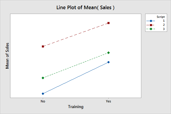
A line plot of the mean sales from a call center shows little interaction between the call script and whether the operators received sales training because the lines are parallel.
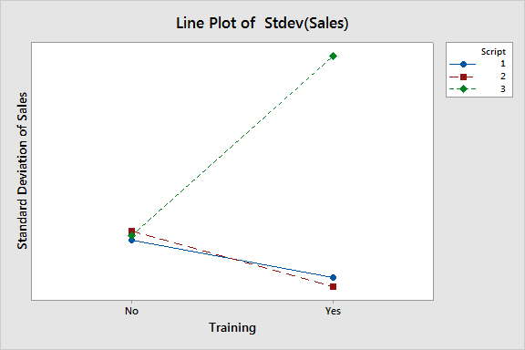
But because line plot allows us to examine functions other than the mean, we can see that there is, in fact, an interaction effect in terms of standard deviation. The lines are not parallel. For some reason, the variability in sales seems to be affected by the combination of script and training.
How to create a line plot in Minitab
Creating a line plot in Minitab is simple. For example, suppose that your company makes pipes. You’re concerned about the mean diameter of pipes that are produced on three manufacturing lines with raw materials from two suppliers.
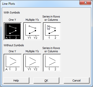
Because you’re examining only two factors—line and supplier—a With Symbols option is appropriate. Use Without Symbols options when you have many groups to consider. Symbols may clutter the graph. Within these categories, you have your choice of data arrangement.
Choose Graph > Line Plot > With Symbols, One Y.
Click OK.
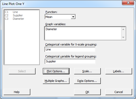
Now, enter the variables to graph. Note that Line Plot allows you to graph a number of different functions apart from the mean.
In Graph variables, enter 'Diameter'.
In Categorical variable for X-scale grouping, enter Line.
In Categorical variable for legend grouping, enter Supplier.
Click OK.
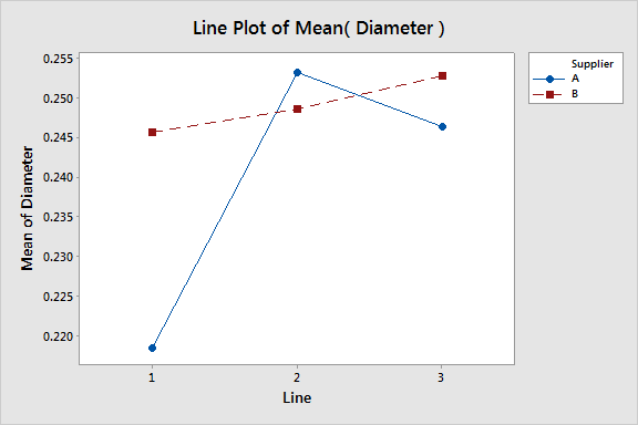
The line plot shows a clear interaction between the supplier and the line that manufacture the pipe.
Putting line plots to use
The line plot is an ideal way to get a first glimpse into the data behind your processes. The line plot resembles a number of graphs, particularly the interaction plots used with DOE or ANOVA analyses. But, while the function of line plots may be similar, their simplicity makes them an especially appropriate starting point.
It can highlight the variables and the interactions that are worth exploration. Its powerful graphing features also allow you to analyze subsets of your data or to graph different functions of your measurement variable, like standard deviation or count.