


 In my last blog, I showed how it’s possible to statistically assess the structure of a message and determine its capacity to convey information. We saw how my own words fit the patterns that are present in communications that are optimized for conveying information. However, these were fairly rough assessments to illustrate the fundamentals of information theory.
In this post, I’ll use more sophisticated analyses to more precisely determine whether my blog content fits the ideal distribution. Along the way, we’ll have some interesting discussions about the vagaries of dolphin, human, and extraterrestrial communications!
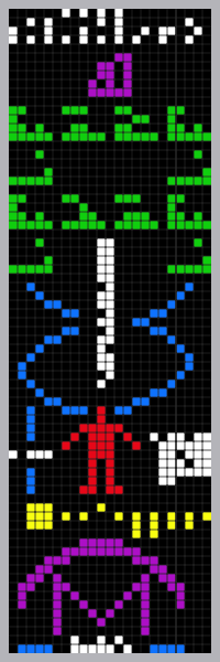
This image is the message that scientists beamed into space from the Arecibo radio telescope in 1974.
Identifying a Discrete Distribution: Zipf’s Law
Information theory states that messages maximize their capacity to convey information when the content follows Zipf’s law. Zipf’s law is a discrete distribution based on ranked data. Data follow the Zipfian distribution when the 2nd ranked data point has half the occurrences of the 1st ranked point, the 3rd point has a third of the occurrences of the 1st, the 4th has a quarter, etc. We’ll get into why this distribution is ideal later.
First, we need to determine whether my words follow Zipf’s law. Probability Plots are an important tool in Minitab statistical software for identifying the distribution of your data (Graph > Probability Plot). You can also generate a group of Probability Plots for 14 distributions and 2 transformations with Individual Distribution Identification (Stat > Quality Tools > Individual Distribution Identification). Earlier, I blogged about how to identify the distribution of your data.
Probability plots are easy to use because you only need to see whether the data points follow a straight line. Unfortunately, you can’t create a Probability Plot for Zipf’s law out-of-the-box. Have no worries, we can create our own! To do this, we have to make two adjustments to a scatterplot:
Transform the graph’s axes: A Probability Plot transforms the graph’s axes so that the data points follow a straight line if the data follow the distribution. In my research, I found that a scatterplot which uses the log of the rank and the log of the frequency of occurrence for the x and y-axes displays data that follows Zipf’s law in a straight line.
Add a calculated line: All Probability Plots display a comparison line that your data should follow. For the word data, the word ranked #1 has 2,461 occurrences. So that will be our first point. Zipf’s law says that the point that is ranked #2461 should have just 1 occurrence. This will be the last point on our line. The slope of this line is -1, which becomes important to our discussion.

If my word count data follows Zipf’s law, the data points will follow the line. Most of the points follow a straight line, but they do not follow the comparison line. So, while my data don’t follow Zipf’s law, the distribution isn’t completely dissimilar. That similarity probably explains why the first glance at the data in the last post didn’t reveal any obvious differences from the expected distribution.
Virtually all of the data points on the graph are above the line. A point above the line indicates that the observed frequency at the corresponding rank is higher than the frequency that Zipf’s law predicts. In other words, as rank decreases, frequency doesn’t decrease as rapidly as expected.
We’re learning more about these data, and there is more to learn. Let’s take a quick diversion into another word frequency data set for a comparison.
Comparison to Wikipedia Data
Wikipedia created the same graph for their content. As you can imagine, Wikipedia has many more words than my data and they were written by many authors and cover more topics. Here’s their graph.

The points that follow the green line are the points that follow Zipf’s law. You can disregard the other lines. The graph shows that word frequencies closely follow the Zipf distribution for high-ranked words, but then deviate. The deviation begins around rank 10,000 out of about 1 million unique words. From my reading, Zipf’s law best fits the higher-ranked words.
Zipf's Slope of the Data
The comparison line in the log-log scatterplot has a slope of -1, which follows Zipf’s law. Information theory states that this slope is an ideal compromise between the sender and receiver in what Zipf described as the Principle of Least Effort. Language requires a diversity of words to convey a wide array of information. However, too much diversity can be confusing. Mandelbrot refined Zipf’s theory by suggesting that human languages evolved over time to optimize the capacity to convey information from the sender to receiver.
The slope that the word data follow on a log-log scatterplot is known as the Zipf statistic. A very steep line (a more negative slope) represents a smaller, more repetitive vocabulary. A smaller vocabulary requires less effort of the sender but it may be too restrictive to efficiently convey information. On the other hand, a flatter line (where the slope is greater than -1) represents a more diverse vocabulary. The receiver wants the sender to use a larger, more precise vocabulary to improve comprehension by removing ambiguities. However, a larger vocabulary is harder to learn and work with.
The Zipf statistic evaluates the balance between redundancy and diversity. A slope of -1 is right in the middle and represents a compromise between the speaker and listener. As you move further away from -1.0, both negatively and positively, the communication potential decreases.
Researchers have found that the slope for dozens of human languages consistently falls around -1. Adult squirrel monkeys have a flatter slope of -0.6, while Orca whales have a steeper slope, between -1.241 to -1.468, depending on the study.
Some scientists suggest that you can measure language acquisition by tracking the Zipf statistic by age within a species. In humans, 22-month-old babies score a -0.82, which then steepens over time to the optimal -1.0.
Infant dolphins have a slope of -0.82, while the adults are nearly optimal at -0.95. Conversely, mice pups start with a slope of -1.96, which flattens to -1.48 as they mature into adults. Both dolphins and mice move closer to the optimal but from opposite directions. Is this language acquisition?
The Slope of My Word Data
My word data do not fit the Zipf distribution with its slope of -1, but the data are fairly linear on the log-log scatterplot. Let’s estimate the slope of my data. To do this, I’ll regress the log of the rank on the log of the frequency. I’ll use the top 615 words because this accounts for 80% of the word usage in my blogs, and the Zipf slope works best for the top-ranked words.
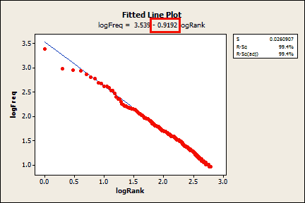
According to the Fitted Line Plot, the slope of my data is only -0.9192! With an r-squared of 99.4%, the fit is great. General Regression (not shown) calculates a 95% confidence interval for the slope (-0.9231 to -0.9153) that excludes -1. My score is slightly worse than adult dolphins (-0.95) and is significantly different from -1. Maybe I am an adolescent dolphin? We have a stat cat blogger, and now a stat dolphin?! Well, at least I beat the monkeys!
Blogs, and Globalization, and Extraterrestrials! Oh my!
Joking aside, what does my score indicate? This case shows how understanding the context behind any statistic is crucial. Yes, my Zipf slope is flatter than a dolphin’s. A flatter Zipf slope can indicate a more random signal, but it can also indicate a broader vocabulary that conveys a more precisely worded message. I’d like to think that my posts use careful and clear wording to convey information about a potentially difficult subject. Zipf suggests that attempts to remove ambiguities should produce a flatter slope that favors the recipient. I hope that is the case with my blogs, but I’ll let you decide.
Mandelbrot postulated that human languages evolved to efficiently convey information, and that is why all of their slopes are around -1. That theory got me wondering about attempts to intentionally control word usage. Minitab, and other global companies, have to take care of their international audience. This entails writing English content that is:
- natural for native English speakers
- easy to understand by those who speak English as a second language
- easily translatable into high-quality localized versions
This is a tall order, but it is possible with a lot of work and new technology. The process involves restricting the use of words. If there are multiple ways to state something, we’ll pick a subset that satisfies all of these criteria. In terms of writing for an international audience, there are definitely correct and incorrect ways to phrase content.
New technology is coming online to help us choose phrasings that are globally friendly as we write the content. In essence, we are using linguistics and technology to improve upon the natural evolution of language. The goal is to simultaneously reduce the vocabulary and increase comprehension, which are contradictory goals according to Zipf. These controlled vocabularies should produce a steeper Zipf slope. How steep? I’m not sure, but perhaps that’s a subject for a future post.
Finally, I’ve wondered about using Zipf’s slope to assess an extraterrestrial signal for information capacity. With E.T., we lose the vital context that we have when we compare, say, a statistics blogger to aquatic mammals. Without the context, we simply wouldn’t know how to interpret the slope.
If an E.T. is writing a message for a universal audience, it might determine that a very restricted vocabulary is best when two species have no common frame of reference. It might use an extreme version of our process of restricting vocabulary for a global audience and produce some very steep Zipf slopes. Conversely, the aliens might be so mentally superior to humans that using an extremely diverse vocabulary presents no difficulty at all. If this is the case, their communications could produce some very flat Zipf slopes.
What’s your Zipf slope? -- Try this pickup line at the next Information Theorists’ party you attend!