Shhh. I have a secret. Working at Minitab, I should probably say that I love all of its analyses equally. Perhaps it would be OK to love them differently, but equally. However, I’ve always had a sneaking preference for Minitab’s regression analysis. I just can’t keep it a secret anymore!
If you promise to keep this secret, I’ll give you a special bonus tip at the end of the post. In fact, most of my colleagues here at Minitab don’t even know about this one! Seriously!
I’ve used regression extensively and love it for all of its flexibility. You can use:
- multiple predictor variables
- continuous and categorical variables
- higher-order terms to model curvature
- interaction terms to see if the effect of one predictor depends upon the value of another
That’s all cool stuff. But the list leaves out an almost magical property of regression analysis. Regression has the ability to disentangle some very convoluted problems. Problems where the predictors seem enmeshed together like spaghetti.
Suppose you’re a researcher and you are studying a question that involves intertwined predictors. For example, you want to determine:
- whether socio-economic status or race has a larger effect on educational achievement
- the importance of education versus IQ on earnings
- how exercise habits and diet effect weight
- how drinking coffee and smoking cigarettes are related to heart disease
- if a specific exercise intervention (separate from overall activity levels) increases bone density
These are all research questions where the predictors are likely to be correlated with each other and they could all influence the response variable. How do you untangle this web and separate out the effects? How do you determine which variables are significant and how large of a role does each one play? Regression comes to the rescue!
You Must Control Everything! (Or at least the important variables)
Multiple regression estimates how the changes in each predictor variable relate to changes in the response variable. Importantly, regression automatically controls for every variable that you include in the model.
What does it mean to control for the variables in the model? It means that when you look at the effect of one variable in the model, you are holding constant all of the other predictors in the model. Or "ceteris paribus," as the Romans would’ve said. You explain the effect that changes in one predictor have on the response without having to worry about the effects of the other predictors. In other words, you can isolate the role of one variable from all of the others in the model. And, you do this simply by including the variables in your model. It's beautiful!
For instance, a recent study assessed how coffee consumption affects mortality. Initially, the results showed that higher coffee consumption is correlated with a higher risk of death. However, many coffee drinkers also smoke. After the researchers included a variable for smoking habits in their model, they found that coffee consumption lowered the risk of death while smoking increased it. So, by including coffee consumption, smoking habits, and other important variables, the researchers held everything that is important constant and were able to focus on the role of coffee consumption.
Take note, this study also illustrates how not including an important variable (leaving it uncontrolled) can completely mess up your results.
What to Look For in the Regression Output
To answer questions like these, after you fit and verify that you have a good model, all you need to do is look at the p-value and coefficient for each predictor. If the p-value is low (usually < 0.05), the predictor is significant. Coefficients represent the mean change in the response for one unit of change in the predictor while holding other predictors in the model constant.
For example, if your response variable is income and your predictors include IQ and education (among other relevant predictors), you might see output like this:

The p-values indicate that both IQ and education are significant. The IQ coefficient shows that an increase of one IQ point increases your earnings by an average of around $4.80, holding everything else in the model constant. Further, an increase in 1 unit of education increases your earnings by $24.22, ceteris paribus.
How To Get Results That You Can Trust
With this great power comes some responsibility. Sorry, but that’s the way it always works. For it all to work out correctly you need to do the following:
- Include all of the important variables in your model. Leaving out important variables leaves them uncontrolled and can bias your coefficients (i.e., they’re probably wrong).
- You should have good measures for the included variables, or at least include proxy variables for those that are hard to measure.
- Check your residual plots to make sure that your model fits your data.
Correlated Predictors
As we’ve seen, regression analysis can handle predictors that are correlated, also known as mullticollinearity. Moderate multicollinearity may not be a problem. However, severe multicollinearity is problematic because it can increase the variance of the regression coefficients, making them unstable and difficult to interpret.
For example, IQ and education are probably correlated, as is drinking coffee and smoking. As long as they aren’t excessively correlated, it’s not a problem. How do you know? VIFs are your friend! Variance inflation factor (VIF) is an easy to use measure of multicollinearity.
VIF values greater than 10 may indicate that multicollinearity is unduly influencing your regression results. If you see high VIF values, you may want to remove some of the correlated predictors from your model.
For General Regression in Minitab statistical software, you can display the VIFs by clicking the Results button and checking Display variance inflation factors.
Closing Thoughts and the Bonus Tip!
Regression gives you the power to separate out the effects of even tricky research questions. You can unravel the intertwined spaghetti noodles by holding all relevant variables constant and seeing the role that each plays.
If you're learning about regression, read my regression tutorial!
Now, on to the bonus tip! I’ve learned this tip just recently, even though this feature has been in Minitab for a while. It was also a surprise to my colleagues.
Imagine you’re in the process of finding the proper regression model for your data. You have many variables, and you’ve included the terms for curvature and interactions. You’re reducing your model down to just the significant terms and checking the residual plots along the way. The result is a lot of output in the session window and many graphs. It can be difficult to find the specific plots for any given regression model.
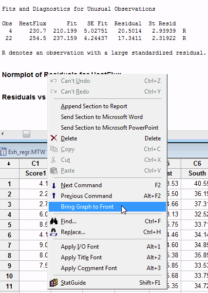
There is an easy way to pull up the plots for a specific model. As you scroll down through the session window, just right-click on the heading for the graph and choose Bring Graph to Front, as shown below. Voila! The graph for that specific model is visible! This action works for other graphs, as long as you produce them as part of a statistical analysis (e.g. 2-sample t-test, ANOVA, etc).
Have fun with regression!