I love all data, whether it’s normally distributed or downright bizarre. However, many people are more comfortable with the symmetric, bell-shaped curve of a normal distribution. It is not as intuitive to understand a Gamma distribution, with its shape and scale parameters, as it is to understand the familiar Normal distribution with its mean and standard deviation.
However, it's a fact of life that not all data follow the Normal distribution. Hey, a lot of stuff is just abnormal...er...non-normally distributed. How to understand and present the practical implications of your non-normal distribution in an easy-to-understand manner is an ongoing challenge for analysts.
This is particularly true for quality process improvement analysts, because a lot of their data is skewed (non-symmetric). The output of many processes often have natural limits on one side of the distribution. Natural limits include things like purity, which can’t exceed 100%. Or drill hole sizes that cannot be smaller than the drill bit. These natural limits produce skewed distributions that extend away from the natural limit. So, non-normal data is actually typical in some areas.
Fear not; if you can shine the light on something and identify it, it makes it less scary. I will show you how to:
- use Minitab Statistical Software to identify the distribution of your data (this post)
- reap the benefits of the identificaton (next post)
To illustrate this process, I’ll look at the body fat percentage data from my previous post about using regression analysis for prediction. You can download this data here if you want to follow along.
Going with Raw Sample Data
We could simply plot the raw, sample data in a histogram like this one:

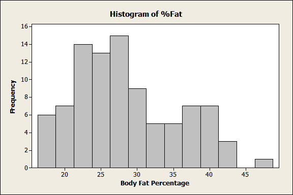
This histogram does show us the shape of the sample data and it is a good starting point. We can see that this distribution is skewed to the right and probably non-normal. However, this graph only tells us about the data from this specific example. You can’t make any inferences about the larger population.
What can be done to increase the usefulness of these data? First, identify the distribution that your data follow. Once you do that, you can learn things about the population—and you can create some cool-looking graphs!
How to Identify the Distribution of Your Data
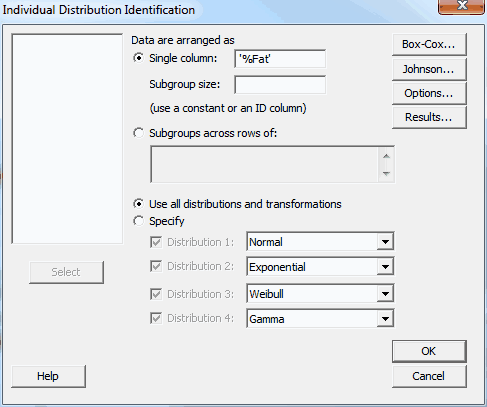
To identify the distribution, we’ll go to Stat > Quality Tools > Individual Distribution Identification in Minitab. This handy tool allows you to easily compare how well your data fit 16 different distributions. It produces a lot of output both in the Session window and graphs, but don't be intimidated. Before we walk through the output, there are 3 measures you need to know.
Anderson-Darling statistic (AD): Lower AD values indicate a better fit. It’s generally valid to compare AD values between distributions and go with the lowest.
P-value: You want a high p-value. A low p-value (e.g., < 0.05) indicates that the data don’t follow that distribution. For some 3-parameter distributions, the p-value is impossible to calculate and is represented by asterisks.
LRT P: For 3-parameter distributions only, a low value indicates that adding the third parameter is a significant improvement over the 2-Parameter version. A higher value suggests that you may want to stick with the 2-Parameter version.
So, for my data, I’ll fill out the main dialog like this:

Let’s dive into the output. We’ll start with the Goodness of Fit Test table below.

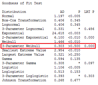
The very first line shows our data are definitely not normally distributed, because the p-value for Normal is less than 0.005!
We'll skip the two transformations (Box-Cox and Johnson) because we want to identify the native distribution rather than transform it.
A good place to start is to skim through the AD values and look for the lowest. The lowest AD is for 3-Parameter Weibull. However, the AD values for 3-Parameter Lognormal, Largest Extreme Value, and 3-Parameter Gamma are all close. For the 3-Parameter Weibull, the LRT P is significant (0.000), which means that the third parameter significantly improves the fit. The LRT P is not significant for the other 3-Parameter candidate distributions.
Given the lower AD value and the significant LRT P value, we can pick the 3-Parameter Weibull distribution as the best fit for our data. We identified this distribution by looking at the table in the Session window, but Minitab also creates a series of graphs that provide most of the same information along with probability plots.
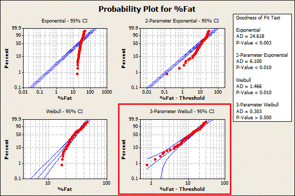
 You can see 3-Parameter Weibull in the graph below. The data points follow a fairly straight line, which indicates a fit.

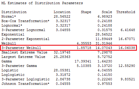
Now we know what the distribution is—but what are the distribution's parameter values? For those, look at the next table down in the Minitab Session window output:

How Does Identifying the Distribution of Data Help with Analysis?
All right. Now we know that the body fat percentage data follow a 3-Parameter Weibull distribution with a shape of 1.85718, a scale of 14.07043, and a threshold of 16.06038.
At this point you may be wondering, "How does that help us?" The answer: with this information about the distribution, we can go beyond the raw sample data and make statistical inferences about the larger population.
In my next post, I'll show you how to use powerful tools in Minitab to gain deeper insights into your research area and present your results more effectively.

Prev


http://www.scribd.com/doc/84506538/Body-Fat-Data-for-Identifying-Distribution-in-Minitab
I've also added a link to the data in the body of Jim's post. Thanks again!
Eston Martz
Blog Editor
that would be very helpful. "Now we know that the body fat percentage data follow a 3-Parameter Weibull distribution with a shape of 1.85718, a scale of 14.07043, and a threshold of 16.06038."
Thanks for writing. You raise several good points.
I agree that the 5 decimal places can give a false sense of precision. However, I wanted to stick with the default output so it would be easier for readers to follow along and match values. Particularly because there is no reason to suspect that these values are less accurate than more truncated values.
I'm not quite clear on why you think the p-values are suspect. Perhaps you're thinking of multiple comparisons where you adjust the alpha level downwards based on the number of comparisons. Here, we are more focused on the AD values. We also look at the p-values, but we actually want high values. If you're concerned about fitting a distribution by chance, see below.
Great point about the importance of replicating results. That is standard for inferential statistics, where you take a sample and make inferences about a larger population. This sample is the best evidence we have right now about the properties of the population. But, it's always a good idea to see if new data supports it.
Cheers,
Jim Frost
Normal 108.709
You must have some interesting data! That's a good question. The answer depends on what you want to do with your data. Fortunately, you have several options!
One thing I'd check for is whether your data set might combine different populations. If you see multiple peaks, or a stretched out peak, your data might contain multiple populations. If that's the case, try separating and then identifying the distribution for the subpopulations. For example, you wouldn't want to identify the combined distribution for the heights of men and women. Instead, you'd separate the data.
If you want to report the middle and spread of your data, you can use the emperical median and quartiles. These statistics are based on your sample rather than a fitted distribution. The advantage is that you don't need to identify the distribution. You can do this in Minitab if you go to Stat > Basic Statistics > Display Descriptive Statistics.
If you want to compare your data to a target value or compare groups within your data, you can use Nonparametric analyses. This set of analyses has fewer assumptions than parametric analyses and, generally, you don't need to identify your distribution. You can find them in Minitab if you go to: Stat > Nonparametrics.
I hope this helps!
Jim
Thanks for the treatise here and these are great examples of how one should deal with non-normal distribution based data.
I have a series of articles coming out this summer on the same topic in an academic environment where the natural limits is 100 % for student score in a given high school.
It would be very interesting to see how your predicted scores match up with the actual ones to have us a mathematical model that is valid.
Great work and keep it coming!
Sincerely,
Shree
Thanks for reading and sharing your own work! Please let me know when your articles are out so I can read them!
Sincerely,
Jim
You can test for these distributions in Minitab but it'll take a little more work. First, you'll need to tally the observed counts for each value in your sample. Second, you'll need to calculate the theoretical proportions for each value in your sample based on the distribution that you want to test.
After that, you can use Stat > Tables > Chi-Square Goodness-of-Fit Test (One Variable) in Minitab. In this dialog, you'll see where to enter the column of observed counts. Under Test, you want to choose Specific proportions and enter your column of theoretically expected proportions.
Minitab will then check to see if your observed proportions differs from the proportions you'd expect for the distribution. A low p-value suggests that your data does not follow that distribution.
I hope this helps!
Jim Frost
My first question would be, can you transform the differences so they follow a normal distribution? If so, that's the preferred approach. You can transform your data (Box-Cox or Johnson) and do a capability analysis all in one shot: Stat > Quality Tools > Capability Analysis > Normal.
If the differences don't follow any distribution and can't be transformed, that gets a bit more difficult. One possibility would be to create a Tolerance Interval: Stat > Quality Tools > Tolerance Intervals.
This analysis will assess your data and calculate an interval that is likely to contain 95% of all future differences. If you prefer, you can change the percentage and/or specify a one-sided bound. Then, compare the interval or bound to your requirements to see if the results are satisfactory.
For tolerance intervals, your data aren't required to follow any distribution. Just be sure to look at the results that use the nonparametric method.
I hope this helps!
Jim
firstly please can I just say THANK YOU for such a descriptive summary of how to do this. I managed to follow it with ease and now have managed to compile a capability study with non-normal data.
I was originally stumped. I wanted to compile something to show to our directors that was relatively straight forward to explain, but when I did the original histograms they were extremely skewed, and quite frankly looked a bit messy.
So I identifed that my data was 3 paramter logloglistic and have now managed to do some nice looking capability curves and also calculate process sigma level.
Thanks again for this, it has been extremely useful!
I'm so glad that you found the blog helpful. It's pretty amazing how easily you can convey complex information with a nice graph!
Thanks so much for writing!
Jim
This is really useful. However I am slightly confused about distributions. For instance the literature says most examples of my data are negative-binomial distributions, and isn't count data usually a poisson distribution? How do I test for these distributions, aren't they pretty common? I'm using Generalized linear models for my data were I need to specify the distribution of my data.
Many thanks, great blog.
Andrew
Thanks for reading and for your question. Your comment is timely! My next blog will be about identifying a discrete distribution. In the mean time, if you look higher up in the comments for my reply to Stanley, you'll see a general procedure for how to do this.
It's true that both negative binomial and Poisson distributions are counts. However, they are counts of very different things that you would use for different situations.
The Poisson distribution describes a count of a characteristic (e.g. defects) over a finite observation space, such as the number of scratches on a windshield.
The negative binomial distribution describes a count of the number of trials necessary to produce a specified number of a certain outcome given a constant event probability. For example, it can model the number of windshields produced until you reach 100 defective units.
Jim
thanks for a very exhaustive and informative post!
I am currently creating probability distribution plots and calculating Goodness of fit for all the possible distribution included in Minitab 16 for a high number of variables of a model that I want to test for global sensitivity and uncertainty. The problem arises when the plots seem very good to me, but the p-values are extremely low, and hence suggest I should reject the H0 of the datasets fitting the distribution. But I do have a very high number of points for each variable i'm testing (between 1,000 and 1,800 usually). Should I trust the exceedingly powerful tests or my eyes?
All the best and thanks to you and your colleagues for these super-useful blog!
Tom
Thanks for reading and for the nice comments!
As you mention, very large sample sizes give the distribution tests very high power. So, even a small deviation is flagged as statistically significant. However, statistically significant doesn't mean that it is practically significant deviation. In this case, I would trust your eyes!
My colleague, Patrick Runkel, wrote a great blog post about this. You can find it here. Just look for the "Warning 2" section!
http://blog.minitab.com/blog/statistics-and-quality-data-analysis/large-samples-too-much-of-a-good-thing
Jim
many thanks for sharing the info.
all the queries in turn helped to understand this topic in detail.
thanks to all.
regards
Lokesh
I have some left-censored datasets for which I want to find the distribution type. I use Distribution ID plot subdialog box under distribution analysis (Arbitrary Censoring). The problem is that Minitab does not consider the highest observation in drawing the probability plot. Adding an artificial value (larger than the largest observation) the missing value is then shown. However, the decision about the distribution type (based on A-D or correlation coefficient) will change if an artificial value is added or not. The question is should I add the artificial value or not?
Thanks
I would go with the normal distribution, rather than the transformed data. They're so close that the difference is not important.
Generally, if you have two close distributions, it's probably easier to see any differences in a probability plot than through the numbers.
Thanks for reading!
Jim
Thanks for the outstanding explanation above. I have below data set
113462
91038
52448
68147
78161
118206
122366
100877
105233
109658
110314
101057
I performed Individiual distribution Identification and got the following result
Distribution ID Plot for PBT
Descriptive Statistics
N N* Mean StDev Median Minimum Maximum Skewness Kurtosis
12 0 97630.6 21255.3 103145 52448 122366 -1.04395 0.348496
Box-Cox transformation: Lambda = 3
Goodness of Fit Test
Distribution AD P LRT P
Normal 0.505 0.162
Box-Cox Transformation 0.217 0.794
Lognormal 0.759 0.035
3-Parameter Lognormal 0.528 * 0.087
Exponential 3.513 0.500 0.257
Smallest Extreme Value 0.259 >0.250
Largest Extreme Value 0.798 0.032
Gamma 0.691 0.076
3-Parameter Gamma 4.921 * 1.000
Logistic 0.447 0.217
Loglogistic 0.631 0.058
3-Parameter Loglogistic 0.447 * 0.136
Now here p value is 0.162 which is greater than 0.05. So it suggests that the null is accepted and data is normally distributed.
But when I am performing Anderson Darling Manually with the formula
AD=∑ {(1-2i)/n}{ln(F[Zi])+ln(1-F[Zn+1-i])}-n i. which is the standard AD formula. I am getting a value of 7.13 which is way higher than 0.752 also the AD value shown by minitab is 0.505
I am unable to understand what is going wrong. Can you help me out?
TIA
Thanks for the outstanding explanation. I have below data set
113462
91038
52448
68147
78161
118206
122366
100877
105233
109658
110314
101057
I performed Individiual distribution Identification and got the following result
Goodness of Fit test
Distribution AD P LRT P
Normal 0.505 0.162
Box-Cox Transformation 0.217 0.794
Lognormal 0.759 0.035
Now here p value is 0.162 which is greater than 0.05. So it suggests that the null is accepted and data is normally distributed.
But when I am performing Anderson Darling Manually with the formula
AD=∑ {(1-2i)/n}{ln(F[Zi])+ln(1-F[Zn+1-i])}-n i. which is the standard AD formula I am getting a value of 7.13 which is way higher than 0.752 also the AD value shown by minitab is 0.505
I am unable to understand what is going wrong. Can you help me out?
TIA