


I’m a Star Trek fan and a statistics fan. So, I’m thrilled to finally have the opportunity to combine the two into a blog post! In the original Star Trek series with Captain Kirk, the crew members of the U.S.S. Enterprise who wear red shirts have a reputation for dying more frequently than those who wear blue or gold shirts. Wearing a red shirt appears to be the kiss of death! In this blog, we’ll conduct several hypothesis tests to determine whether this is true.
Matthew Barsalou published an article in Significance that studies this from a statistical perspective. Barsalou is also a guest blogger right here at Minitab's blog! His hypothesis is that the proportion of the red-shirted personnel who die is no greater than the other colors. We see more red-shirt deaths simply because red-shirts comprise about half the crew. Barsalou uses Minitab Statistical Software to produce a series of graphs that break down the data. He then assesses the probabilities with his own Bayesian calculations. It’s worth reading the original article.
Rather than duplicating his work, I’ll add to it by using Minitab to formally test his two hypotheses using several tests that he doesn't use.
Fatalities by Uniform Colors
The uniform color denotes the area that the crewmember works in. We’re going to determine if a crewmember’s duty area affects his chances of being killed. In the table below, you can see that red-shirts make up the majority of both the crew and the fatalities. The data is “real” in the sense that the deaths are depicted on the show and the crew numbers are from authoritative reference sources.
Let’s boldly go where no hypothesis tests have gone before!
| Color |
Areas |
Crew |
Fatalities |
| Blue |
Science and medical |
136 |
7 |
| Gold |
Command and helm |
55 |
9 |
| Red |
Operations, engineering, and security |
239 |
24 |
| Ship’s total |
All |
430 |
40 |
Chi-Square Test for Uniform Color and Fatalities
To determine whether the percentage of fatalities varies by uniform color, we’ll perform a Chi-square analysis. In this case, the Chi-square statistic quantifies how the observed distribution of counts varies from the distribution you would expect if no relationship exists between uniform color and the number of fatalities. A low p-value suggests that there is a relationship. You can get the data here. (If you want to follow along but you don't already have Minitab Statistical Software, go ahead and download the free 30-day trial version of Minitab.)
- In Minitab, go to Stat > Tables > Cross Tabulation and Chi-square.
- In For rows, enter Color. In For columns, enter Status. And, in Frequencies are in, enter Frequencies. Under Display, check both Counts and Row percents.
- Click the Chi-square button and check both Chi-Square analysis and Each cell’s contribution to the Chi-Square statistic.
- Click OK in all dialog boxes.
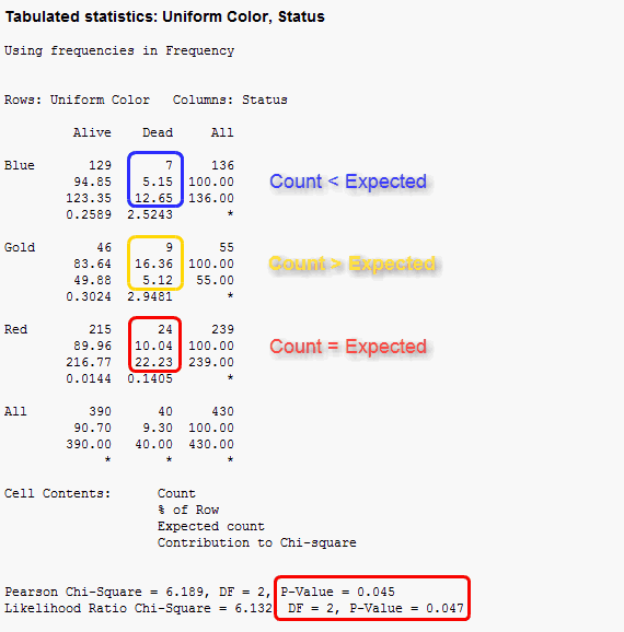
The first thing to note is that both p-values are less than 0.05, which indicates that there is a relationship between uniform color and fatalities. Next, we’ll determine the nature of the relationship.
To do this, we’ll assess how much each cell in the Dead column contributes to the significant Chi-square statistic (bottom value in each cell). I've graphed the contributions below:
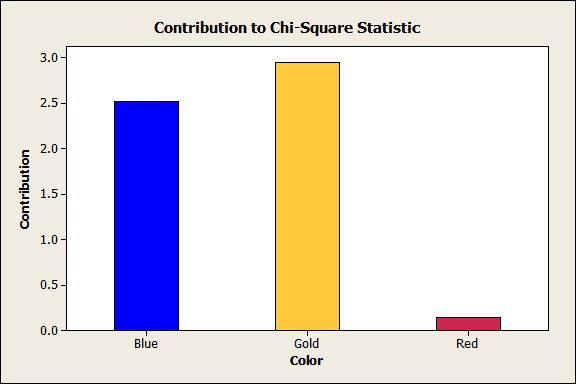
Red contributes almost nothing to the Chi-square statistic. Instead, the story really involves the blue and gold uniforms. These two colors produce the statistical significance.
By comparing the actual counts to the expected counts in the output, we see that blue-shirts have fewer deaths than expected while gold-shirts have more deaths than expected. We can also look at the percentage of fatalities for each uniform color (% of row).
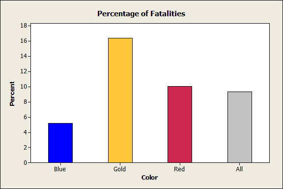
The graph confirms the conclusions drawn by comparing the actual to expected values: blue has the lowest percent, gold the highest, and red is right at the overall percentage.
The Chi-square analysis and hypothesis test support Barsalou’s theory that red-shirts do not die at a higher rate. Instead, there is simply a larger population of red-shirts who die at the average rate. However, there is more to the story. As we'll see, a moral to this story is that it's crucial to pick the truly important explanatory variable.
2 Proportions test to compare Security Red-Shirts to Non-Security Red Shirts
Barsalou goes on to postulate that perhaps shirt color is not the relevant variable. After all, crew members in a variety of other departments (including Engineering and Operations) also wear red shirts. Perhaps it’s only the security department that has a higher fatality rate?
The 2 Proportions test can put this theory to the test. We’ll compare the proportion of deaths between two subgroups of red-shirts: security vs non-security.
In Minitab, go to Stats > Basic Statistics > 2 Proportions. Choose Summarized data and enter the following:
|
|
Events |
Trials |
| First |
18 |
90 |
| Second |
6 |
149 |
The first group includes red-shirts who are in the security department while the second group includes red-shirts who are not in the security department. The events are the number of deaths while the trials are the number of personnel.
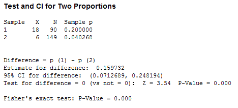
The p-value is 0.000, which indicates that the two proportions are significantly different. There is a whopping 20% fatality rate within the security department compared to only 4% for the non-security red-shirts. To put that in perspective, security personnel have the highest fatality rate on the ship, even higher than the gold-shirts. Non-security red-shirts have a fatality rate right around that of the blue-shirts.
Consequently, the 2 Proportions test supports Barsalou’s theory that it’s just the red-shirts in Security who have the higher death rate. Engineering and Operations are not at a higher risk, even though they also wear red-shirts.
Who's At Risk?
Both hypothesis tests show that specific duty areas have a significantly higher fatality rate than other duty areas. If you're a doctor, scientist, engineer, or in ship operations on board the Enterprise, you're relatively safe, with a risk of dying of about 5% over the timeframe of the series.
On the other hand, if you're in the command hierarchy or security, you're at a significantly higher level of risk, one that exceeds 15%!