


In this post I'll show how we can use a multivariate statistical analysis (in this case, a factorial analysis) to better understand data on social progress and economic development. This is a very simple and practical example of a factorial analysis performed using Minitab Statistical Software.
Factorial analysis is often considered to be a complex and advanced statistical technique, but I hope that this example will show that it can also be intuitive, easy to interpret, and accessible -- although it is obviously computationally intensive, this difficult and tedious part of the task will be handled by Minitab. I have chosen a very simple, illustrative example, I believe.
The Data Set for Factorial Analysis
For the Social Progress Index, recent data on obesity, literacy, life expectancy, GDP per capita, Internet access and many other socioeconomic variables have been collected from numerous sources, including the World Health Organization (WHO), the Economic Intelligence Unit, UNICEF, the United Nations, the CIA, and other institutions around the globe. Fifty countries have been covered in this study.
The image below shows just the upper part of the ranking data table (19 countries out of 50):
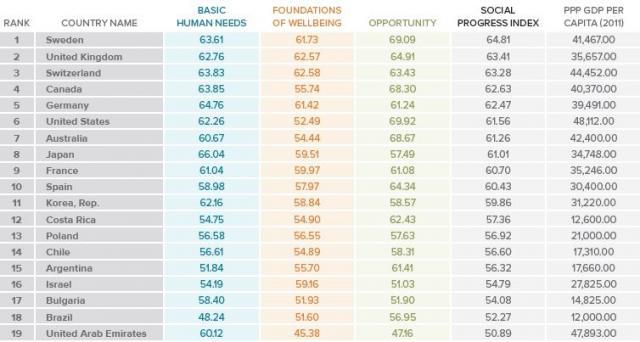
All these statistics have been summarized into three main indices : Basic Human needs (“Does a country provide for its people’s essential needs ?”), Well Being (“Enhance and sustain the well being of communities and individuals ?”) and Opportunity (“Is there opportunity for all individuals to reach their full potential ?”). These three indices have then been amalgamated into an overall Social progress Index. Not surprisingly, countries such as Sweden, the U.S, the U.K., Spain and Switzerland are extremely well positioned in this ranking.
We are interested in analysing how these variables interrelate. Is there a relationship between adult literacy, criminality, access to higher education, number of deaths due to HIV or to cardiovascular diseases etc., and the economic performance of a country (measured by GDP per Capita)? Do we expect the amount of wealth created in a country to be a consequence of its achievements in terms of Social Progress? Or the other way around ? Is it sufficient to establish good conditions in terms of basic human needs, well being, and individual opportunities, to generate faster economic growth in a country?
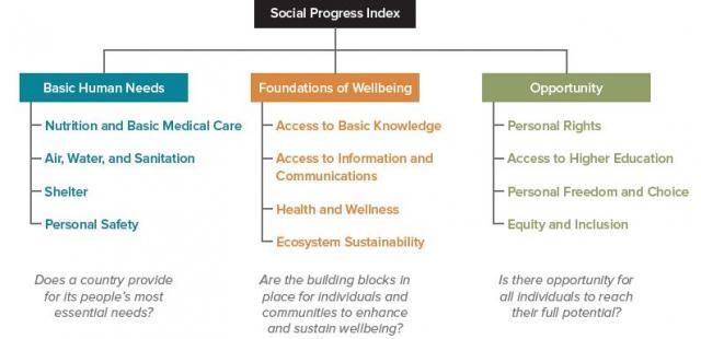
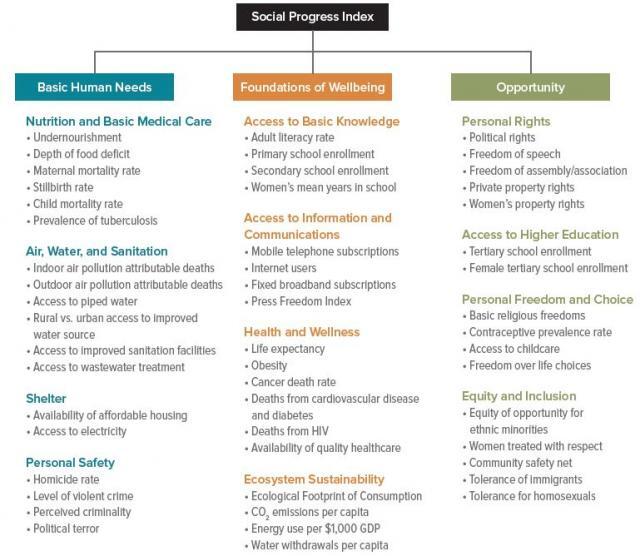
Basic Human Needs, Well Being, Opportunity Indices and GDP per Capita in 2011 (Purchasing Power Parity : PPP) will all be considered as outcomes in this study. The graphic below shows more detailed information about the indices :
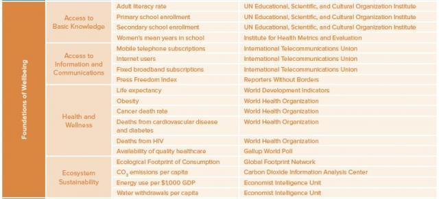
And if you'd like to dig deeper, below is a list of the variables that have been used to compute the value of the “Foundations of Well Being“ index :
Why Perform a Factorial Analysis ?
We expect our variables to be correlated (for example, wealthy countries also tend to reach higher Social Progress scores). We are looking for the underlying factors (factors that are “hidden” behind the measured variables), because this will help us better understand the underlying structure of our data.
In the socioeconomic field, factorial analysis can be used to group numerous highly correlated variables into a few coherent and homogeneous indices (such as the Opportunity, Well Being, and Basic Needs indices presented above, for example).
In both manufacturing and service industries, factorial analysis can be used to analyse a large number of variables in order to assess the effects of some “underlying” factors that cannot be measured directly (i.e., they are not directly observable), when these 'factors' influence some variables we can measure. In both cases, our goal is to summarize a large number of variables into a very limited number of “Factors”.
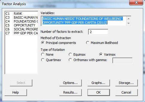
To perform a factorial analysis in Minitab, go to Stat > Multivariate > Factor Analysis:
Click on Graphs to select the graphs you want to create:
And Minitab provides this graphical result :
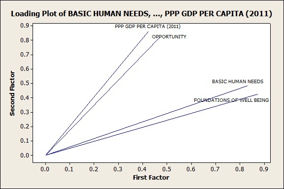
The graph reveals that GDP Per Capita and Opportunities are very close to one another (the lines follow the same direction, meaning they are strongly correlated). Understandably, more opportunities to reach one’s full potential (more personal rights and choices, a more inclusive society, better access to higher education) are clearly related to wealth creation (GDP). ‘Basic Human Needs’ and ‘Foundations of Well Being’ also are positioned next to one another (again same direction of these two lines meaning that they are strongly correlated). We will call the association between GDP and Opportunity to reach one’s full potential ‘Economic Development’, and the association between Basic Needs and Well Being will be named ‘Human Development’, although I acknowledge the fact that the names that I have chosen might be subject to long discussions.
These two sets of variables are also correlated with one another (they take somewhat similar directions in the graph). Again, this could have been expected since wealthy countries also generally tend to reach higher Social Progress scores: the first factor (the horizontal axis of the graph) is more closely linked to Basic Needs and Well Being (our so-called ‘Human Development’ association), whereas the second factor (vertical axis) is more closely related to GDP per capita and Opportunity (the ‘Economic Development’ association).
Let us now consider the way countries are positioned according to these two factorial axes :
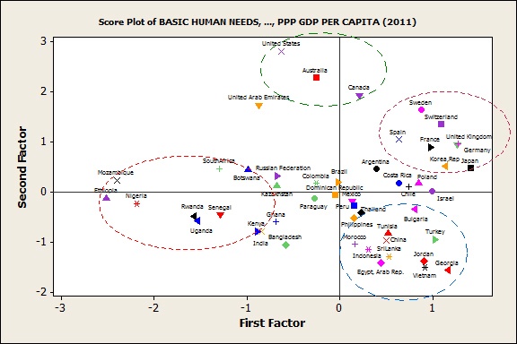
Note that the U.S, Canada, and Australia are positioned high according to the second-factor scale (high economic development), while a group of European and Asian countries (Sweden, Germany, the U.K, Spain, Japan …) are positioned high according to the first-factor scale (high human development). The ideal position is located somewhere close to the top rightmost corner.
The group that includes the U.S, Canada, and Australia (the “New World”) tends to put greater emphasis on ‘economic development’ and opportunities, whereas the second group of advanced European and Asian countries (including Germany, France, Switzerland, South Korea etc. -- the “Old World”) tends to put more emphasis on ‘human development.’
Also note the specific position of the United Arab Emirates, close to the “New World” group but with even more pronounced characteristics (good economic development places it high on the second-factor scale, but a somewhat lower human development score places it relatively low on the first-factor scale compared to other wealthy countries), probably due to the abundance of natural resources.
A large group of African countries (Ethiopia, Mozambique, Botswana, Kenya, Nigeria, etc.) have low scores in terms of human development (First Factor). Another group, including China, Georgia, Egypt, Jordan, etc. (those on the lower corner of the graph on the right) have low scores in terms of economic development and opportunities (second factor). Based on these data, we might conclude the priorities in these two groups of countries, at least in terms of development, need to be different.
Conclusion
I focused this discussion on the factorial analysis graphs, because they are very intuitive and easy to interpret. In this case study, we have performed a very simplified factor analysis on only four variables.
Whenever a very large number of measured outcomes and large data sets need to be analysed, factorial analysis can be a very powerful and helpful tool, and not only for social scientists.
Is the amount of wealth created in a country a consequence or a cause of its achievements in terms of Social Progress ? What should come first? This very brief analysis cannot answer this question, but we can see that these variables are clearly interrelated, and that each country has a different profile.