


Have you ever wished your control charts were better? More effective and user-friendly? Easier to understand and act on? In this post, I'll share some simple ways to make SPC monitoring more effective in Minitab.
Common Problems with SPC Control Charts
I worked for several years in a large manufacturing plant in which control charts played a very important role. Virtually thousands of SPC (Statistical Process Control) charts were used to monitor processes, contamination in clean rooms, monitor product thicknesses and shapes as well as critical equipment process parameters. Process engineers regularly checked the control charts of the processes they were responsible for. Operators were expected to stop using equipment as soon as an out of control alert appeared and report this incident back to their team leader.
But some of the problems we faced had little to do with statistics. For example, comments entered by the operators were often not explicit at all. Control chart limits were not updated regularly and were sometimes not appropriate due to process changes in time. Also, there was confusion about the difference between control limits and specification limits, so even when drifts from the target were clearly identifiable, some process engineers were reluctant to take action as long as their data remained within specifications.
Other problems could be solved with a better knowledge of statistics. For example, some processes were cyclical in nature, and therefore the way subgroups were defined was critical. Also, since the production was based on small batches of similar parts, the within-batch variability was often much smaller than the between-batch variability (simply because the parts within a batch had been processed in very similar conditions). This lead to inappropriate control limits when standard X-bar control charts were used.
Five Ways to Make SPC Monitoring Control Charts More Effective
Let's look at some simple ways to make SPC monitoring more effective in Minitab. In addition to creating standard control charts, you can use Minitab to:
- Import data quickly to identify drifts as soon as possible.
- Create Pareto charts to prevent special causes from reoccurring.
- Account for atypical periods to avoid inflating your control limits.
- Visually manage SPC alerts to quickly identify the out-of-control points.
- Choose the right type of charts for your process.
1. Identify drifts as soon as possible.
To ensure that your control charts are up to date in Minitab, you can right click on them and choose “Automatically update Graphs.” However, Minitab is not always available on the shop floor, so the input data often must be saved in an Excel file or in a database.
Suppose that the measurement system generates an XML, Excel or text file, and that this data needs to be reconfigured and manipulated in order to be processed in an SPC chart in Minitab. You can automate these using a Minitab macro.
This macro might automatically retrieve data from an XML or a Text file or from a database (using Minitab's ODBC “Open Data Base Connectivity” functionality) into a Minitab worksheet, or transpose rows into columns, stack columns, or merge several files into one etc. This macro would enable you to obtain a continuously updated Minitab worksheet -- and consequently a continuously updated control chart.
You could easily launch the macro just by clicking on a customized icon or menu in Minitab (see the graph below) in order to update the resulting control chart.
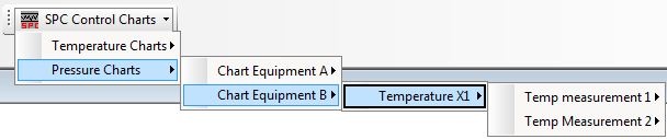
Alternatively, if the macro is named Startup.mac, it will launch whenever you launch Minitab. If you're using Minitab to enable process operators or engineers to monitor control charts, you could also customize Minitab's toolbars and icons in order to show only the relevant toolbars and icons and focus on SPC.
The product support section of our website has information on adding a button to a menu or toolbar that will update data from a file or a database.
2. Create Pareto charts to prevent special causes from reoccurring.
Statistical Process Control may be used to identify the true root causes (the so-called special causes) of quality problems from the surrounding process noise (the so-called common causes). The root causes of quality issues need to be truly understood in order to prevent reoccurrence.
A Pareto chart of the causes for out-of-control points might be very useful to identify which special causes occur most frequently.
Comments can be entered in a column of the Minitab worksheet for each out-of-control point. These comments should be standardized for each type of problem. A list of keywords displayed in the Minitab worksheet would help operators enter meaningful keywords, instead of comments that differ each time. Then a Pareto chart could be used to identify the 20% causes that generate 80% of your problems, based on the (standardized) comments entered in the worksheet.
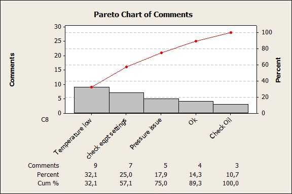
Comments can even be displayed in the SPC chart by using the annotation toolbar. Click on the T (text) icon of the Graph Annotation toolbar.
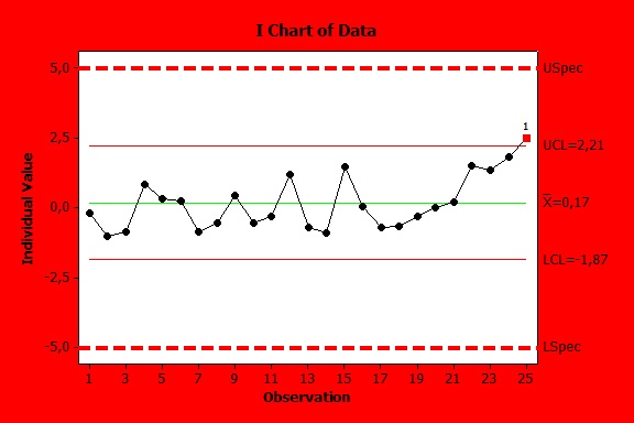
3. Account for atypical periods to avoid inflating your control limits.
Atypical periods (due to measurement issues, outliers, or a quality crisis) may artificially inflate your control chart limits. In Minitab, control limits may be calculated according to a reference period (one with standard, stable /predictable behavior), or the atypical period may be omitted so that control limits are not affected.
In Minitab, go to Options in the control chart dialogue box, look for the Estimate Tab and select the subgroups to be omitted (untypical behavior, outliers), or use only some specified sub-groups to set reference periods. Although the atypical period will still get displayed on the control chart, it won't affect the way your control limits are estimated.
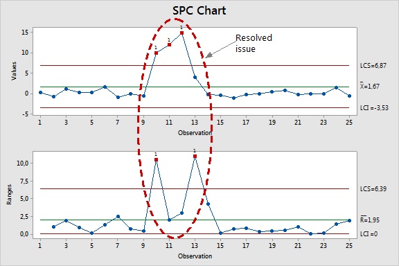
If a reference period has been selected, you will probably need to update it after a certain period of time to ensure that this selection is still relevant.
4) Visually manage SPC alerts to quickly identify out-of-control points.
If the number of control charts you deal with is very large, and you need to quickly identify processes that are drifting away from the target, your could display all control charts in a Tile format (go to Window > Tile). When the latest data (i.e., the last row of the worksheet) generates an out-of-control warning, you can have the control chart become completely red, as shown in the picture below:
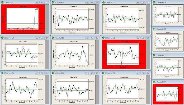
You can do this by going to Tools > Options. Select “Control Charts and Quality Tools” on the list, then choose Other. Under the words “When last row of data causes a new test failure for any point,” check the box that says "Change color of chart." Note that the color will change according to the last row (latest single value) not according to the latest subgroup, so this option is more effective when collecting individual values.
5. Choose the right type of charts for your process.
When it comes to control charts, one size does not fit all. That's why you'll see a wide array of options when you select Stat > Control Charts. Be sure that you're matching the control chart you're using to the type of data and information you want to monitor. For example, if your subgroups are based on batches of products, I-MR-R/S (within/between) charts are probably best suited to monitor your process.
If you're not sure which control chart to use, you can get details about each type from the Help menu in Minitab, or try using the Assistant menu to direct you to the best test for your situation.