


Did you know that Minitab provides several tools you can use to view patterns in data over time? If you want to examine, say, monthly sales for your company, or even how the number of patients admitted to your hospital changes throughout the year, then these tools are for you!
1. Time Series Plot
Time series plots are often used to examine daily, weekly, seasonal or annual variations, or before-and-after effects of a process change. They’re especially useful for comparing data patterns of different groups. For example, you could examine monthly production for several plants for the previous year, or employment trends in different industries across several months.
Here’s an example of a time series plot that shows the monthly sales for two companies over two years:
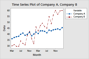
This simple plot reveals a lot about the sales of these two companies. We can conclude that company A’s growth was slow, but was steadily rising over these two years. Company B’s sales started lower than company A’s, but shot up and surpassed company A by the second year.
It’s easy to create time series plots in Minitab – just choose Graph > Time Series Plot, and you’ll be off and running. Check out this article to learn about the different types of time series plots you can create in Minitab, or this past blog post I wrote on weather data and time series plots.
2. Area Graph
An area graph evaluates contributions to a total over time. They display multiple time series stacked on the y-axis against equally spaced time intervals on the x-axis. Each line on the graph is the cumulative sum so that you can see each series' contribution to the sum and how the composition of the sum changes over time.
For example, you could examine the quarterly sales of three different car models over two years, or employment trends in four different industries over several months.
And here’s an example of an area graph you could use to examine the number of cardiac inpatients and outpatients admitted over the past 12 months:
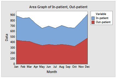
The graph shows that both inpatients and outpatients follow a similar trend, and it also suggests a seasonal effect: the number of patients admitted to the hospital is higher in the winter months.
To create area graphs in Minitab, choose Graph > Area Graph. For step-by-step instructions, check out this article.
3. Scatterplot with a connect line
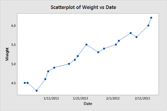
You’ll want to create a scatterplot with a connect line if your data were collected at irregular intervals or are not in chronological order in the Minitab worksheet. For example, in this scatterplot, you can see that as the time in days increases, the weight of the fruit on the tree also increases:
You can create a scatterplot with a connect line in Minitab by choosing Graph > Scatterplot > With Connect Line. If you need a refresher on scatterplots, check out this article from Minitab Support.