


You can use contour plots, 3D scatterplots, and 3D surface plots in Minitab to view three variables in a single plot. These graphs are ideal if you want to see how temperature and humidity affect the drying time of paint, or how horsepower and tire pressure affect a vehicle's fuel efficiency, for example. Ultimately, these three graphs are good choices for helping you to visualize your data and examine relationships among your three variables.
1. Contour Plot
Contour plots display a 3-dimensional relationship in two dimensions, with x- and y-factors (predictors) plotted on the x- and y-scales and response values represented by contours. You can think of a contour plot like a topographical map, in which x-, y-, and z-values are plotted instead of longitude, latitude, and elevation.
For example, this contour plot shows how reheat time (y) and temperature (x) affect the quality (contours) of a frozen entrée (mac-n-cheese, anyone?). The darker regions indicate higher quality. The contour levels reveal a peak centered in the vicinity of 35 minutes (Time) and 425 degrees (Temp). Quality scores in this peak region are greater than 8.
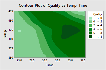
To create a contour plot in Minitab, choose Graph > Contour Plot. Note that you can easily change the number and colors of contour levels by right-clicking in the graph area and choosing Edit Area.
2. 3D Scatterplot
A 3D scatterplot graphs the actual data values of three continuous variables against each other on the x-, y-, and z-axes. Usually, you would plot predictor variables on the x-axis and y-axis and the response variable on the z-axis.
You can create 3D scatterplots in Minitab by choosing Graph > 3D Scatterplot. Take the frozen entrée example from above—you can plot a simple 3D scatterplot to show how reheat time and temperature affect the quality of the entrée:
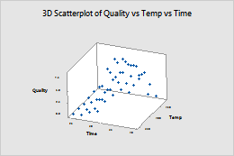
It’s also easy to rotate a 3D scatterplot to view it from different angles. Just click on your plot to activate it, then choose Tools > Toolbars > 3D Graph Tools.
3. 3D Surface Plot
Use a 3D surface plot to create a three-dimensional surface based on the x-, y-, and z-variables. The predictor variables are displayed on the x- and y-scales, and the response (z) variable is represented by a smooth surface (in a 3D surface plot) or a grid (in a 3D wireframe plot).
You may be thinking that the 3D surface plot looks very similar to the 3D scatterplot. The only difference between the two is that for the surface plot, Minitab displays a continuous surface or a grid (wireframe plot) of z-values instead of individual data points.
Here’s the frozen entrée data shown on a 3D surface plot:
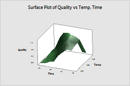
To build a 3D surface plot in In Minitab, choose Graph > 3D Surface Plot. The same instructions above for rotating a 3D scatterplot apply here as well, making it just as easy to view your 3D surface plot from different angles.
Bonus Plot!
It’s your lucky day! Here’s a bonus fourth way to graph 3 variables in Minitab: You can also use a bubble plot to explore the relationships among three variables on a single plot. Like a scatterplot, a bubble plot plots a y-variable versus an x-variable. However, the symbols ("bubbles") on this plot vary in size. The area of each bubble represents the value of a third variable. Visit this blog post to learn more!
If you want to try your hand at creating these graphs in Minitab and you don't already have it, we offer a full trial version—it's free for 30 days!