


I blogged a few months back about three different Minitab tools you can use to examine your data over time. Did you know you that you can also use a simple run chart to display how your process data changes over time? Of course those “changes” could be evidence of special-cause variation, which a run chart can help you see.
What’s special-cause variation, and how’s it different from common-cause variation?
You know that variation occurs in all processes, and common-cause is just that—a natural part of any process. Special-cause variation comes from outside the system and causes recognizable patterns, shifts, or trends in the data. A run chart shows graphically whether special causes are affecting your process.
A process is in control when special causes of variation have been eliminated.
How can I create a run chart in Minitab?
It’s easy! Follow along with this example:
Suppose you want to be sure the widgets your company makes are within the correct weight specifications requested by your customer. You’ve collected a data set that contains weight measurements from the injection molding process used to create the widgets (Open the worksheet WEIGHT.MTW that’s included with Minitab’s sample data sets—open Help > Sample Data).
To evaluate the variation in weight measurements, you create a run chart in Minitab:
- Choose Stat > Quality Tools > Run Chart
- In Single column, enter Weight
- In Subgroup size, enter 1. Click Ok.
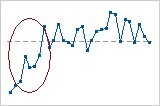
Here’s what Minitab creates for you:
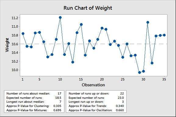
*Note that Minitab plots the value of each data point in the order that they were collected and draws a horizontal reference line at the median.
What does my run chart tell me about my data?
You can examine the run chart to see if there are any obvious patterns, but Minitab includes two tests for randomness that provide information about non-random variation due to trends, oscillation, mixtures, and clustering in your data. Such patterns indicate that the variation observed is due to special-cause variation.
In the example above, because the approximate p-values for clustering, mixtures, trends, and oscillation are all greater than the significance level of 0.05, there’s no indication of special-cause variation or non-randomness. The data appear to be randomly distributed with no temporal patterns, but to be certain, you should examine the tests for runs about the median and runs up or down. However, it looks as if the variation in widget weights will be acceptable to your customer.
Tell me more about these nonrandom patterns that can be identified by a run chart …
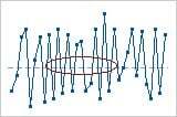
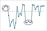
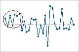
There are four basic patterns of nonrandomness that a run chart will detect—mixture, cluster, oscillating, and trend patterns.
A mixture is characterized by an absence of points near the center line:
Clusters are groups of points in one area of the chart:
Oscillation occurs when the data fluctuates up and down:
A trend is a sustained drift in the data, either up or down:
To learn more about what these patterns can tell you about your data, visit run chart basics on Minitab Support.