Now that Christmas is just days away, research groups are starting to release holiday spending statistics for the 2011 shopping season. I’m an avid shopper (especially online), and I always find these statistics very interesting!
Because I think statistics are easier to understand when they are graphed, I’ve provided a rundown of some of this season’s shopping statistics using Minitab graphs:
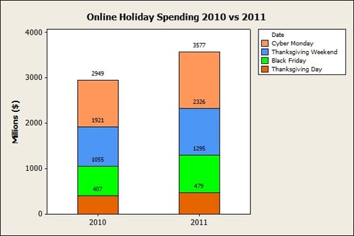
According to research group comScore, U.S. consumers have spent $25 billion online so far this holiday season, which is up 15% from the same time last year. And for key shopping dates (Thanksgiving Day, Black Friday, Thanksgiving Weekend, and Cyber Monday), the percentages have increased similarly from 2010.
In Minitab, I created a bar chart (Graph > Bar Chart) with the stack option to show off each key shopping day and the money spent shopping online on those days for both 2010 and 2011. This graph makes it easy to compare 2010 with 2011 as a whole.

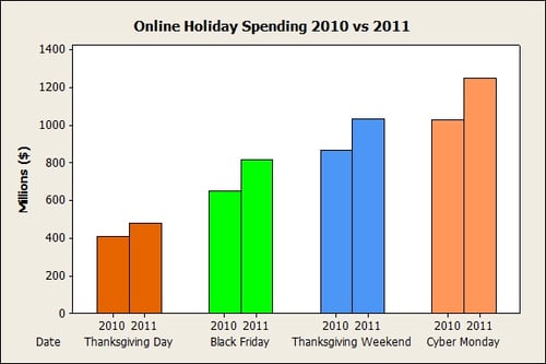
To compare each date a little more closely, we can choose the cluster option to compare yearly spending differences for each day/weekend:

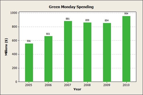
Another interesting statistic, again courtesy of comScore, reports that heavy online shopping occurs on the date known as “Green Monday.” The phrase “Green Monday” was coined by eBay in 2007 and is used to describe the Monday occurring around the second week of December (a few weeks after Cyber Monday). Green Monday was Monday, December 12 this year, but as I write this post, online spending data is not yet available. The graph shows this date as a popular online shopping day, especially as retailers continue to offer discounted and free shipping services leading up to Christmas.

In Minitab, I created another bar chart (Graph > Bar Chart), and changed the colors of the bars to green with Minitab’s graph editing features. To do this, right-click on the graph making sure the bars are selected, and choose ‘Edit Bars.’ The ‘Edit Bars’ dialog box will display and color options are in the ‘Attributes’ tab.
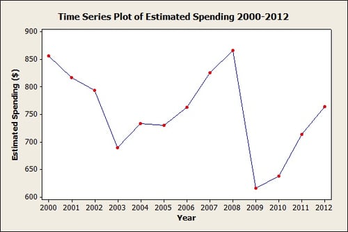
According to a recent Gallup survey, Americans said they would spend an average of $764 on gifts this holiday season. Looking at Gallup’s past November forecasts for estimated Christmas spending (since 2000), I used a Minitab Time Series Plot to see how this number has changed through the years:

Time series plots are used to evaluate patterns in data over time, and by the looks of this graph, it’s easy to see that estimated spending appears to be on the rise since the depressed economic times in November 2008 and 2009. To make a time series plot like this one in Minitab, choose Graph > Time Series Plot > Simple.
Of possible interest:
Minitab: Good for Statistics and for Shopping
Statistics and Shopping II


