


Whether you’re just learning statistics or you're already using data analysis on the job, there are not many tools more straightforward than a bar chart. Bar charts are effective at getting across their message, and are used in a diverse number of fields, from service quality to pharmaceuticals to manufacturing.
However, I’ve noticed recently that a lot of customers looking to create a bar chart are surprised at how many different options are presented when you go to Graph > Bar Chart... in Minitab. There are, in fact, 14 different options based on 1) what you want your final graph to represent, and 2) how your data are set up.
Selecting the right option can be a little daunting, especially for a beginner. I’m going to take a look at how these different cases are handled, so you can have a better idea which choice makes sense for your situation. Today I’ll cover the first three.
If you go to Graph > Bar Chart..., the first option you’ll see is a drop down titled ‘Bars Represent,’ which is a detailed way of asking how you want Minitab to calculate how tall your bars should be. The first choice is ‘Counts of unique values,’ which has three options (Simple, Cluster, and Stack).
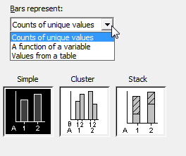
Simple
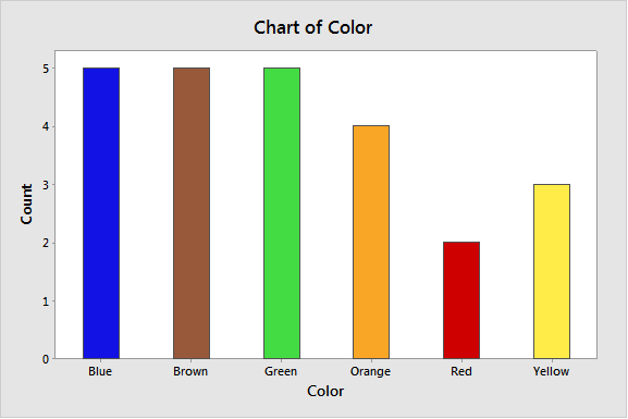
The first option is the simplest, which you can probably tell by the name. It’s asking for one column of data, and the height of the bars will be determined by the frequency of each unique category name occurring in that column. Here is an example of how your column should appear, alongside a completed dialog. (This data is a count of the color of M&M’s in one sample bag.)
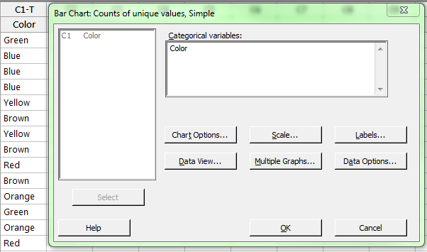
The resulting graph shows that Minitab counted the number of times each color occurred, and plotted that count against the color to form the chart.
Cluster
Easy enough, right? But what if we have a second group? You can use Cluster if we have a second categorical column, much like the first, and we want to plot counts of two separate categorical variables. In this scenario, we want to see one of our groups “clustered” together along the x-axis. For example, we can look at different types of defects happening in different months. Our data sheet has one column for defects, and one for the month, like this:
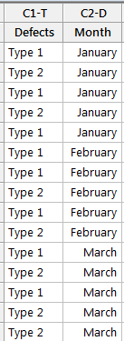
It’s very similar to the first case, with just an extra sorting column. And the dialog seems straightforward, right? Just enter the variables.
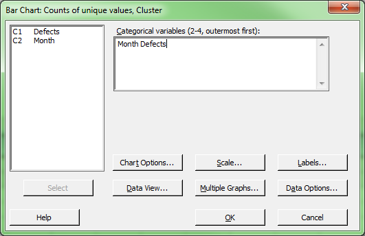
But in what order? And what does ‘outermost first' mean? To see, let’s create our graph:
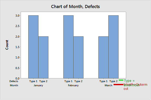
The finished graph allows us to see what “Outermost” refers to. When you group by 2 variables, the x-axis needs a hierarchy. Outermost refers to the group that gets sorted first. Within the outermost variable comes the next variable, and so on. It’s the last, or innermost category (in our case, Defect Type) that ends up being clustered. When filling out this dialog, the question you need to ask yourself is, "How do I want my groups ordered? Which do I want clustered together?"
Stack
Stack works very similar to the cluster chart, and in fact can use the same data setup. Let’s just get right into the dialog box.
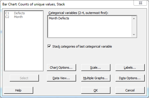
We have a very similar dialog here. We still need to keep in mind the hierarchy of sorting along the x-axis, but we do have one additional option, and that is to make sure the ‘Stack’ option is checked. Instead of clustering our innermost categorical variable like the last chart, Minitab will stack it instead. We can see the final product below:
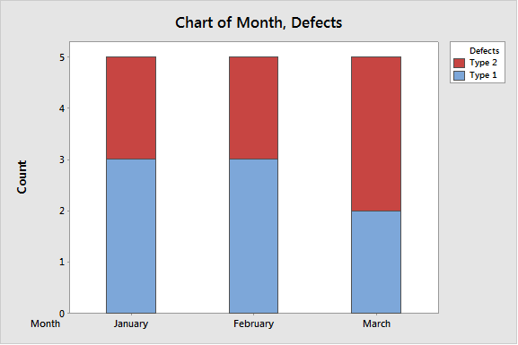
As you can see, nearly the same dialog produces differing results. Instead of two bars for each month, we see one bar, with two sections stacked, one on top of another.
I hope this gives you a better idea of how to navigate the first three types of bar charts available in Minitab. Check back soon when I'll be detailing another Bar Chart option, 'Function of a Variable.'