


Time series data is proving to be very useful these days in a number of different industries. However, fitting a specific model is not always a straightforward process. It requires a good look at the series in question, and possibly trying several different models before identifying the best one. So how do we get there? In this post, I'll take a look at how we can examine our data and get a feel for what models might work in a particular case.
How Does a Time Series Work?
The first thing to note is how Time Series work in general, and how those concepts apply to fitting the ARIMA model we're going to create.
In general, there are two things we look at when trying to fit a time series model. One is past values, which is what we use in AR (autoregressive) models. Essentially, we predict what our next point would be based on looking at a certain number of past points. An AR(1) model would forecast future values by looking at 1 past value.
The second thing we can look at is past prediction errors. These are called MA (moving average) models, and an MA(1) model would be predicting future values using 1 past prediction error.
Both of these concepts make sense individually; they're just different approaches to how we predict future points. An ARIMA model uses both of these ideas and allows us to fit one nice model that looks at both past values and past prediction errors.
Example of Fitting a Time Series Model
So let's take a look at an example and see if we can't fit a model. I've randomly created some time series data, and the first thing to do it simply plot it and see what's happening. Here, I've plotted my series:
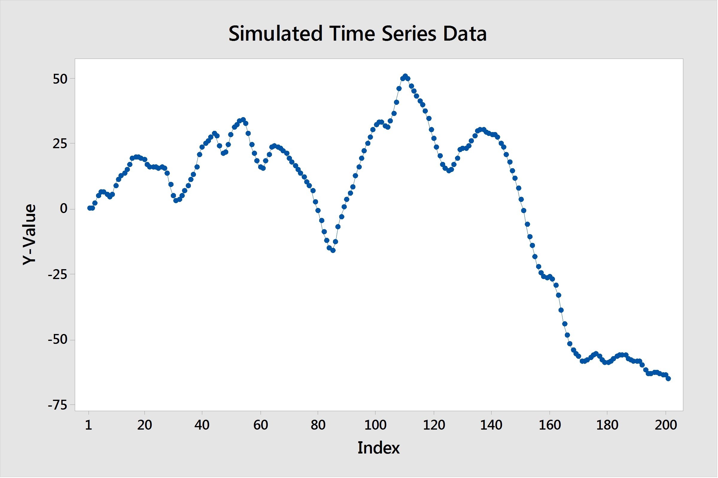
Here are some things to look for. First, a key assumption with these models is that our series has to be stationary. A stationary time series is one whose mean and variance are constant over time. In our case, it's clear that our mean is not constant over time—it's decreasing.
To resolve this, we can take a first difference of our data, and investigate that. In Minitab, this can be done by going to Stat > Time Series > Differences and taking a difference of lag 1. (This means that we are subtracting each data point from the one that follows it.)
When we plot this lag 1 difference data, we can see it is now stationary:
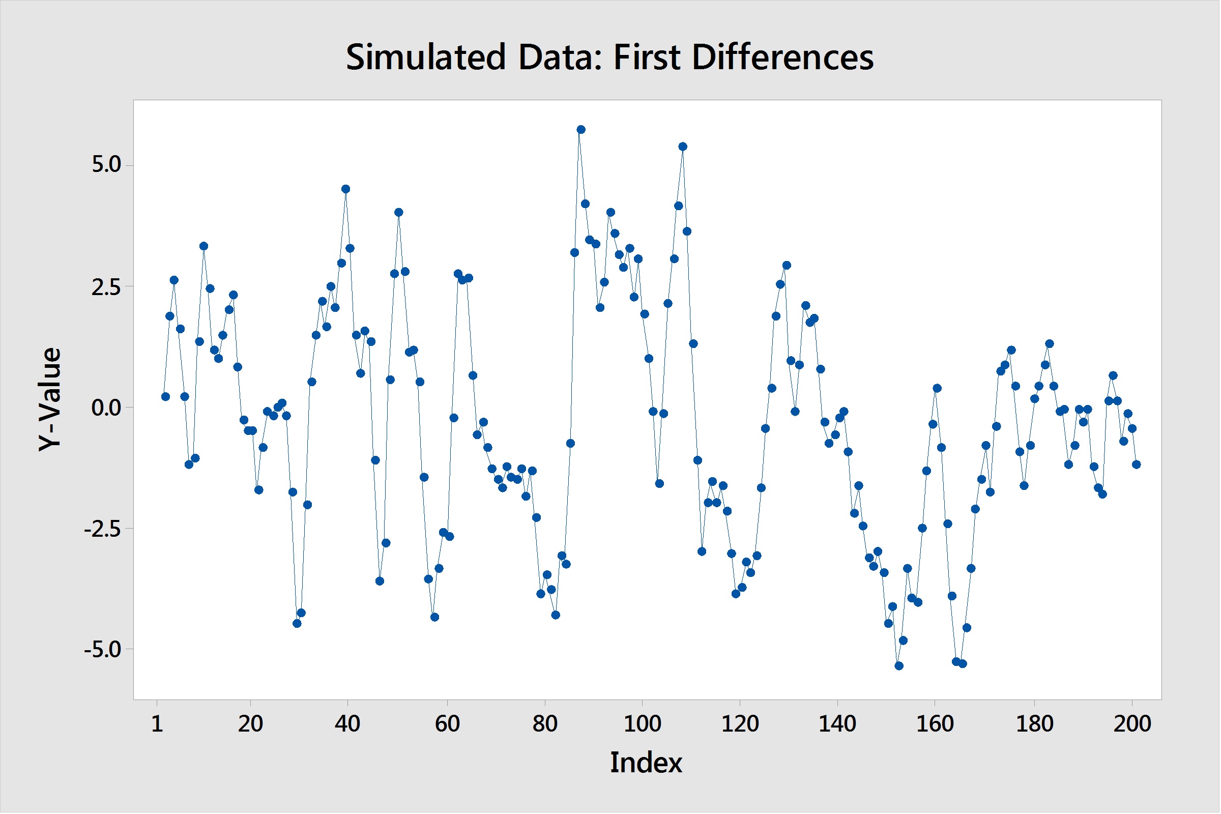
It took one difference to make our data stationary, so we now have one piece of our ARIMA model, the "I", which stands for "Integration." We know that we have an ARIMA(p,1,q). Now, how do we find the AR term(p) and the MA term(q)? To do that, we need to dive into two plots, namely the ACF and PACF—and this is where it gets tricky.
Interpreting ACF and PACF Plots
The ACF stands for Autocorrelation function, and the PACF for Partial Autocorrelation function. Looking at these two plots together can help us form an idea of what models to fit. Autocorrelation computes and plots the autocorrelations of a time series. Autocorrelation is the correlation between observations of a time series separated by k time units.
Similarly, partial autocorrelations measure the strength of relationship with other terms being accounted for, in this case other terms being the intervening lags present in the model. For example, the partial autocorrelaton at lag 4 is the correlation at lag 4, accounting for the correlations at lags 1, 2, and 3. To generate these plots in Minitab, we go to Stat > Time Series > Autocorrelation or Stat > Time Series > Partial Autocorrelation. I've generated these plots for our simulated data below:
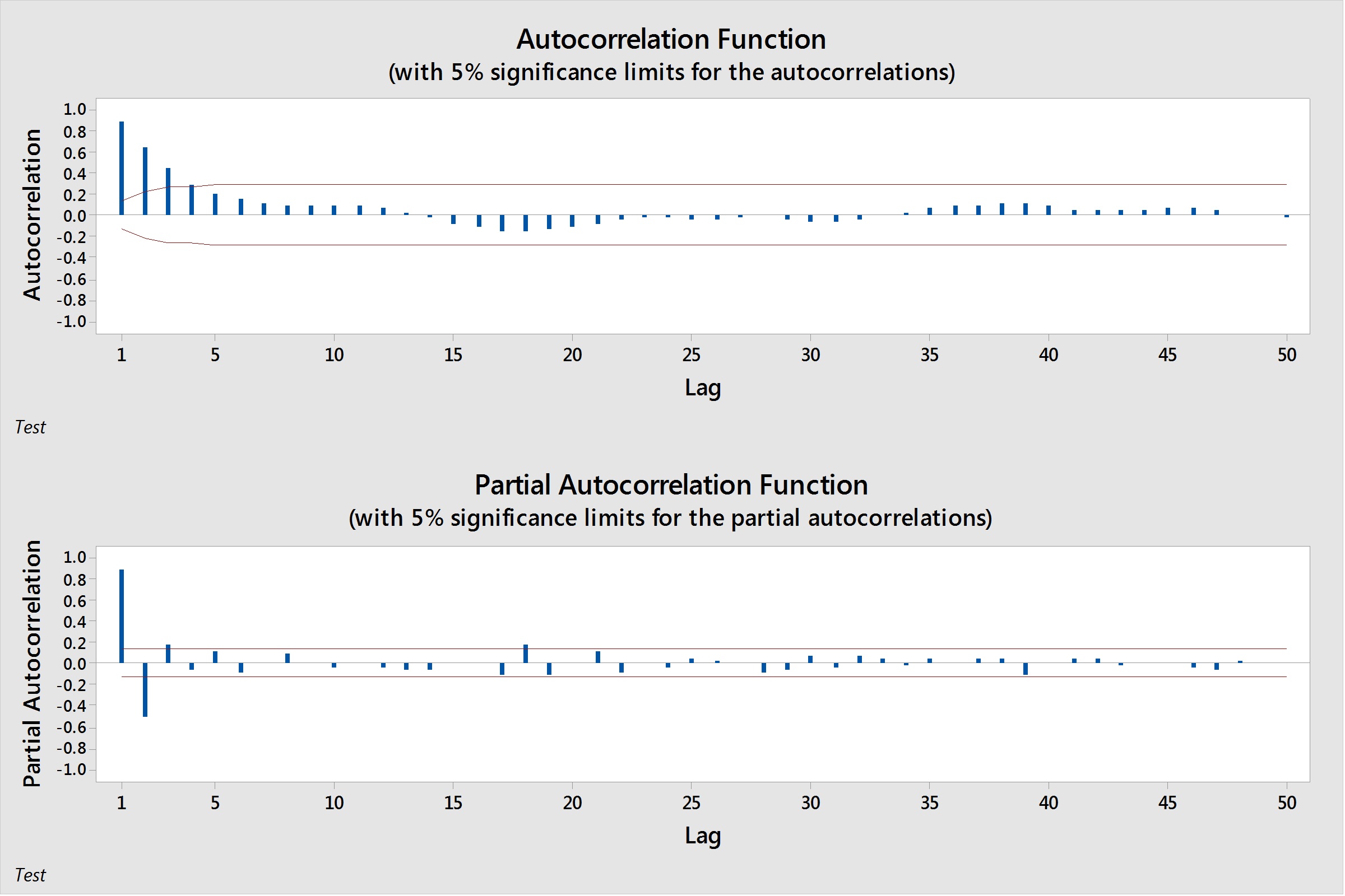
So what do these plots tell us? They each show a clear pattern, but how does that pattern help us to determine what our p and q values will be? Let's notice our patterns. Our PACF slowly tapers to 0, although it has two spikes at lags 1 and 2. On the other side, our ACF shows a tapering pattern, with lags slowly degrading towards 0. The table below can be used to help identify patterns, and what model conclusions we can make about those patterns.
| ACF Pattern | PACF Pattern | Conclusion |
|---|---|---|
| Tapers to 0 in some fashion | non-zero values at first p points; zero values elsewhere | AR(p) Model |
| non-zero values at first q points; zero values elsewhere | Tapers to 0 in some fashion | MA(q) model |
| Values that remain close to 1, no tapering off | Values that remain close to 1, no tapering off | Symptoms of a non-stationary series. Differencing is most likely needed. |
| No significant correlations | No significant correlations | Random Series |
If a model contains both AR and MA terms, the interpretation gets trickier. In general, both will taper off to 0. There may still be spikes in the ACF and/or PACF which could lead you to try AR and MA terms of that quantity. However, it usually helps to try a few different models, and based on model diagnostics, choose which one fits best.
In this case, I used simulated data, so I know the best fit for my model is going to be an ARIMA(1,1,1). However, with real-world data, the answer may not be so obvious, and thus many models may have to be considered before landing on a single choice.
In my next post, I'll go over some diagnostic measures we can compare between models to see which gives us the best fit.