Statistics is all about modelling. But that doesn’t mean strutting down the catwalk with a pouty expression.
It means we’re often looking for a mathematical form that best describes relationships between variables in a population, which we can then use to estimate or predict data values, based on known probability distributions.
To aid in the search and selection of a “top model,” we often utilize calculated indices for model fit.
In a time series trend analysis, for example, mean absolute percentage error (MAPE) is used to compare the fit of different time series models. Smaller values of MAPE indicate a better fit.
You can see that in the following two trend analysis plots:
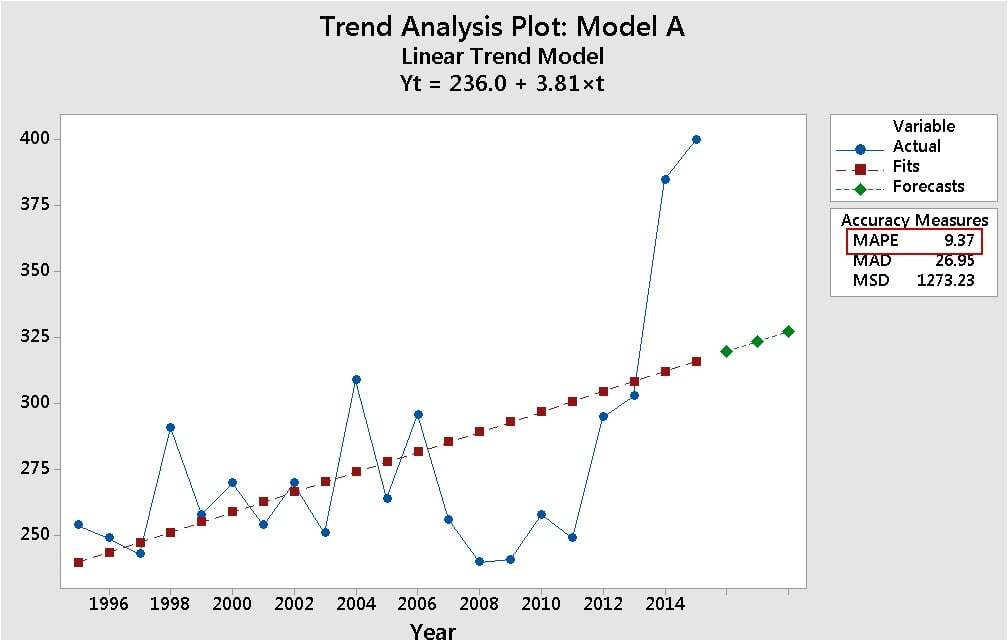
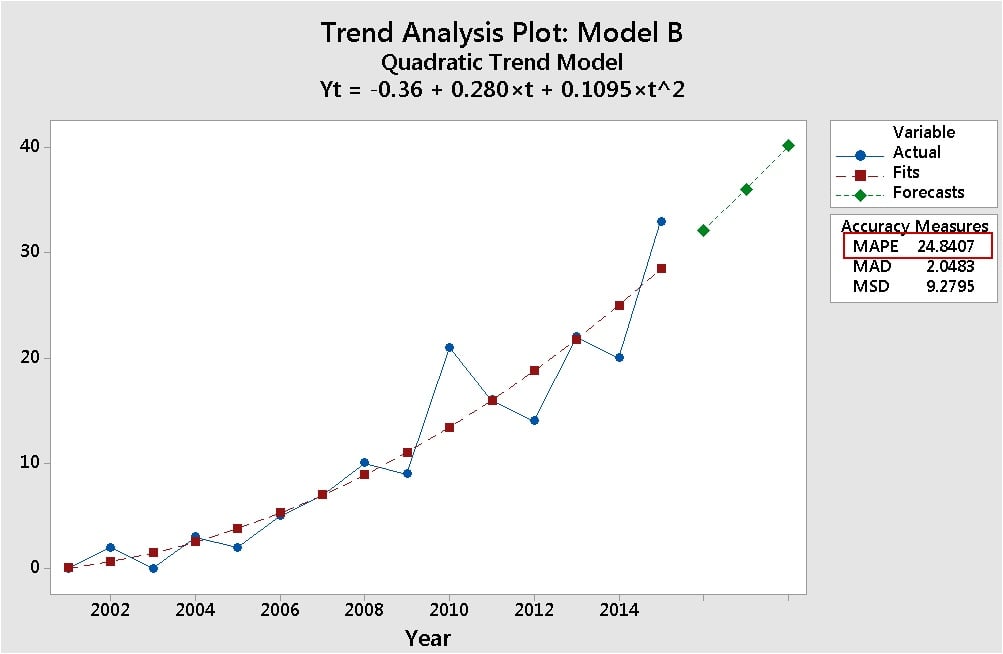
The MAPE value is much lower in top plot for Model A (9.37) than it is for the bottom plot with Model B (24.84). So Model A fits its data better than Model B fits its dat—ah…er, wait…that doesn’t seem right.. I mean… Model B looks like a closer fit, doesn’t it…hmmm…do I have it backwards…what the...???
Step back from the numbers!
Statistical indices for model fit can be great tools, but they work best when interpreted using a broad, flexible attitude, rather than a narrow, dogmatic approach. Here are a few tips to make sure you're getting the big picture:
-
Look at your data
No, don't just look. Gaze lovingly. Stare rudely. Peer penetratingly. Because it's too easy to get carried away by calculated stats. If you graphically examine your data carefully, you can make sure that what you see, on the graph, is what you get, with the statistics. Looking at the data for these two trend models, you know the MAPE value isn’t telling the whole story.
-
Understand the metric
MAPE measures the absolute percentage error in the model. To do that, it divides the absolute error of the model by the actual data values. Why is that important to know? If there are data values close to 0, dividing by those very small fractional values greatly inflates the value of MAPE.
That’s what’s going on in Model B. To see this, look what happens when you add 200 to each value in the data set for Model B—and fit the same model.
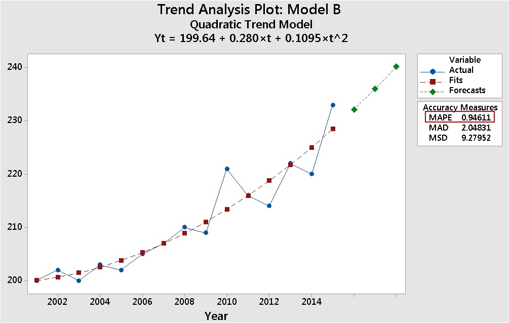
Same trend, same fit, but now the absolute percentage of error is more than 25 times lower (0.94611) than it was with the data that included values close 0—and more than 10 times lower than the MAPE value in Model A. That result makes more sense, and is coherent with the model fit shown on the graph.
-
Examine multiple measures
MAPE is often considered the go-to measurement for the fit of time series models. But notice that there are two other measures of model error in the trend plots: MAD (mean absolute deviation) and MSD (mean squared deviation). Notice that in both trend plots for Model B, those values are low—and identical. They’re not affected by values close to 0.
Examining multiple measures helps ensure you won't be hoodwinked by a quirk for a single measure.
-
Interpret within the context
Generally you’re safest using measures of fit to compare the fits of candidate models for a single data set. Comparing model fits across different data sets, in different contexts, leads to invalid comparisons. That’s why you should be wary of blanket generalizations (and you’ll hear them), such as “every regression model should have an R-squared of at least 70%.” It really depends what you’re modelling, and what you’re using the model for. For more on that, read this post by Jim Frost on R-squared.
Finally, a good model is more than just a perfect fit
Don't let small numerical differences in model fit be your be-all and end-all. There are other important practical considerations, as shown by these models.