


The Pareto chart is a graphic representation of the 80/20 rule, also known as the Pareto principle. If you're a quality improvement specialist, you know that the chart is named after the early 20th century economist Vilfredo Pareto, who discovered that roughly 20% of the population in Italy owned about 80% of the property at that time.
You probably also know that the Pareto principle was later adopted and repurposed as a powerful business metric by Dr. Joseph Juran in the 1940s, to identify the "vital few" issues versus the "trivial many".
But most people don't realize that human use of the Pareto chart goes back much earlier than this. Archeological evidence suggests the chart could date back to the Middle Paleolithic era: using broken-off mastodon bones for bars, and hyena sinews for connect lines, it appears Stone Age humans constructed rudimentary Pareto charts to depict problems as they first began to cook with fire.
Based on the fossilized records, I used our statistical software to recreate a Stone Age Pareto chart:
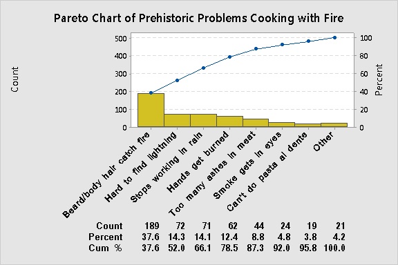
Unfortunately, although Paleolithic humans were able to create a rough-hewn version of a Pareto chart, their brains were still too small to interpret it. Moreover, they didn't have follow-up tools to identify the root causes of the "vital few" problems identified by the chart. Early attempts at fishbone diagrams similarly failed because the bones were eaten before the diagram was completed. Thus, it would take another 400,000 years of evolution before humans could fry an egg, over-easy.
Fast forward to about 4500 BP (Before Pareto). Hieroglyphic documents unearthed in the tombs of the great pyramids reveal that Egyptian quality engineers in the sphinx manufacturing industry used Pareto charts to reveal the vital few defects in their product.
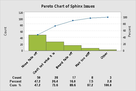
Unlike their Stone age predecessors, Egyptian quality engineers were able to identify root causes of the vital few issues shown on the chart. For example, they found that the poor grade of limestone used to make the sphinx was responsible for most nose and beard breakage. (The engineers recommended using a more durable, high-quality stone for construction. Unfortunately, the chief treasurer deemed this too costly, arguing that it would undercut the Pharaohs' short-term profit margin over the next few centuries.)
Based on the second-highest bar in the chart, product designers also recommended that the design be modified to make the sphinx either more like a lion, or more like a human. However, upper level priests and viziers noted that the current design was based on Nile delta marketing research that showed the 50% of customers wanted a gigantic lion, while 50% wanted a really, really big person. The current design was deemed a compromise.
None of the recommendations based on the chart were adopted, and the sphinx manufacturing industry went bankrupt soon thereafter.
Novel Applications in the Modern Era
By the 20th century, the Pareto chart had become a quintessential tool for quality improvement in the manufacturing and service industries. However, new applications were still being made in other diverse fields, including social work and psychotherapy.
On February 7, 1959, marriage therapist Dr. Sigma Freud was the first to apply a Pareto chart in the venue of couples counseling. Alfred and Gloria VanderCamp had sought help to save their crumbling marriage of 23 years. But the counseling sessions soon became bogged down in endless recriminations, as each spouted the innumerable, trivial flaws of the other.
To gain insight, the doctor suggested that the VanderCamps track and record each other's defects over a period of one month. Then the Pareto chart could be used to identify the vital few flaws from the trivial many, allowing the couple to focus on important issues in the marriage. The results are shown below.
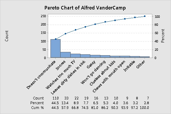
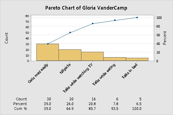
Although Dr. Freud was hopeful that the VanderCamps could improve their relationship by focusing on vital flaws, her initial application of the Pareto chart overlooked two critical assumptions:
1. Pareto charts that track frequency assume that the more frequently something happens, the greater the impact it has on the outcome. If this is not the case, flaws should be scored by severity.
2. A Pareto analysis usually illuminates only a snapshot in time, and may not take into account changing conditions.
And so it was. Two months into therapy, Mrs. VanderCamp decided that nothing in life was as important as dancing, and ran off with a ballroom dance instructor.
Several months into the new relationship, upon creating a Pareto chart of her twinkle-toed partner, the former Mrs. VanderCamp was aghast to discover that his flaws—both the vital few and the trivial many—were essentially the same as Alfred's.
She did, however, dance more.