


“Shall I compare thee to a standard normal distribution?
Thou art more symmetric and more bell-shaped…”
— Melvin Shakespeare (William’s lesser-known statistician brother)
The Greek philosopher Aristotle believed that symmetry was one of the primary elements of the universal ideal of beauty. Over 2000 years later, emerging research seems to bear him out.
Studies suggest we tend to be more attracted to people with symmetrical bodies. Using motion-capture technology to record the movements of people dancing to a popular song, one recent study concluded that we even prefer those who dance symmetrically. (Note to Seinfeld fans: This may explain why Elaine’s dancing really stinks!)
But symmetry is more than skin-deep. It's also rooted in some universal truths.
The concept of symmetry pops up in the fundamental laws of physics (including the laws of motion and gravitation theory), in fractal geometry (chaos theory), quantum mechanics, in the design and analysis of computer algorithms, and in many other fields in science and mathematics.
In statistics, symmetry can have some important, concrete implications when you analyze your data.
The World's Most Beautiful Distribution
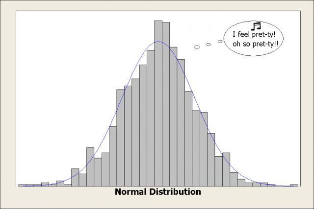
Quite attractive, isn’t it? The distribution of everyone's dreams.
People often think their data should always be normally distributed. That “normal” is “good,” and “nonnormal” is “bad.”
Sometimes I wonder if it’s partly because the symmetry of this distribution is so pleasing to the eye. Looking at its graceful bell curve, you might believe for a second that everything in the universe falls into perfect order.
But your data probably won’t look like this…and you know what? That’s perfectly okay. In fact, it’s perfectly…um...normal.
Why the Beauty of the Normal Distribution May Be Overrated...and Overstated.
Many statistical analyses, such as t-tests, are formally based on the normal distribution. But often these analyses—like t-tests—are robust to modest departures from normality, especially if you have a reasonably large sample (n > 30).
Other analyses, such as capability analysis and reliability analysis, are less forgiving and do require fairly strict adherence to a distribution. But that distribution doesn’t have to be normal—it could be a Weibull distribution, an exponential distribution, or other distribution.
For these parametric analyses—that is, analyses based on a specific distribution of data—the key issue is that your data match (more or less, depending on the analysis) the distribution that’s being used to analyze your data.
But that distribution need not always be a symmetric, bell-shaped curve.
When to Go Nonparametric
There are also times when a parametric test may not meet your needs:
- You have extreme outliers that can’t be removed from the data.
- Your data set is small and extremely skewed.
- Your data can’t be transformed (or you don’t want to transform them).
- You cannot clearly ascertain the distribution of your data.
- The distribution is not covered by methods of parametric analysis.
- A nonparametric measure is more meaningful for your application.
In these cases, you may opt for nonparametric analysis, which does not require your data to follow specific distribution.
For example, suppose you want to estimate “average” home prices in a town. After you collect the data, you could use a 1-sample t-test to test whether the mean price of a home is greater or less than a hypothesized value, such as $200,000.
But suppose there are several new mega-mansions in the town that sell for millions of dollars. Those extreme values will inflate the arithmetic average of all the homes—making the mean not truly representative of the “average” home price. However, you shouldn’t remove those extreme values from your data set because they’re not errors or flukes.
Instead, it may be wiser to assess the “average” home prices using the median, a nonparametric measure, instead of the mean. The median is simply the value that 50% of the data fall above, and 50% fall below. The median is not overly influenced by extreme values, so in this case, it provides a better reflection of the “average” home price.
Symmetry in Nonparametrics: Choosing Between 1-sample Tests
 Statistics is based on probability theory, so making informed choices often involves deciding how to best hedge your bets.
A nonparametric test generally provides less power than its corresponding parametric test. So by using it when your data do not satisfy minimum parametric requirements, you’re sacrificing some ability to detect a significant difference in order to gain increased certainty that any significant difference that you find is legitimate. Less power for more safety. (People weigh similar tradeoffs when buying a car.)
However, one common misconception is that a nonparametric test has no data requirements at all. Although it's true that no specific distribution is assumed for the data, nonparametric tests may have other requirements.
For example, suppose you decide to use a 1-sample nonparametric test to the median against a hypothesized value. In Minitab you’ll see two tests to choose from:
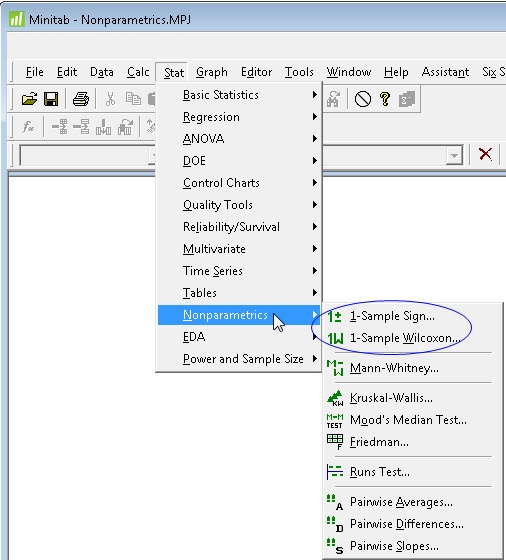
The 1-sample Wilcoxon is more powerful than the 1-sample Sign test, but it comes with a hitch: the 1-sample Wilcoxon test requires that your data be fairly beautiful (i.e., symmetric). The 1-sample Sign test does not.
Assessing the Symmetry of Data
To assess the symmetry of your data, you can use a symmetry plot, a histogram, or a boxplot. Personally, I like to use all three to get a composite sense. (If you want to follow along and create these graphs in Minitab, here's the data set.)
The symmetry plot in Minitab (Stat > Quality Tools > Symmetry plot) includes a histogram in the upper right corner, as you can see below. I also created a boxplot (Graph > Boxplot) of the same data. Then I used Minitab’s Graph Layout tool (Editor > Layout Tool) to combine the boxplot and symmetry plot on the same graph.
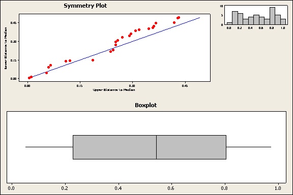
The symmetry plot graphs the distance from the median of points above the median against the corresponding points below the median. The closer these points lie to the 45-degree line, the more symmetric the data is.
Caution: The symmetry plot is not the same as a probability plot. It’s a more general tool, so the data points do not need to hug the diagonal line as closely. The important thing to look for is whether the points remain close to or parallel to the line, versus the points diverging from the line.
For the boxplot and histogram, look for whether they could be folded in half at their center and roughly match on each side. For the boxplot, the length of the whiskers and boxes on each side of the centerline (median) should be about the same.
Judging by the plots above, these data are fairly symmetric. You could use the 1-Sample Wilcoxon test.
What Do Nonsymmetric Data Look Like?
When data are not symmetric, they may be skewed in one direction. Here’s how skewed data appear on the plots:
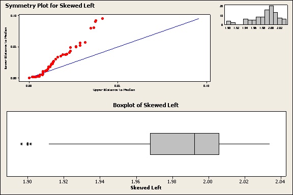
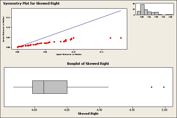
Notice that the points on the symmetry plot diverge consistently either above or below the diagonal line. The histogram has longer tail in one direction. The boxplot has a longer box and whisker on one side of the median. Alas, these less-lovely plots have a much tougher time getting dates.
Because they’re not symmetric, the 1-Sample Sign test would be a better choice for these data than the 1-sample Wilcoxon.
Conclusion
Symmetry is more than just a pretty face. Whenever you're choosing a 1-sample nonparametric test, use Minitab boxplots, histograms, and symmetry plots to evaluate the symmetry of your data and choose the appropriate test.
As for the beauty of symmetry, it may not be as universally admired as Aristotle thought. The Japanese aesthetic of wabi-sabi reveres asymmetry and imperfection.
Personally, I find that a lot more interesting and appealing—in both people and data.