


When I started out on the blog, I spent some time showing some data sets that would be easy to illustrate statistical concepts. It’s easier to show someone how something works with something familiar than with something they’ve never thought about before.
Need a quick illustration to share with someone about how to summarize a variable in Minitab? See if they have a magazine on their desk, and evaluate it for line length.
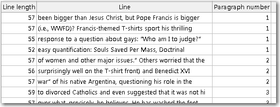
Pick a few lines in the middle of paragraphs and count the number of characters per line. Using a formal random sample would be best, but in my experience, you can get by with a cluster sample. For a cluster sample in this context, randomly select a few paragraphs and then count up the number of characters in all of the lines except the first and last lines. (The first and last lines will tend to be shorter. Most magazines indent first lines. Last lines end where the sentence ends, rather than where the column ends.)
The sample in this illustration is from Newsweek’s recent article “Is the Pope Catholic?” (I used the tablet version, not the online article, for the data.)
Make Everything Clear—The Assistant Menu
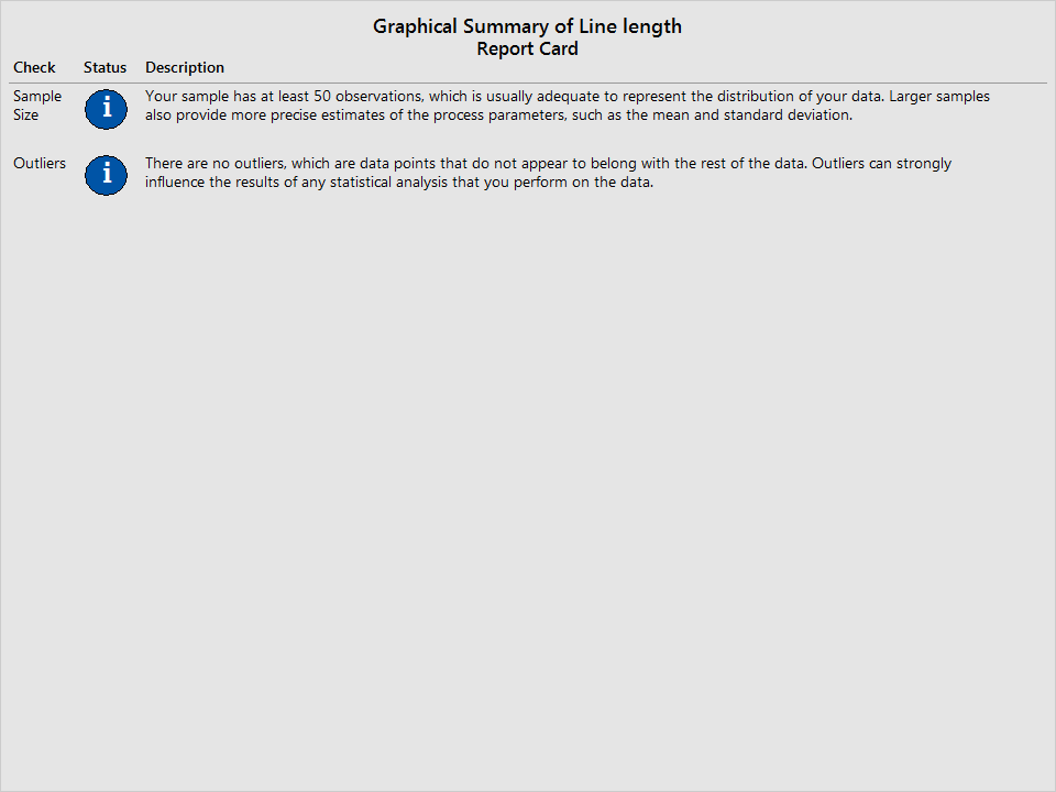
In Minitab, the most complete way to summarize your data is with the Assistant menu. In Minitab, select Assistant > Graphical Analysis > Graphical Summary. With this tool, you don’t just get a graphical summary. You get everything you’ve come to expect from the Assistant to help you understand your data. Minitab evaluates your sample size and checks for outliers on the Report Card.
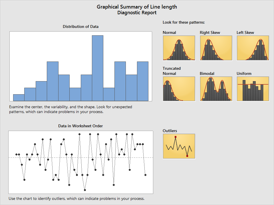
Then, the Diagnostic Report shows you graphs that let you compare visualize outliers and the shape of your data.
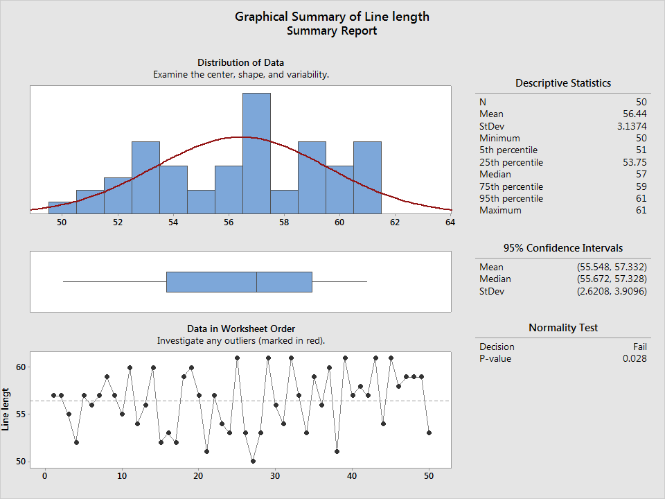
The Summary Report includes descriptive statistics, confidence intervals for common statistics, a normality test, and graphs—everything that you need to present your summary to others so that they’ll understand what’s important about the data.
So what’s important about these data? While I didn't do a capability analysis, Newsweek's probably doing a good job. Print magazines are generally designed so that the line lengths enhance legibility for readers. Although there are many factors to consider, 50 to 60 characters per line is usually a reasonable target. The minimum line length in these sample is 50, no smaller than it should be. Only 6 of the values out of 50 samples are higher than 60, and those are all 61. It’s pretty easy to see on this histogram that the spread of the values is right where you’d want it to be.
Get what you need when you summarize data
With Minitab’s Assistant, the data summary that you need is ready at a moment’s notice. You get the guidance you need to be confident that what you’re presenting is everything you need to make smart decisions.
The image of Pope Francis is by the Korean Culture and Information Service and is licensed under this Creative Commons License.