


Since we introduced new control charts in Minitab, I’ve been waiting to come across some real data I could use to showcase their awesome power. My friends, this day has come! I am about to reveal a perhaps unconventional use of the Laney P' chart to investigate national cycling data in the UK. So we’re not looking at any real process here, which is how the P' chart is usually used, just data from a national study about cycling habits. Why? Because this dataset gives us a prime example (see what I did there…?) of overdispersion issues that can cause problems when we use standard P control charts.
Preparing the Data for Analysis
Following a very successful cycling and Olympic sports summer for the UK (we earned 29 Gold medals, 17 Silver and 19 Bronze in case you did not realise, thank you very much!) I notice more and more cyclists on the road these days. I hope this will be one of many long-lasting legacies of London 2012.
Okay, that's enough boasting...besides, another factor probably is affecting the number of bicycles on the road. UK towns and city councils have made Britain more “cyclist friendly” over the years by adapting our existing road network and creating more cycle lanes. It is now easier than ever to leave the car at home and take the bicycle instead. However, as we shall see, the picture is far from uniform across the country.
I wanted to determine whether the entire nation had similar cycling habits, or if people in some towns and cities were "out of control" and cycling all over the place! There are many ways to do this, but I thought it would be fun to use control charts. More specifically, P control charts.
I used data from a survey conducted by the Department for Transport (Local area walking and cycling in England, 2010/11). It was published at the end of August 2012 but the data actually apply to 2010/2011. They surveyed a sample of the population of each local authority and recorded the proportions of participants in the following 4 cycling frequency rates:
- Once a month
- Once a week
- 3 times a week
- 5 times a week
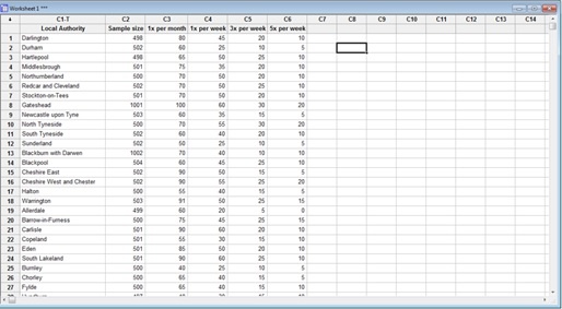
Sample sizes ranged from approximately 500 to 2,500, depending on the town or city. The original dataset showed the results in percentages. I re-formatted it to show counts, and I will only focus on participants who answered that they cycle at least once a week (column C4). Here is a screenshot of the data:
Since I have sample sizes and the corresponding counts for each cycling frequency rate, I can chart the proportions of participants who cycle at least 1x a week across the whole country, using a P chart.
Are P-charts a Sensible Approach to My Data?
I created the following P chart by going to Stat > Control Charts > Attributes Charts > P, selecting '1 x per week' for Variables, 'Sample size' for Subgroup sizes, and clicking OK:
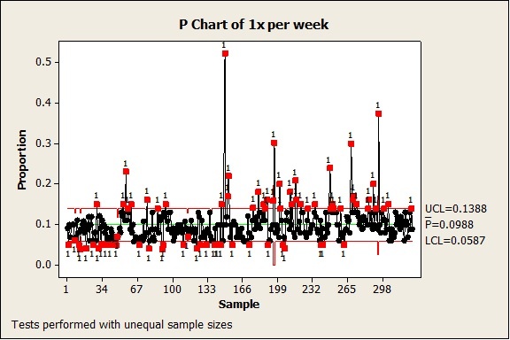
Each point on the chart represents the proportion of respondents who cycle at least 1x per week for a given local authority. Looking at the green centre line we can see that the average proportion for the country is 9.88%, with a lower control limit LCL at 5.87% and an upper control limit UCL at 13.88% (the red lines on each side). These control limits are calculated from the data and help us determine which samples are statistically out of control. Out of 326 samples/local authorities, a relatively high number of samples (78 in total) are outside of the control limits and flagged up in red. That's about 24% of the local authorities in this survey. Also note that the control limits are not perfectly straight lines because we have unequal sample sizes.
See how many of the points in red are just marginally outside of the control limits? Hmm…you could almost imagine how different this control chart would look, if only those control limits were only just a fraction larger. Perhaps we would only end up with the points that are blatantly out of control, like the ones over 0.20 (20%), for example. But this is just wishful thinking. For now.
This P-chart, as it is, does not really help narrow to a reasonable number those local authorities with different cycling habits. Is that just the way the data is, or is there a bit more to it? For some reason I have this gut feeling that I should not just accept this analysis, and that I am probably witnessing a very common problem with P charts: Overdispersion.
What Is Overdispersion in Data and How Does It Affect P Charts?
Overdispersion exists when your data have more variation than you'd expect based on a binomial distribution. Traditional P-charts assume your rate of defectives (or, in this example, the proportion of respondents who cycle 1x a week) remains constant over time. However, external noise factors, which are not special causes, normally cause some variation in this rate over time.
The control limits on a traditional P-chart become narrower when your subgroups are larger. If your subgroups are large enough, overdispersion can cause points to appear to be out of control when they are not! I suspect this is the case here. Remember, we have sample sizes ranging from about 500 to 2,500!
The relationship between subgroup size and the control limits on a traditional P chart is similar to the relationship between power and a 1-sample t-test. With larger samples, the t-test has more power to detect a difference. However, if the sample is large enough, even a very small difference that is not of practical interest can become statistically significant. For example, with a sample of 1,000,000 observations, a t-test may determine that a sample mean of 50.001 is significantly different from 50, even if a difference of 0.001 has no practical implications for your process.
How Can I Detect Overdispersion in My Data?
You can use the P-Chart Diagnostic to test your data for overdispersion and underdispersion if you're using Minitab Statistical Software. If your data exhibit overdispersion or underdispersion, a Laney P' chart may more accurately distinguish between common cause variation and special cause variation than a traditional P chart. (For more info about underdispersion, which I'm not talking about here, choose one of the Laney control charts from the Stat menu, click the Help button at the lower-left corner of the dialog box, then click the hyperlink labeled overdispersion in the first bullet point in the Help window. You can also check out our interview with Mr. David Laney himself.)
Let’s see what happens when we use the P-Chart diagnostic on these data. Go to Stat > Control Charts > Attributes Charts > P Chart Diagnostic, select '1 x per week' for Variables, 'Sample size' for Subgroup sizes, and click OK:
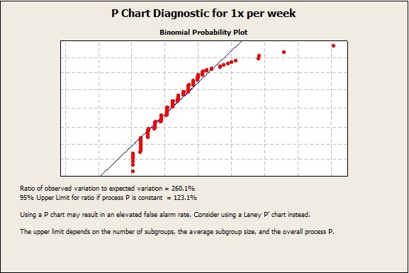
Minitab tells us that the high ratio of observed variation to expected variation—260.1%—does suggest overdispersion, and that using a P-chart may result in an elevated false alarm rate! I was right to doubt the results given by the traditional P chart. We should consider using a Laney P' Chart instead.
Amongst other things, the binomial probability plot above highlights the fact that some points are departing from a binomial distribution, especially those at the top right corner. I bet these values are the out-of-control points with abnormally high proportions, which we could already spot in the original P chart. I could always use the brush tool if I really wanted to find out….but I have more on the brush tool further down anyway.
How the Laney P' Chart Solves Problems with Overdispersion
Now, let‘s see what the Laney P' chart tells us about our nation’s cyclists. Go to Stat > Control Charts > Attributes Charts > Laney P', select '1 x per week' for Variables, 'Sample size' for Subgroup sizes, and click OK:
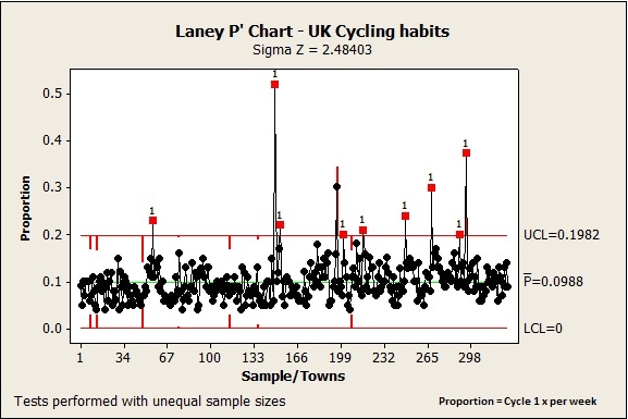
Wow, what a difference! We only have 9 out-of-control points now, and they are all well above the UCL. You can easily understand why this is happening by looking at the control limits. LCL is now 0 and UCL is surprisingly close to what I had anticipated at the beginning of this post, with a value of 0.1982. (By the way, I am actually quite chuffed at how good my prediction was and I swear I did not cheat…oops, I am boasting again!)
Also note that the Laney P' chart gives us a Sigma Z value. A Sigma Z value greater than 1 indicates that an adjustment was made to take overdispersion issues into account. In this case the adjustment must have been quite substantial since Sigma Z has a value of 2.48403!
Now that I have isolated the local authorities that truly exhibit different cycling habits, I can use the brush tools to identify them and perhaps understand why these particular towns or cities are doing so much better than the rest of the country.
Enter Brush mode by doing a right click and choosing Brush. Then you can hold down the Shift key to selected all 9 points. Right-click again, chose Set ID Variables, select 'local authority' from the left hand side selection window , and click OK. The brushing window now clearly shows the culprits:
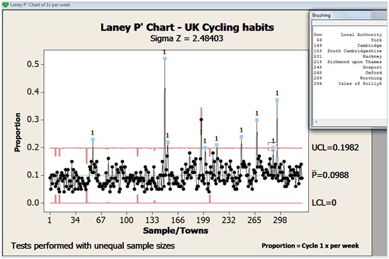
Looking at this list, it becomes apparent that these local authorities share particular traits: they are all popular seaside or tourist destinations. We have two world-renowned university towns, Cambridge and Oxford, with Cambridge scoring an impressive 52%. We also see quite a few romantic getaway destinations, such as York, Isles of Scilly, and Richmond upon Thames. Then there are seaside towns, such as Worthing, Gosport, and of course Hackney, which is where the London 2012 Olympics took place!
So not only this data enabled me to showcase the use of the great Laney P' chart but I can now say with confidence:
If you fancy visiting Britain, and you love cycling, go to these places:
- http://www.visitcambridge.org/
- http://www.visitoxfordandoxfordshire.com/
- http://www.visityork.org/
- http://www.visitrichmond.co.uk/
- http://www.visitworthing.co.uk/
- http://www.discovergosport.co.uk/
- http://www.hackney.gov.uk/
I should have been a travel agent. :-)
Thanks for reading!