Have you ever had a probability plot that looks like this?
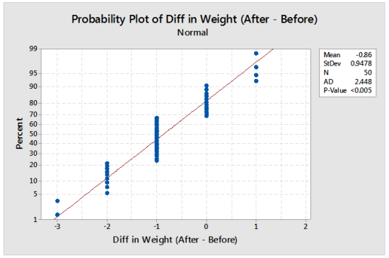
The probability plot above is based on patient weight (in pounds) after surgery minus patient weight (again, in pounds) before surgery.
The red line appears to go through the data, indicating a good fit to the Normal, but there are clusters of plotting points at the same measured value. This occurs on a probability plot when there are many ties in the data. If the true measurement can take on any value (in other words, if the variable is continuous), then the cause of the clusters on the probability plot is poor measurement resolution.
The Anderson-Darling Normality test typically rejects normality when there is poor measurement resolution. In a previous blog post (Normality Tests and Rounding) I recommended using the Ryan-Joiner test in this scenario. The Ryan-Joiner test generally does not reject normality due to poor measurement resolution.
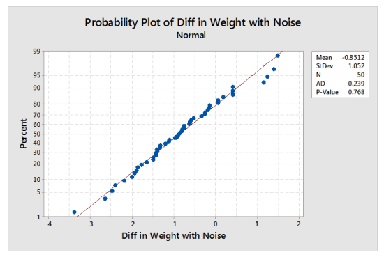
In this example, the Ryan-Joiner p-value is above 0.10. A probability plot that supports using a Normal distribution would be helpful to confirm the Ryan-Joiner test results. How can we see a probability plot of the true weight differences? Simulation can used to show how the true weight differences might look on a probability plot.
The difference in weight values were rounded to the nearest pound. In effect, we want to add a random value from -0.5 to +0.5 to each value to get a simulated measurement. The steps are as follows:
- Store simulated noise values from -0.5 to +0.5 in a column using Calc > Random Data > Uniform.
- Use Calc > Calculator to add the noise column to the original column of data.
- Create a normal probability plot using Stat > Basic Statistics > Normality Test.
- Repeat steps 1-3 several times if you want to see how the results are affected by the simulated values.
The resulting graph from one iteration of these steps is shown below. It suggests that the Normal distribution is a good model for the difference in weights for this surgery.