


Keeping your vehicle fueled up is expensive. Maximizing the miles you get per gallon of fuel saves money and helps the environment, too.
But knowing if you're getting good mileage requires some data analysis, which gives us a good opportunity to apply one of the common tools used in Six Sigma -- the I-MR (individuals and moving range) control chart to daily life.
Finding Trends or Unusual Variation
Looking at your vehicle’s MPG data lets you see if your mileage is holding steady, declining, or rising over time. This data can also reveal unusual variation that might indicate a problem you need to fix.
Here's a simulated data set that collects 3 years’ worth of gas mileage records for a car that should get an average of 20 miles per gallon, according to the manufacturer’s estimates. However, the owner didn’t do any vehicle maintenance for the first two years he owned the car. This year, though, he’s diligently performed recommended maintenance.
How does his mileage measure up? And has his attention to maintenance in the past 12 months affected his car’s fuel economy? Let’s find out with the Assistant in Minitab Statistical Software.
Creating a Control Chart that Accounts for Process Changes
To create the most meaningful chart, we need to recall that a major change in how the vehicle is handled took place during the time the data were collected. The owner bought the car three years ago, but he’s only done the recommended maintenance in the last year.
Since the data were collected both before and after this change, we want to account for it in the analysis.
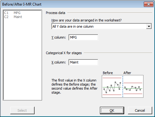
The easiest way to handle this is to choose Assistant > Before/After Control Charts… to create a chart that makes it easy to see how the change affected both the mean and variance in the process.
If you're following along with Minitab, the Maint column in the worksheet notes which MPG measurements were taken before and after DeWaggen started paying attention to maintenance. Complete the Before/After I-MR Chart dialog box as shown below:
Interpreting the Results of Your Data Analysis
After you press OK, the Assistant produces a Diagnostic Report with detailed information about the analysis, as well as a Report Card, which provides guidance on how to interpret the results and flags potential problems. In this case, there are no concerns with the process mean and variation.
The Assistant's Summary Report gives you the bottom-line results of the analysis.
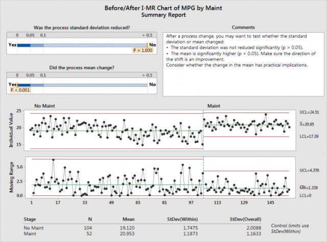
The Moving Range chart, shown in the lower portion of the graph, illustrates the moving range of the data. It shows that while the upper and lower control limits have shifted, the difference in variation before and after the change is not statistically significant.
However, the car’s mean mileage, which is shown in the Individual Value chart displayed at the top of the graph, has seen a statistically significant change, moving from 19.12 MPG to just under 21 MPG.
Easy Creation of Control Charts
Control charts have been used in statistical process control for decades, and are among the most commonly accessed tools available in statistical software packages. The Assistant has made it particularly easy for anyone to create and see whether or not a process is within control limits, to confirm that observation statistically, and to see whether or not a change in the process results in a change in the process outcome or variation.
As for the data we used in this example, whether or not a 2 mile-per-gallon increase in fuel economy is practically as well as statistically significant could be debated. But since the price of fuel rarely falls, we recommend that the owner of this vehicle continue to keep it tuned up!