


I confess: I'm not a natural-born decision-maker. Some people—my wife, for example—can assess even very complex situations, consider the options, and confidently choose a way forward. Me? I get anxious about deciding what to eat for lunch. So you can imagine what it used to be like when I needed to confront a really big decision or problem. My approach, to paraphrase the Byrds, was "Re: everything, churn, churn, churn."
Thank heavens for Pareto charts.
What Is a Pareto Chart, and How Do You Use It?
A Pareto chart is a basic quality tool that helps you identify the most frequent defects, complaints, or any other factor you can count and categorize. The chart takes its name from Vilfredo Pareto, originator of the "80/20 rule," which postulates that, roughly speaking, 20 percent of the people own 80 percent of the wealth. Or, in quality terms, 80 percent of the losses come from 20 percent of the causes.
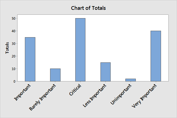
You can use a Pareto chart any time you have data that are broken down into categories, and you can count how often each category occurs. As children, most of us learned how to use this kind of data to make a bar chart:
A Pareto chart is just a bar chart that arranges the bars (counts) from largest to smallest, from left to right. The categories or factors symbolized by the bigger bars on the left are more important than those on the right.
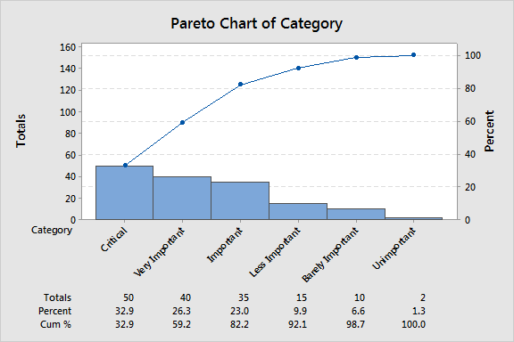
By ordering the bars from largest to smallest, a Pareto chart helps you visualize which factors comprise the 20 percent that are most critical—the "vital few"—and which are the "trivial many."
A cumulative percentage line helps you judge the added contribution of each category. If a Pareto effect exists, the cumulative line rises steeply for the first few defect types and then levels off. In cases where the bars are approximately the same height, the cumulative percentage line makes it easier to compare categories.
It's common sense to focus on the ‘vital few’ factors. In the quality improvement arena, Pareto charts help teams direct their efforts where they can make the biggest impact. By taking a big problem and breaking it down into smaller pieces, a Pareto chart reveals where our efforts will create the most improvement.
If a Pareto chart seems rather basic, well, it is. But like a simple machine, its very simplicity makes the Pareto chart applicable to a very wide range of situations, both within and beyond quality improvement.
Get the most out of your Minitab experience. Check out our training options!
Use a Pareto Chart Early in Your Quality Improvement Process
At the leadership or management level, Pareto charts can be used at the start of a new round of quality improvement to figure out what business problems are responsible for the most complaints or losses, and dedicate improvement resources to those. Collecting and examining data like that can often result in surprises and upend an organization's "conventional wisdom." For example, leaders at one company believed that the majority of customer complaints involved product defects. But when they saw the complaint data in a Pareto chart, it showed that many more people complained about shipping delays. Perhaps the impression that defects caused the most complaints arose because the relatively few people who received defective products tended to complain very loudly—but since more customers were affected by shipping delays, the company's energy was better devoted to solving that problem.
Use a Pareto Chart Later in Your Quality Improvement Process
Once a project has been identified, and a team assembled to improve the problem, a Pareto chart can help the team select the appropriate areas to focus on. This is important because most business problems are big and multifaceted. For instance, shipping delays may occur for a wide variety of reasons, from mechanical breakdowns and accidents to data-entry mistakes and supplier issues. If there are many possible causes a team could focus on, it's smart to collect data about which categories account for the biggest number of incidents. That way, the team can choose a direction based on the numbers and not the team's "gut feeling."
Use a Pareto Chart to Build Consensus
Pareto charts also can be very helpful in resolving conflicts, particularly if a project involves many moving parts or crosses over many different units or work functions. Team members may have sharp disagreements about how to proceed, either because they wish to defend their own departments or because they honestly believe they know where the problem lies. For example, a hospital project improvement team was stymied in reducing operating room delays because the anesthesiologists blamed the surgeons, while the surgeons blamed the anesthesiologists. When the project team collected data and displayed it in a Pareto chart, it turned out that neither group accounted for a large proportion of the delays, and the team was able to stop finger-pointing. Even if the chart had indicated that one group or the other was involved in a significantly greater proportion of incidents, helping the team members see which types of delays were most 'vital' could be used to build consensus.
Use Pareto Charts Outside of Quality Improvement Projects
Their simplicity also makes Pareto charts a valuable tool for making decisions beyond the world of quality improvement. By helping you visualize the relative importance of various categories, you can use them to prioritize customer needs, opportunities for training or investment—even your choices for lunch.
How to Create a Pareto Chart
Creating a Pareto chart is not difficult, even without statistical software. Of course, if you're using Minitab, the software will do all this for you automatically—create a Pareto chart by selecting Stat > Quality Tools > Pareto Chart... or by selecting Assistant > Graphical Analysis > Pareto Chart. You can collect raw data, in which each observation is recorded in a separate row of your worksheet, or summary data, in which you tally observation counts for each category.
1. Gather Raw Data about Your Problem
Be sure you collect a random sample that fully represents your process. For example, if you are counting the number of items returned to an electronics store in a given month, and you have multiple locations, you should not gather data from just one store and use it to make decisions about all locations. (If you want to compare the most important defects for different stores, you can show separate charts for each one side-by-side.)
2. Tally Your Data
Add up the observations in each of your categories.
3. Label your horizontal and vertical axes.
Make the widths of all your horizontal bars the same and label the categories in order from largest to smallest. On the vertical axis, use round numbers that slightly exceed your top category count, and include your measurement unit.
4. Draw your category bars.
Using your vertical axis, draw bars for each category that correspond to their respective counts. Keep the width of each bar the same.
5. Add cumulative counts and lines.
As a final step, you can list the cumulative counts along the horizontal axis and make a cumulative line over the top of your bars. Each category's cumulative count is the count for that category PLUS the total count of the preceding categories. If you want to add a line, draw a right axis and label it from 0 to 100%, lined up with the with the grand total on the left axis. Above the right edge of each category, mark a point at the cumulative total, then connect the points.
Try Minitab for FREE! Get a trial today.