Applied regression analysis can be a great decision-making tool because you can predict the average outcome given input values. However, predictions are not as simple as plugging numbers into an equation. In my previous post I showed how a majority of experts vastly underestimated the variability around the predicted outcome in a manner that can lead to costly mistakes.
We also saw how graphing the data is a simple way to avoid these mistakes because it highlights the uncertainty. In this post, I'll explore other techniques that you can use in Minitab statistical software to facilitate good decision-making when using applied regression models.
Use Prediction Intervals to Incorporate Uncertainty in to Your Decision-Making
A prediction interval represents the range where a single new observation is likely to fall given specified settings of the predictors. Prediction intervals account for the variability around the mean response inherent in any prediction.
Like confidence intervals, predictions intervals have a confidence level and can be a two-sided range, or an upper or lower bound.
Unlike confidence intervals, prediction intervals predict the spread for individual observations rather than the mean.
I’ll cover several ways to use prediction intervals in Minitab. You can also read a post where I compare confidence intervals, tolerance intervals and prediction intervals.
Graphically Illustrating Prediction Intervals with Fitted Line Plots
In my last post, we saw how a nice and neat data set makes it easy to visually determine likely and unlikely values. I’ve created a data set that has very similar properties as Soyer and Hogarth’s data. You can get the Minitab project file for all the examples here. (If you don't already have Minitab and you'd like to play along, please download our free trial.)
We’ll answer the same question from the study I discussed in the previous post, but this time we’ll use prediction intervals. Because there is only one predictor, I can use a Fitted Line Plot to display the results.
What would be the minimum value of X an individual would need to make sure that s/he obtains a positive outcome (Y > 0) with 95% probability?
To answer this question, we need a 95% lower bound. The Fitted Line Plot can’t display a one-sided bound, but the lower limit of a 90% prediction interval is equivalent to a 95% lower bound. So, we’ll just use the lower green line in the Fitted Line Plot.
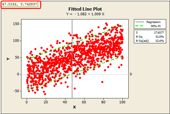
In the plot, I’ve added a reference line at zero and used Minitab's crosshairs feature (Editor > Crosshairs) to display the value where the lower bound crosses the reference line, around 47.0152. This tells us that we need an X of about 47 to ensure that Y is greater than 0 with 95% confidence.
What if our data weren’t quite so neat? Perhaps we didn’t measure 1,000 data points but only 50? I randomly sampled 50 data points from the original data set using Calc > Random Data > Sample From Columns.
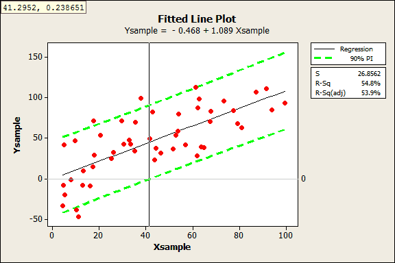
This is where prediction intervals really shine, because it would be hard to visually determine the answer with these data. Despite this sample being 1/20th the size of the original, the results are fairly similar. With the crosshairs, we see the answer is 41.2952.
Prediction Intervals for Models with Multiple Predictor Variables
If you have more than one predictor, you can’t graph the regression model, but you can still create prediction intervals. Let’s try this out with an example of an empirical model with multiple predictors.
As part of a solar energy test, researchers measured the total heat flux. They found that heat flux can be predicted by the position of the focal points in the south and north directions. We’ll use the General Regression results to correctly position the focal points.
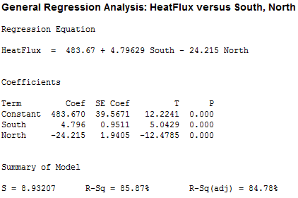
We want to arrange the focal points so that we can be 95% confident that the heat flux will be less than 250 in order to reduce heat damage. However, we don’t want to go lower than necessary because the system would capture less sunlight.
To protect against variability around the average prediction, we’ll need settings that produce an average heat flux prediction that is somewhat less than 250. But how much lower should it be?
Graphical approach to determine the target
We can’t use a fitted line plot to graph the variability like we did above because we have more than one predictor. However, we can plot the actual values by the fitted values. To do that, I’ll rerun the General Regression analysis above and have Minitab store the fitted values in the worksheet (fitted values are the same thing as predicted values).
Next, I’ll produce a Fitted Line Plot where the fitted value is the predictor and the actual heat flux value is the response. Like before, I’ll include the 90% prediction interval and we’ll use the upper limit as the 95% upper bound. I’ve also added a reference line at 250.
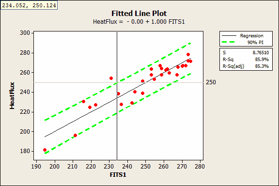
With the crosshairs, we see that the 95% upper bound crosses the reference line at a fitted value of 234.052. This tells us that we’ll need a fitted value near 234 to be 95% confident that the next measurement of heat flux will be less than 250. This graph doesn’t tell us the specific settings for the focal points, but we have an idea of what our target prediction should be.
Prediction tools to specify the variable settings
In order to generate predictions and the 95% upper bound of a prediction interval for specific settings, we’ll need to use General Regression. You can specify the interval properties in Options and the variable settings in Prediction.
There are an infinite number of combinations for the South and North focal points that produce a fitted value around 234. You need to use subject-area knowledge to pick settings that are feasible and affordable. I’ll fill the Prediction dialog as indicated below.
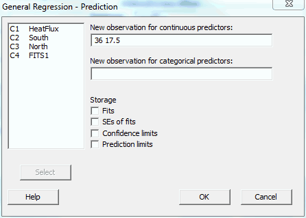
Minitab produces the following output:
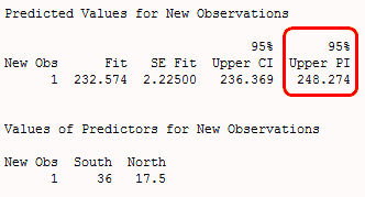
The results show that if we set the South and North focal points at 36 and 17.5 respectively, the average predicted heat flux is 232.574 and the upper bound of the prediction interval is 248.274. We can be 95% confident that the next heat flux measurement at these settings will be below 248.
Prediction Quick Tips for Other Ways to Avoid Costly Mistakes
- Check the predicted R-square: Even if your model has a high R-squared value, it may not be able to adequately predict new observations. Predicted R-squared indicates how well the model predicts responses for new observations. Read more about predicted R-squared.
- Check the Standard Error of the Regression (S): R-squared gets all of the attention; however, it does not tell you how the data values compare to the predicted values. S does just that! S is measured in the units of the response variable and represents the standard distance data values fall from the regression line. Also, the fitted value plus/minus 2*standard error of the regression provides a quick approximation of a 95% prediction interval.
- Perform validation runs: After you identify optimal settings, you should perform some testing at these settings to be sure that the real world behaves as your model predicts it should!
You can read an example of how to use body mass index (BMI) to predict body fat percentage here.
Have you used an applied regression model to make a decision?


