


Imagine that you’ve studied an empirical problem using linear regression analysis and have settled on a well-specified, actionable model to present to your boss. Or perhaps you’re the boss, using applied regression models to make decisions.
In either case, there’s a good chance a costly mistake is about to occur!
How regression results are presented can lead decision-makers to make bad choices. Emre Soyer and Robin M. Hogarth*, who study behavioral decision-making, found that even experts are frequently tripped up when making decisions based on applied regression models.
In this post, I'll look into what causes this problem and potential solutions.
The Problem: Illusion of Predictability
Decision-makers can use regression equations to predict outcomes. However, Soyer and Hogarth find that experts in applied regression analysis generally don’t correctly assess the uncertainties involved in making predictions. Instead, they assess the average effect of changing a predictor, but not the distribution around that average.
The end result is that outcomes are perceived to be more predictable than is justified by the model. Soyer and Hogarth refer to this as the illusion of predictability.
Studying the Perception of Prediction Uncertainty
Soyer and Hogarth asked 257 economists to use regression results to make decisions. The majority of empirical economic studies use regression analysis, so it's very familiar to economists.
The researchers presented the regression results in the format used by the majority of empirical studies in the top economic journals: descriptive statistics, regression coefficients, constant, standard errors, R-squared, and number of observations.
The authors presented several models and asked questions of mostly professors in applied economics and econometrics. Let’s walk through one example.
Make a decision based on a regression model
What would be the minimum value of X an individual would need to make sure that s/he obtains a positive outcome (Y > 0) with 95% probability?
Standard errors are in parentheses and the coefficient is significant at the 95% confident level.
| Variable |
Mean |
Std. Dev |
| X |
50.72 |
28.12 |
| Y |
51.11 |
40.78 |
| X Coefficient |
1.001 (0.033) |
| Constant |
0.32 (1.92) |
| R-squared |
0.50 |
| N |
1000 |
The responses illustrate the difference between perception and reality
76% of the participants believed that a very small X (X < 10) is enough to ensure a positive Y.
Given the regression equation: Y = 0.32 + 1.001X, an X of 10 produces a Y of 10.33. That seems well enough above zero to assure a positive result, doesn’t it? That’s the average outcome, but what about the variability around it?
Because of the variability, the correct answer is actually 47! Only 20% of the experts provided an answer that was close despite the fact that it is possible to mathematically solve it using the provided information (these are experts, after all).
What if an important decision had been riding on this answer?
The experts seriously underestimated the variability around the average outcome. Soyer and Hogarth asked the same question about a model with an R-squared of only 25% and the results were virtually identical. No adjustment was made for the greater uncertainty!
This is a psychological issue where the statistics and regression equation make the predictions appear to be more precise than they actually are.
I’ve written about how a high R-squared isn’t always that important except for when you’re making predictions. So an R-squared of 50% -- let alone 25% -- should send up warning flags about imprecise predictions.
The Solution: Graph the Uncertainty in the Relationship
Soyer and Hogarth asked the same question to different sets of experts but altered the presentation: one group saw the regression results with scatterplots, and the other group saw just the scatterplots. Surprisingly, the scatterplots alone produced the largest percentage of correct answers.
The scatterplot below corresponds to the regression results above.
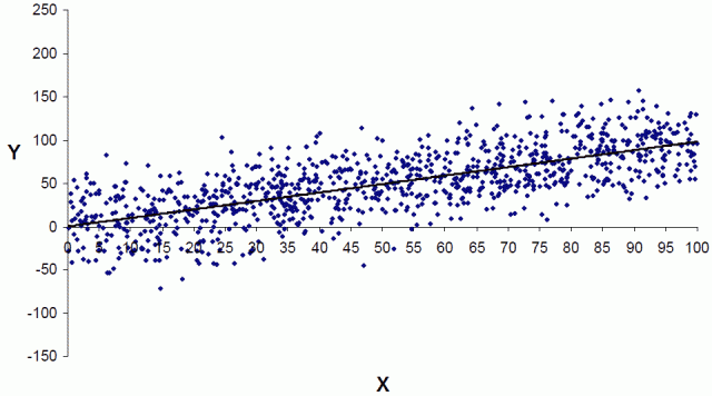 |
| From Soyer and Hogarth, used with permission |
With the scatterplot, only 10% of the respondents answered less than 10, and 66% percent were in the right ballpark.
The key is that scatterplots help the viewer to experience and understand the uncertainty. We can actually see data points that fall below the desired value. It puts the uncertainty in your face, so to speak!
To bring the illusion of predictability to life, compare the scatterplot above that displays the actual variability to the scatterplot below with the perceived amount of variability. The difference between the two is startling!
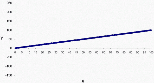 |
| From Soyer and Hogarth, used with permission |
Closing Thoughts
Predictions are not as simple as plugging a number into an equation. If the majority of applied regression experts are misled by the numeric results, just imagine the error rate among less experienced analysts!
I fully agree with Soyer and Hogarth’s call to revamp the way applied regression results are presented. I frequently use Minitab’s Fitted Line Plots (scatterplots with a regression line) in my blogs. It’s a great tool to explain regression results in a quick and easy-to-understand manner. Seeing is believing!
However, the model the researchers present is particularly conducive to a visual analysis. There is just one predictor variable, which allows you to graph it in two dimensions. There are many data points (n=1,000) that are evenly distributed across the analytical space. This example produces a visually clear demarcation between likely and unlikely values for any given value of X.
What about applied multiple regression, where you have more than one predictor? Or models with interactions and curvature? Or cases where the data aren’t quite so neat and plentiful? We'll still need to incorporate real-world uncertainty into decisions based on applied regression analysis. That’s the subject of part two.
If you're learning about regression, read my regression tutorial!
________________________________
*Emre Soyer, Robin M. Hogarth, The illusion of predictability: How regression statistics mislead experts, International Journal of Forecasting, Volume 28, Issue 3, July–September 2012, Pages 695-711.