


There is more than just the p value in a probability plot—the overall graphical pattern also provides a great deal of useful information. Probability plots are a powerful tool to better understand your data.
In this post, I intend to present the main principles of probability plots and focus on their visual interpretation using some real data.
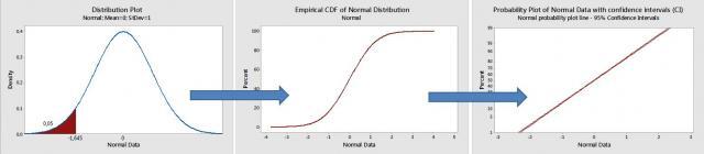
In probability plots, the data density distribution is transformed into a linear plot. To do this, the cumulative density function (the so-called CDF, cumulating all probabilities below a given threshold) is used (see the graph below). For a normal distribution the CDF will look like an S shape. In order to transform this S shaped curve into a line, a special Gausso-arithmetic (nonlinear) scale is needed (for the vertical Y scale).
A low p value indicates that the normality hypothesis needs to be rejected. But I want to focus specifically on analyzing graphical patterns in probability plots, based on a subjective visual examination of the data. In assessing how close the points are to a straight line, the "fat pencil" test is often used. If the points are all covered by this imaginary pencil, then the hypothesized distribution (the normal distribution in this case) is likely to be appropriate.
Using Probability Plots to Identify Outliers or Significant Effects
Probability plots may be useful to identify outliers or unusual values. The points located along the probability plot line represent “normal,” common, random variations. The points at the upper or lower extreme of the line, or which are distant from this line, represent suspected values or outliers.
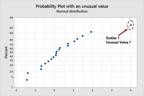
Outliers may strongly affect regression or ANOVA models since a single outlier may result in all predictor coefficients being biased. So probability plots on residual values from a statistical model are very useful for model validation and to detect some outliers that might be caused by failed tests, wrong measurements etc.
Probability plots also help up understand experimental designs. In a DOE (design of experiments) analysis, the effect plots are probability plots that represent factor or interaction effects. They may be used to identify significant effects. Effects that lie along the normal probability plot line are not significant (these effects are only caused by random variations), whereas the points that look like outliers represent real significant effects.
Using Probability Plots to Identify Asymmetrical Distributions
In the graph below, the data has been generated from an extremely asymmetrical (exponential) distribution. Clearly the points do not follow the probability plot line, with more dispersion on the longer (right-sided) tail. The data are very concentrated and close to one another at the other end (left side) of the distribution. The final result is a curve, not a line.
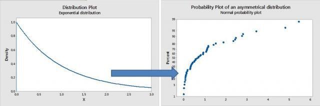
This has use in capability analyses: such a curvilinear pattern indicates that an asymmetrical distribution would be more appropriate (not the normal one). Cp and Cpk estimates are very sensitive to non-normality issues.
In a DOE or in a regression analysis, a plot like this this indicates that you need either to transform your data (into a normal distribution) or use another, more appropriate distribution.
Using Probability Plots to Identify Discrete Distributions
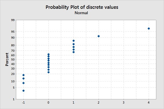
In the graph below, distinct groups of points are displayed along the probability plot line. Clearly this does not represent a continuous distribution. In measurement system analysis, such a pattern often indicates that the resolution of a measuring device is insufficient (with a low number of distinct categories, for example). There are certainly small differences between the points that look totally similar in this graph, but the measurement device cannot detect and recognize such small differences, resulting in a discrete distribution.
Example: Probability Distribution Plots Using Laser Game Data
 Laser games have become very popular entertainment over the last few years. Players score points by tagging targets with an infrared device. Successfully tagging players from competing teams will increase your score, while shooting players from your own team or being targeted and shot by the opposing team will decrease your score. I collected scores from several laser game rounds to analyze the graphical patterns in the probability plots of these scores. (This is real data—my son is a fan of laser games and I collected some of his score sheets).
In graph below, the game 1 probability plot (upper left corner) has a clear outlier/suspect value (the graphs shows a “super player” in the game clearly over-performed his opponents).
Even without the outlier, note that it is not possible to draw a single “fat pencil” line across all points. We do have different groups, so three lines are needed. The three points on the left represent a group that under-performed; the points on the right group represent a group over-performed; and the group between these represents the average players. Points located along a single line represent random variation (within a normal distribution) due to “common causes.” Differences between single lines represent “special causes” (real significant differences), probably due to different fighting techniques, level of expertise, scoring ability, players that are more advanced in the learning curve etc.
Looking at all four graphs, several groups of players can clearly be distinguished (several fat pencil lines are needed in each case).
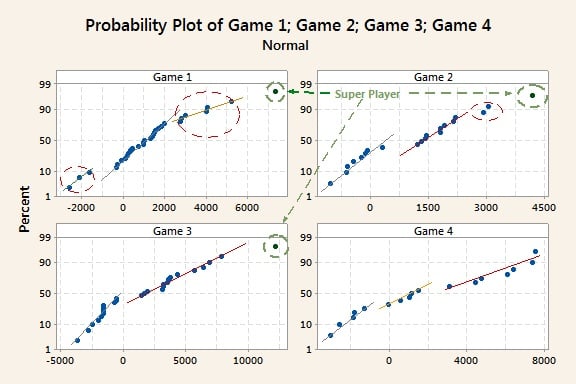
Note that the lines for the lower scores are generally steeper (less dispersion and more concentrated data), whereas the slopes of the lines for the best performing groups on the right side are more moderate, with more intra-group dispersion. This pattern indicates that the amount of dispersion is not constant according to the average value of each group (the larger the average, the larger the amount of variation: this particular behavior is named “heteroscedasticity”). This is probably because inexperienced players get shot easily and cannot express their real, full potential, whereas differences in playing styles and techniques have a more important role for more experienced players, so we see larger differences between them in terms of scores. If you've ever seen or played a laser-tag game, you can imagine beginners advancing in a huge dark space being targeted by more experienced players (well positioned behind obstacles) and not knowing where to go exactly.
How would graphs like this be interpreted in a quality improvement situation?
Capability analyses: In capability analyses, such different “fat pencil” or broken lines indicate that parts from different production lines, suppliers etc., have been mixed together. The result is an overall nonnormal distribution (with biased Cp and Cpk estimates) made from different groups that actually follow several normal distributions (with different means) mixed together. One consequence of this is that, probably, no theoretical distribution (Weibull, lognormal distributions etc.) will ever fit such data. A more complex approach—maybe a non-parametric—may be needed in this case.
Designed experiments: In a DOE effects plot, an outlier will cause some effects to be overestimated (if there is a 1 coded level in the outlier row for such a factor) or underestimated (if there is a -1 coded level in the outlier row for this particular factor). The result will be different “fat pencil” lines (broken lines) again.
Reliability: In a reliability analysis, broken lines are often caused by different failure modes. Although the normal distribution is less likely to be used in this context, Weibull probability plots convey the same type of information.
Conclusion
Laser games are great in that they do provide a lot of data. I wish “Super Player” good luck in his next rounds!
As you can see, simple visual examination of probability plots does yield some useful insight into the data structure. The amount of data being generated from the Internet, electronic devices, customer relations management, and other technologies is rapidly increasing. Recognizing patterns in all this data is key to better understanding our processes, our customers, our products, and our opportunities.
Laser tag photo by Johannes Gilger, used under Creative Commons 2.0 license.