


Our vacation planning has begun. My daughter has requested a trip to Disney World as her high school graduation present. For most people, trip planning might mean a simple phone call to the local travel agent or an even simpler do-it-yourself online booking.
Not for me.
As a statistician, a request like this means I’ve got a lot of data analysis ahead. So many travel questions require (in my world, anyway) data-driven decisions. What is the best time to book tickets? What is the best flight/airline to use given the probability of cancellation and/or missed connections traveling from our small airport? How do we schedule our in-park time so we aren’t waiting in line most of the day?
My list of questions goes on and on, and will keep me very busy in the weeks to come. But to keep this at a reasonable length for a blog post, let’s just focus on the last one. Specifically, how do we minimize queue time and maximize fun? There are many valid approaches to looking at a question like this, but to keep things simple and use available data, I’m going to take advantage of some features available in Minitab Statistical Software.
Disney queue time data is available on several websites with varying levels of sophistication, but I chose to use a very simple set of average wait times. It’s well known that park attendance is highly seasonal, so I chose to only look at data that matches the predicted crowd level for the days we will be there. We’re also going to focus this particular analysis on my family’s seven must-see attractions at The Magic Kingdom.
If you want to follow along in Minitab, please download my data sheet.
My primary variable of interest is wait time in minutes. I want to investigate wait time by time of day using the specific ride as a grouping variable. To get a quick overview of the data, I started with a time series plot (Graph > Times Series Plot > Simple.) You can overlay multiple graphs (in this case, our seven must-see rides) on a single plot like this by selecting Overlaid on the same graph under the Multiple Graphs button.
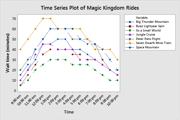
From this graph, I see that the new Seven Dwarfs Mine Train—the yellow line at or near the top for every hour—is going to be a tough one to ride without a substantial wait, but with the right timing, we can get through It’s a Small World pretty quickly. Everything else falls somewhere in between.
This is certainly good to know. What would be more useful, though, is to look at the actual data in our Minitab spreadsheet and set up some rules based on what we believe are acceptable wait times. My personal wait time tolerance can be roughly described as:
- Under 20 minutes: totally Happy.
- 20 to 35 minutes: may get a little Sleepy.
- More than 35 minutes: this better be the best ride ever or I’ll become very Grumpy.
Wouldn’t it be great if I could use information to visualize my data in the Data window? Fortunately, I can use conditional formatting to do this. Simply click in the Data window, and either right-click or choose Editor > Conditional Formatting. I used the options under Highlight Cell to set three rules: Less than 20, Between 20 and 35, and Greater than 35. I can now use the resulting Green, Yellow, and Red formatting to plan my day at The Magic Kingdom.
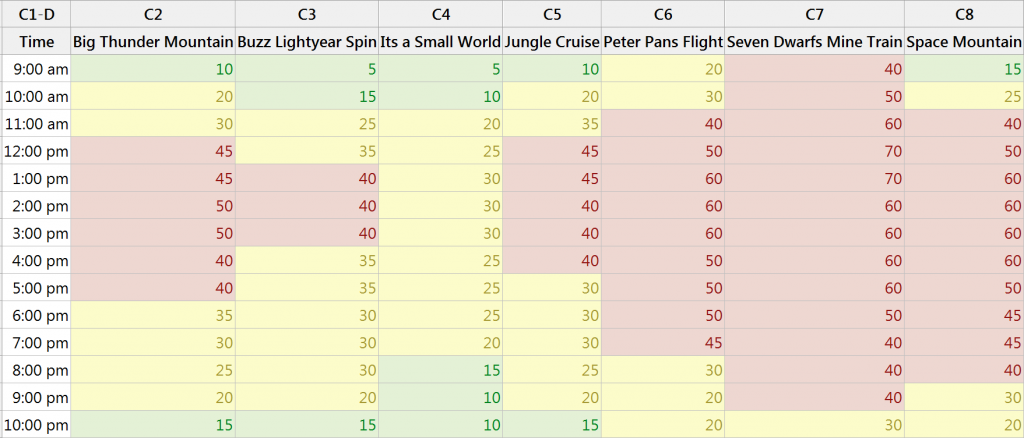
Although Seven Dwarfs Mine Train never makes it into the green zone, putting the wait at the very end of our day—when our feet will be tired from walking anyway—may be reasonable. To avoid red as much as possible, we might want to hit either Space Mountain or Big Thunder Mountain first and move around from there.
I still need to collect information about the distance between rides to complete our plan, but I think we’re off to a promising start!