


Like many, my introduction to 17th-century French philosophy came at the tender age of 3+. For that is when I discovered the Etch-a-Sketch®, an entertaining ode to Descartes' coordinate plane.
Little did I know that the seemingly idle hours I spent doodling on my Etch-a-Sketch would prove to be excellent training for the feat that I attempt today: plotting an Empirical Cumulative Distribution Function (ECDF).
How Can We Use an Empirical CDF?
We can use an empirical cdf graph to:
- Determine how well data follow a specific distribution.
- Get estimates of parameters and population percentiles.
- Compare sample distributions.
Like the Etch-a-Sketch, an ECDF is fairly simple. Each unique value in a sample is represented by a step on the ECDF. The data values are represented on the x-axis, and the y-axis represents the cumulative percentage (from 0% to 100%). In other words, you plot the value of each observation against its actual cumulative probability. As you move from left to right, the steps of the ECDF climb toward 100%.
Creating an Empirical CDF using Software
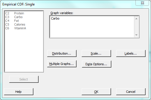
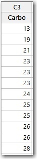
Here's an example. This is an ECDF of the Carbo variable in the Cereal.MTW data set. To open this data set in Minitab, choose Help > Sample Data. I sorted the values in ascending order for this demonstration. To do the same, click in the column to select part of it, then right-click and choose Sort Columns > Entire Worksheet > Smallest to Largest. Finally, choose Graph > Empirical CDF..., select "Single," and in the dialog box choose "Carbo" as the graph variable as shown. (Note that I've also clicked the "Distribution" button and opted to display only the connect line between the points in my graph.)
Minitab outputs the following graph:
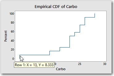
The first step in the ECDF shows that the smallest value in the sample is 13 (X) and that 8.33% (Y) of the values in the sample are less than or equal to 13. (With 12 observations in the sample, each observation accounts for 1 / 12 x 100 = 8.33% of the sample).
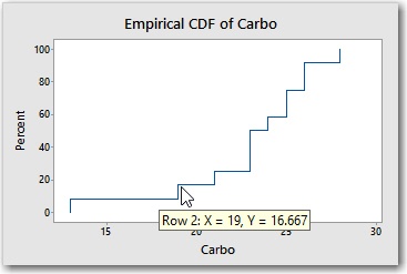
The next smallest value in the sample is 19. Together, the two observations (13 and 19) account for 16.66% of the sample. Notice that the 4th step, which represents the x-value of 23, is steeper than most. That's because there are 3 observations that have the value 23, so this step increases the cumulative percentage from 25% to 50%.
Using an Etch-an-ECDF
To turn my Etch-a-Sketch into an "Etch-an-ECDF," I needed to perform some careful knob calibration. I didn't want to eyeball the values, so I had to do some calculations.
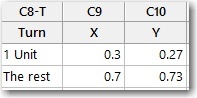
The horizontal axis represents the units of x, from 13 on the left to 28 on the right. After some twiddling, I determined that 4.5 rotations of the x-knob are required to move the stylus all the way from the left edge of the screen to the right edge. So 4.5 rotations equals 15 x-units. Which means that one x-unit is equal to 4.5 / 15 = 0.3 rotations.
The vertical axis represents the cumulative percentages. I determined that 3.2 rotations of the y-knob are required to move the stylus all the way from the bottom of the screen to the top. Since there are 12 observations, each observation receives 3.2 / 12 = 0.27 rotations of the y-knob.
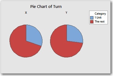
To rotate the knobs with any degree of accuracy, I need a gauge that can show me, for example, what 0.27 of a full rotation looks like. I realized that a pie chart would make an excellent gauge. I entered the following data in the worksheet.
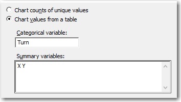
To create the pie chart of these data, I choose Graph > Pie Chart and complete the dialog box as follows.
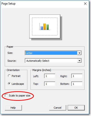
NOTE: To print the pie chart at the desired size, select the graph and choose File > Page Setup and uncheck Scale to paper size. By default, Minitab stretches or shrinks the graph when it prints so that it takes a up a full page.
With the pie chart gauges, a hole-punch, some scissors, and some tape, I was ready to transform my Etch-a-Sketch into an Etch-an-ECDF.
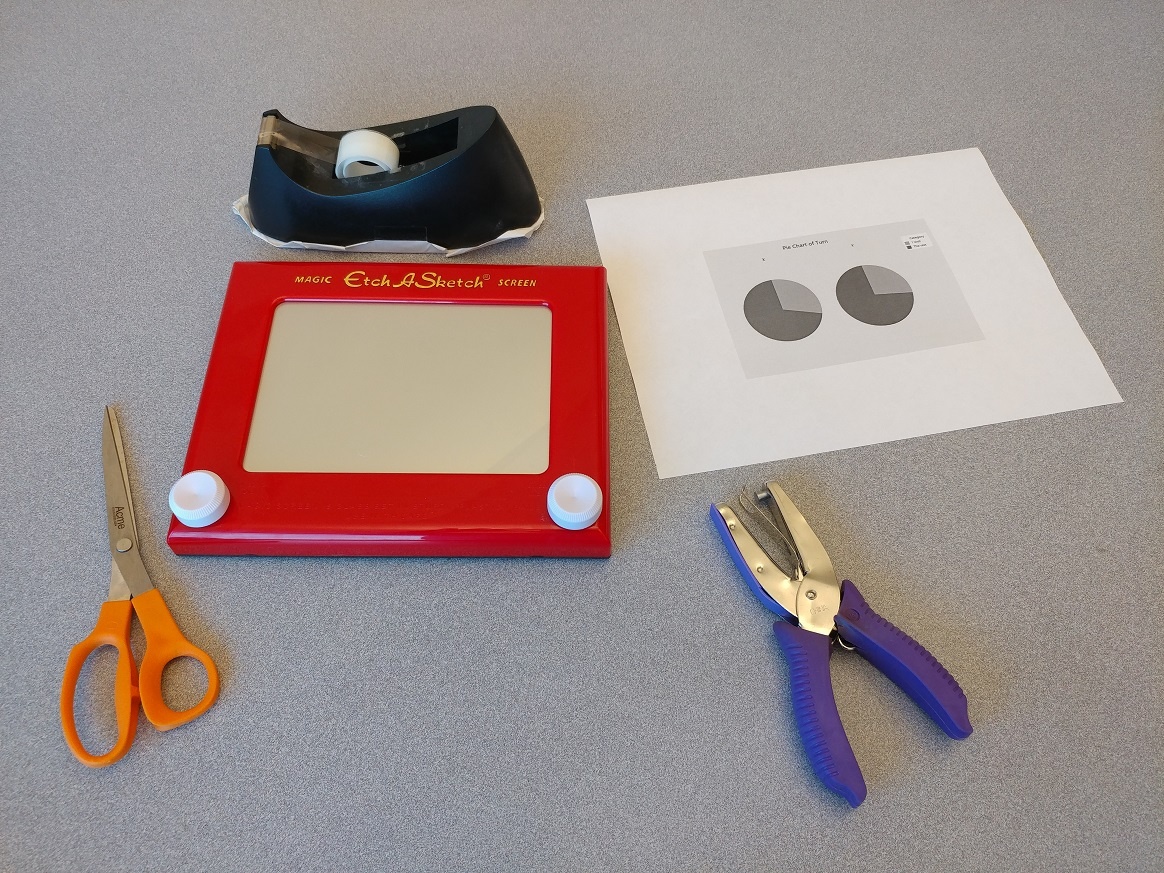
I cut out the pie gauges, being careful not to mix up the x-gauge with the y-gauge. Then I punched a hole in the center of each gauge as shown below.
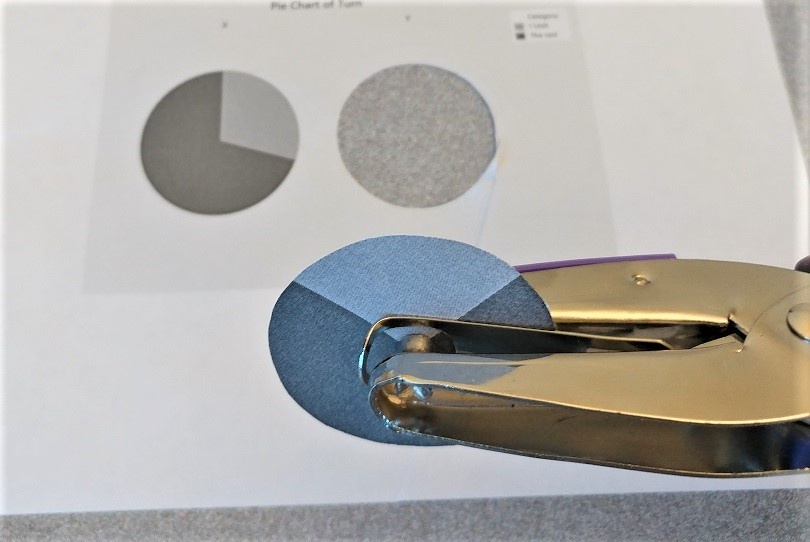
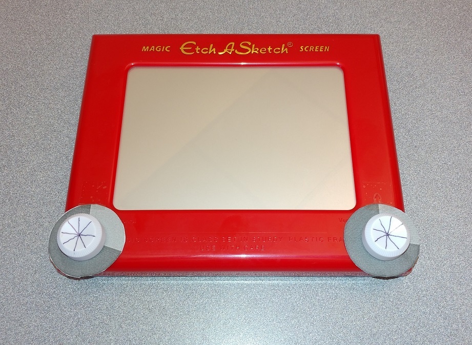
After cutting a slit from the edge of each gauge to the center, I slipped the gauges under the knobs and tapped them into place. I also penned some lines on the knobs to provide reference points. Voilà!
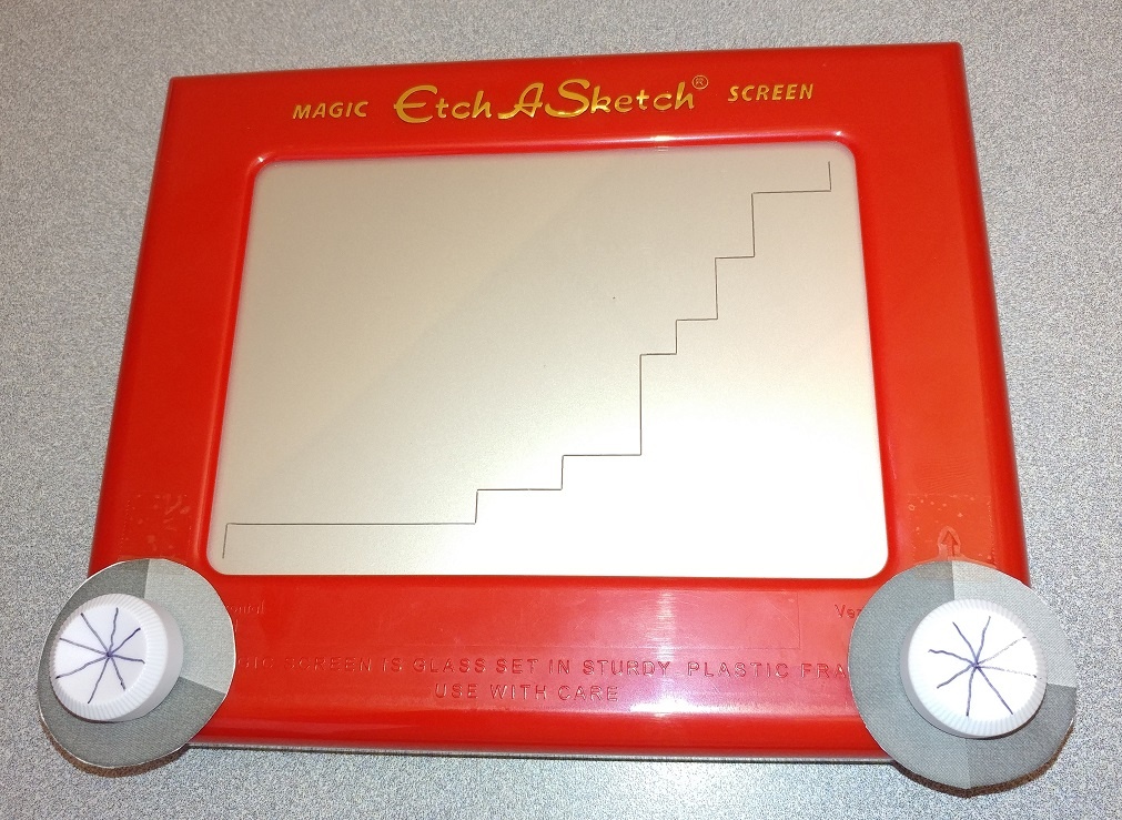
With my knobs calibrated, I was ready to start plotting. With the stylus in the lower left, I used the gauge to carefully turn the y-knob 0.27 rotations to represent the 8.33% cumulative percentage for the smallest x-value, 13.
![]()
Then, to advance from x=13 to x=19, I used the x-gauge to carefully turn the x-knob one unit at a time until I had turned it 6 units.
![]()
I alternated turning the x- and y-knobs the correct number of units. For example, when I reached x=23, I turned the y-knob 3 units instead of just 1, because there are 3 observations that have the value 23. Before I knew it, I had a work of art depicting the very essence of the Carbo sample!
That was fun. But I have to admit, there are definite limitations to this approach. One huge drawback is that I'll need to recalibrate my knobs to match the range and number of observations in each new sample. Fortunately, Minitab Statistical Software lets you plot an ECDF quickly and easily, without all the cutting and the punching and the taping.
More advantages of creating your ECDF in Minitab
In addition to ease of use, Minitab offers would-be ECDF plotters other advantages as well. For example, you can add fitted lines to show the CDF for a fitted distribution. (We talked about CDFs [Cumulative Distribution Functions] in my previous post, "The Empirical CDF, Part 1: What's a CDF?").
If you hover your cursor over a fitted distribution line, Minitab shows you a table of population percentiles that are estimated from your data.
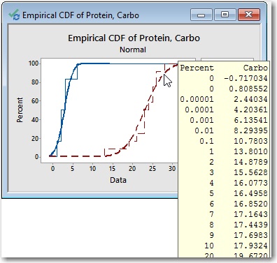
To copy the table of percentiles, select an individual fitted line, then right-click and choose Copy Text. (If your graph includes more than one fitted line, click once to select all fitted lines, then click again to select only the desired fitted line.)
And finally, if you create your ECDF in Minitab Statistical Software, you can also easily and quickly create many other useful graphs such as histograms, probability plots, and marginal plots to learn even more about your data.