


Hi everyone! Over the past month, I fielded some interesting customer calls regarding control chart creation and editing. I wanted to share these potential scenarios with you in hopes that you will find them informative and useful. For these scenarios, I used the XBar-R chart as my template, but you could easily apply them to many of the other control charts in Minitab.
Scenario 1: Create a Control Chart with Stages
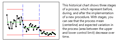
Suppose you want to create an XBar-R Chart with stages. Stages show how a process changes over specific time periods. At each stage, Minitab Statistical Software recalculates the center line and control limits on the chart by default.
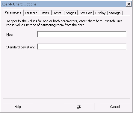
You decide to create a two-stage chart. However, you want to use a historical standard deviation of 2 for the first stage, as opposed to letting Minitab calculate it for you. For the second stage, you’ll let Minitab calculate the standard deviation.
You can enter historical estimates for the standard deviation under the Parameters tab under the Xbar-R Options sub-menu:
You may be inclined to enter in 2 into the second box and hit OK, but that will set the standard deviation to 2 for both stages. You’ll need to add an asterisk to represent the stage that is not affected by the historical estimate:
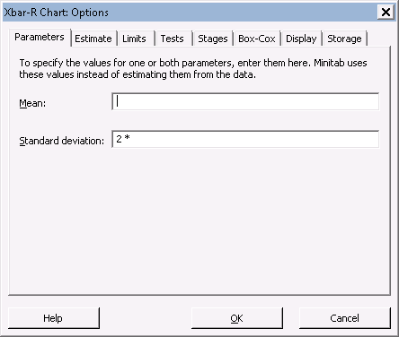
The resulting Xbar-R chart will set the standard deviation to 2 for the first stage, leaving the second stage unaffected.
Scenario 2: Showing Control Limits for Different Stages
Let’s piggyback off of our first scenario and look at an Xbar-R chart with stages:
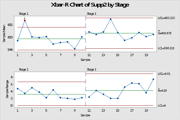
You'll notice that only the last stage’s control limits are displayed, but you really want the first stage's to be displayed as well. This change can be made in the Xbar-R Options sub-menu, under the Display tab:
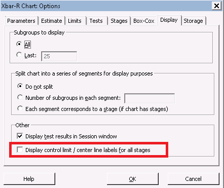
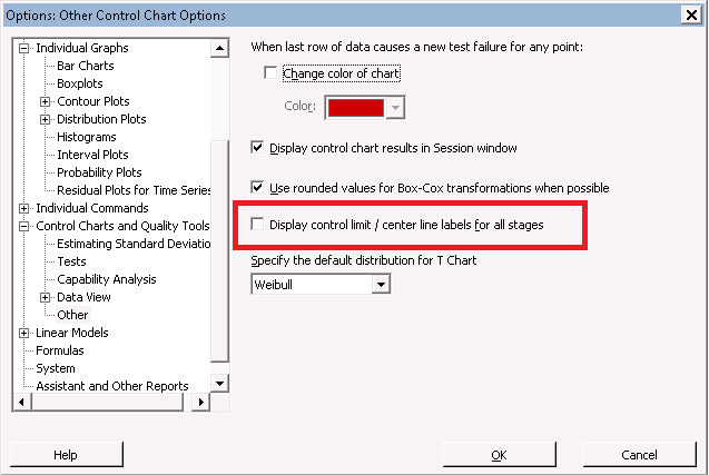
After checking this box and hitting OK a few times, your Xbar-R Chart will show the control limits for all stages. You could set this to be the default behavior under Tools > Options >Control Charts and Quality Tools > Other:
Scenario 3: Hiding Symbols on Your Control Charts
On our Xbar-R chart, let's hide the symbols from the top graph (Xbar) by right-clicking on one of the symbols, and going to the Edit Symbols sub-menu…
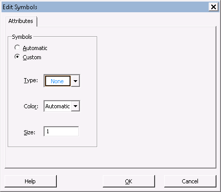
Choose "None" under "Custom" and select OK. The symbols disappear from the top graph. But what if we have a change of heart and want those symbols back? We right-click on different places on the graph, but all we see are options for “Edit Figure Region…”, “Edit Data Region”, or “Edit Connect Line…” Uh-oh. Have we lost our symbols?
Fortunately, we have not. Go to the Editor Menu. (Make sure you have your graph selected prior to doing this. The Editor Menu dynamically changes based on what you are currently selecting with Minitab.) Under Editor > Select Item, select "Symbols." If we had hidden the points from the bottom graph, we would have selected "Symbols 2."
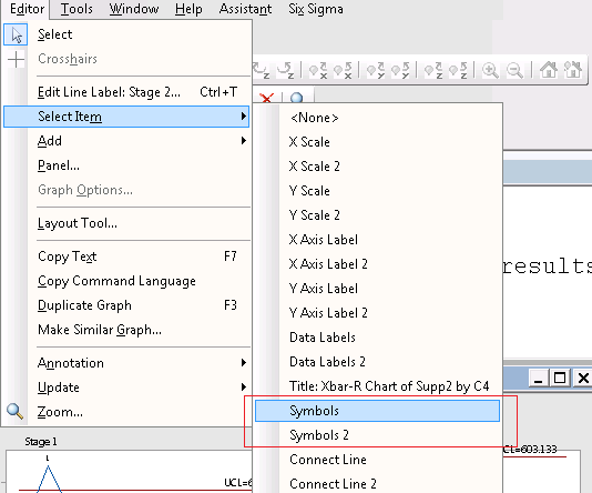
After the symbols have been selected, press CTRL + T to go to the ‘Edit Symbols’ dialog window or simply to go Editor > Edit Symbols…
Scenario 4: Setting Data Labels on Control Charts
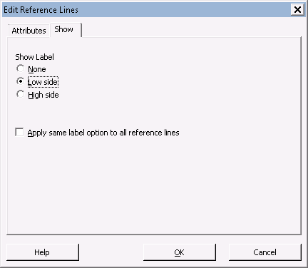
I would like to close this post with a very minor but useful tip. When adding reference lines to a control chart, you can choose whether you want the data label to appear on the lower end or higher end of the line. First add a reference line to your control chart by right clicking on your chart and selecting Add > Reference Lines…
Fill out the dialog as you please by entering a few values, and hit OK to add your reference line to the chart. With the reference line selected, press CTRL+T to open up the Edit Reference Lines dialog. Under the Show tab, you can choose what side of the reference line you want the label to appear.
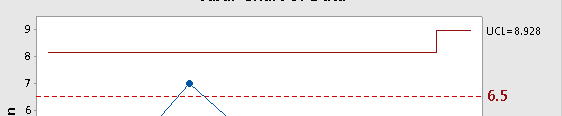
Before:
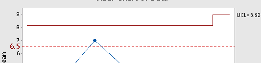
After Changing to ‘Low Side’:
Sharing these tips has helped many people who have contacted us about control charts over the years, and I hope they will help you the next time you find yourself in our control chart menus!