BAH! The NBA makes me mad. Seriously, why can’t they resolve this current lockout? I want to have something to watch after the NFL season is over.
Let’s talk about what is holding up the players and the organizations from agreeing to a decision on how money is distributed.
The NBA Salary Cap is the limit as to how much NBA teams are allowed to pay their players. It was actually first initiated in 1946, but it only lasted that one season. The first modern cap started in the '84-85 season, and has been in place ever since. Here is a Time Series Plot (Stat > Time Series > Time Series Plot in Minitab Statistical Software) of how the cap has grown over the years:
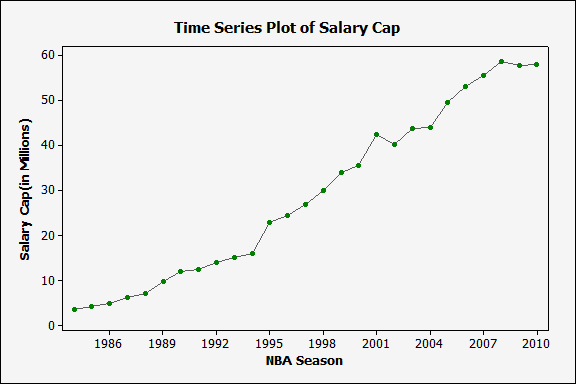
As you can see, the Salary Cap has risen steadily throughout the years. Why has it risen? Well, salary cap is calculated by a projected basketball income per year, and it’s a specific percentage of that income given to the players. Since 2006, the defined percentage of BRI (basketball related income) given to players has been at 51%. It is this number that owners and players are fighting over. Why? Well, NBA commissioner David Stern claims that he expects the NBA to lose $300 million this season, after losing $340 million in the 2009-2010 season.
Have people stopped going to games? Let’s look at attendance:
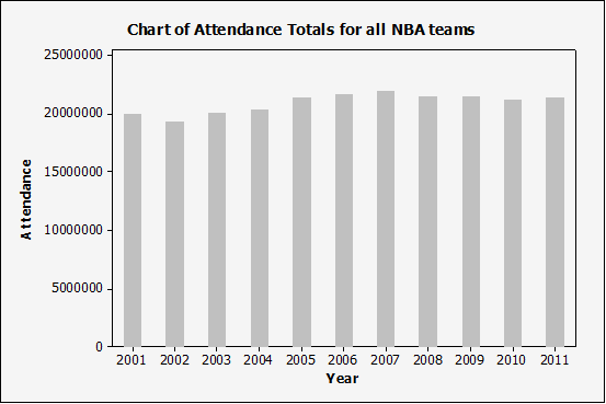
So attendances seem consistent, although I am sure there might be some variability among individual teams. Let’s look at a couple of big-market teams (NY, LA, Miami) and a couple of smaller-market teams (Indy, Cleveland, and Milwaukee) across the years:
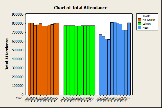
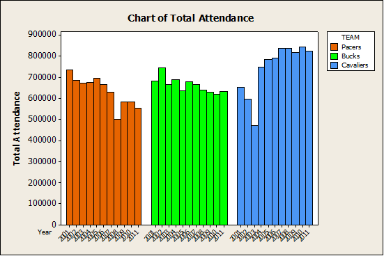
To add these colored attributes by group in Minitab, you just right-click on the bars from your Bar Chart, go to Edit Bars > Groups, and then enter your grouping variable under "Assign attributes by categorical variables." The catch? This specific graph was created by using Graph > Bar Chart > Values from a Table > One column of values, Cluster. I had to include both my team and Year column for my categorical variables for grouping. I then had to remove the Teams from the X-axis(right click on the X-scale > 'Show'). This is why you only see Year on the x-axis. Pretty nifty huh?
One funny observation: the Cavaliers got a boost in attendance during King James’ first year (2003-2004).
Published by the Team Marketing Research Group in November 2010, here is a list of Fan Cost Index Scores for the NBA across all teams in the 2010-2011 season.*
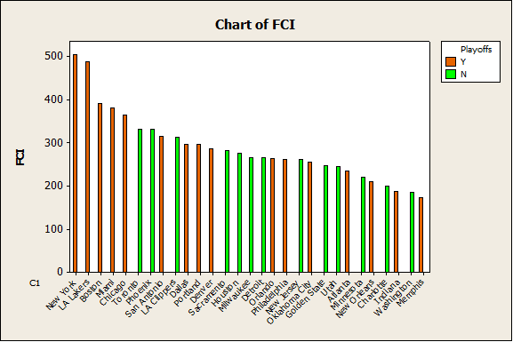
Visual inspection of the graph suggests you will pay more for seeing the teams from the more popular cities. There seems to be more of a mix of Playoff and non-Playoff teams as FCI score drops, which is good for fans -- at least for that 2010-2011 season. Who wants to pay more to see their team make the playoffs? It’s a major concern for smaller market teams and their fans, who try to attract big ticket players to their franchises.
*Fan Cost Index™ comprises the prices of four (4) average-price tickets, two (2) small draft beers, four (4) small soft drinks, four (4) regular-size hot dogs, parking for one (1) car, two (2) game programs and two (2) least-expensive, adult-size adjustable caps.
Stay tuned for Part 2!


