


When you're evaluating a dataset, graphical analysis can be very important. While an analysis like a regression or ANOVA can be backed up by numbers, being able to visualize how your dataset is behaving can be even more convincing than a group of p-values—especially to those who aren’t trained in statistics.
For example, let’s look at a few variables we think may be correlated. In this specific example, we will take the Unemployment Rate and the Crime Rate for each state in the U.S. We have 3 columns of data in Minitab: C1, which contains the State Name; C2, which contains the Crime Rate; and C3, which contains the Unemployment totals.
Go to Graph > Scatterplot > Simple. Then put Unemployment on the X-Axis, and the crime rate on the Y-Axis.
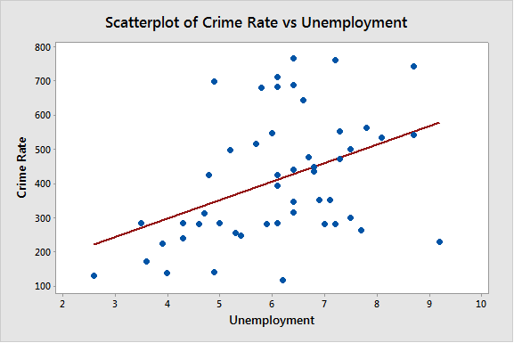
There does appear to be a significant correlation between the Unemployment Rate and the Crime Rate. We can confirm this by running a correlation, but a quick glance at the picture will give you an idea of what’s going on. The more unemployment we have, the higher the crime rate.
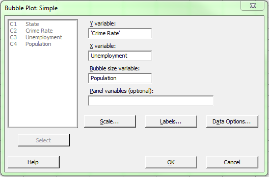
The scatterplot helps us if we are interested in two variables. But what if we have an interest in a third variable we think may be related? A tool in Minitab Statistical Software called a Bubble Plot allows us to investigate a third variable of interest in the same graph.
Let’s add another variable, State Population, in column C4. We can go to Graph > Bubble Plot and fill out our dialog as follows:
Once we have our dialog filled out, we can click OK, which gives us the graph below:
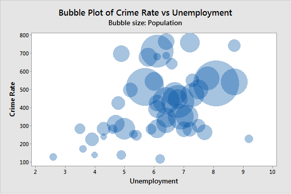
The bubble plot allows us to see a third variable, instead of the two that we are limited to with most graphs. This can be very useful if you have three variables of interest, and can look at this one graph instead of a number of different graphs which are only capable of showing us two variables at once.
It does look like the population does increase along with the crime rate and unemployment, though there are some obvious outliers.
Now, this looks good when we're just looking to see relationships, but what if we want to know specifics? This is where we can use Data Labels on the bubbles. Right-click on the bubbles, and choose Add > Data Labels. Choose the option 'Use labels from column:' and choose our column C1, which represents the State. This gives us the graph below:
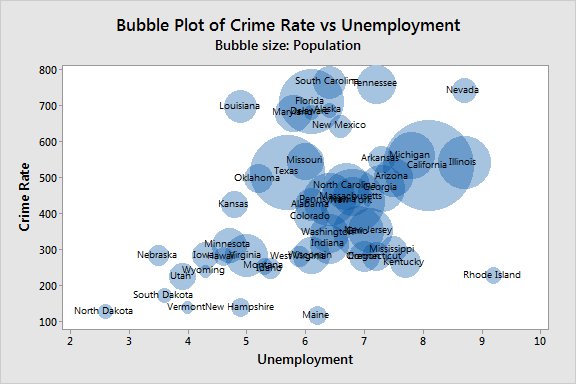
With this final graph, in addition to the straightforward relationships between these variables we can clarify each specific data point. This is the advantage of the Bubble Plot; being able to see the relationship between three different variables in one plot.
The Unemployment Rate data used in this post comes from the Bureau of Labor Statistics. Crime Rate data comes from Census.gov.