


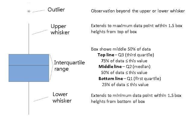
There's nothing like a boxplot, aka box-and-whisker diagram, to get a quick snapshot of the distribution of your data. With a single glance, you can readily intuit its general shape, central tendency, and variability.
To easily compare the distribution of data between groups, display boxplots for the groups side by side. Visually compare the central value and spread of the distribution for each group and determine whether the data for each group are symmetric about the center. If you hold your pointer over a plot, Minitab displays the quartile values and other summary statistics for each group.

The "stretch" of the box and whiskers in different directions can help you assess the symmetry of your data.

Sweet, isn't it? This simple and elegant graphical display is just one of the many wonderful statistical contributions of John Tukey. But, like any graph, the boxplot has both strengths and limitations. Here are a few things to consider.
Be Wary of Sample Size Effects
Consider the boxplots shown below for two groups of data, S4 and L4.
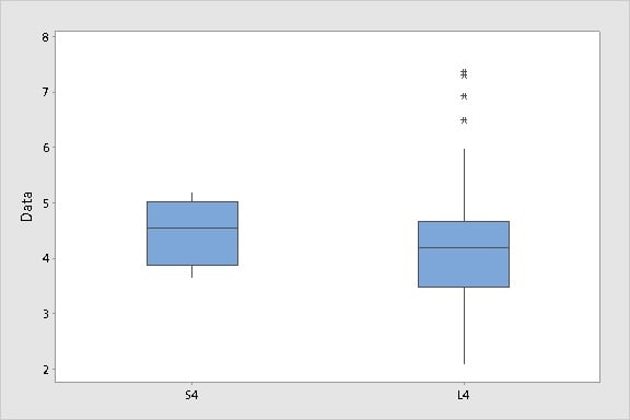
Eyeballing these plots, you couldn't be blamed for thinking that L4 has much greater variability than S4.
But guess what? Both data sets were generated by randomly sampling from a normal distribution with mean of 4 and a standard deviation of 1. That is, the data for both plots come from the same population.
Why the difference? The sample for L4 contains 100 data points. The sample for S4 contains only 4 data points. The small sample size shrinks the whiskers and gives the boxplot the illusion of decreased variability. In this way, if group sizes vary considerably, side-by-side boxplots can be easily misinterpreted.
How to See Sample Size Effects
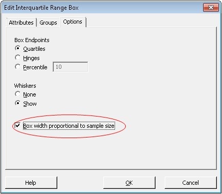
Luckily, you can easily change the settings for a boxplot in Minitab to visually capture sample-size effects. Right-click the box and choose Edit Interquartile Range Box. Then click the Options tab and check the option to show the box widths proportional to the sample size.
Do that, and the side-by-side boxplots will clearly reflect sample size differences.
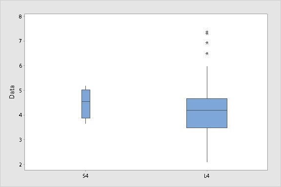
Yes that looks weird. But it should look weird! For the sake of illustration, we're comparing a sample of 4 to a sample of 100, which is a weird thing to do.
In practice, you'd be likely to see less drastic—though not necessarily less important—differences in the box widths when groups are different sizes. The following side-by-side boxplots show groups with sample sizes that range from 25 to 100 observations.
Thinner boxes (Group F) indicate smaller samples and "thinner" evidence. Heftier boxes (Group A) indicate larger samples and more ample evidence. The group comparisons are less misleading now because the viewer can clearly see that sample sizes for the groups differ.
Small Samples Can Make Quartiles Meaningless
Another issue with using a boxplot with small samples is that the calculated quartiles can become meaningless. For example, if you have only 4 or 5 data values, it makes no sense to display an interquartile range that shows the "middle 50%" of your data, right?
Minitab display options for the boxplot can help illustrate the problem. Once again, consider the example with the groups S4 (N = 4) and L4 (N = 100), which were both sampled from a normal population with mean of 4 and standard deviation of 1.
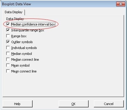
To visualize the precision of the estimate of the median (the center line of the box), select the boxplots, then choose Editor > Add > Data Display. You'll see a list of items that you can add to the plot. Select the option to display a confidence interval for the median on the plot.
Here's the result:
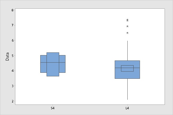
First look at the boxplot for L4 on the right. A small box is added to the plot inside the interquartile range box to show the 95% confidence interval for the median. For L4, the 95% confidence interval for the median is approximately (3.96, 4.35), which seems a fairly precise estimate for these data.
S4, on the left, is another story. The 95% confidence interval (3.65, 5.19) for the median is so wide that it completely obscures the whiskers on the plot. The boxplot looks like some kind of clunky, decapitated Transformer. That's what happens when the confidence interval for the median is larger than the interquartile range of the data. If your plot looks like that when you display the confidence interval for the median, it often means that your sample is probably too small to obtain meaningful quartile estimates.
Case in Point: Boxplots and Politics
Like Ginger Rogers, I'm kind of writing this post backwards—although not in high heels. What got me thinking about these issues with the boxplot was a comment from a reader who suggested that my choice of a time series plot to represent the U.S. deficit data was politically biased. Here's the time series plot:
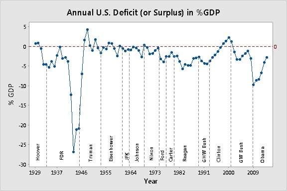
Even though I deliberately refrained from interpreting this graph from a political standpoint (given the toxic political climate on the Internet, I didn't want to go there!), the reader felt that by choosing a time series plot for these data, I was attempting to cast Democratic administrations in a more favorable light.The reader asked me to instead consider side-by-side boxplots of the same data:

I appreciated the reader's suggestion in a general sense. After all, it's always a sound strategy to examine your data using a variety of graphical analyses.
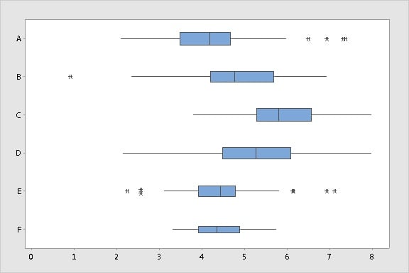
But not every graph is appropriate for every set of data. And for these data, I'd argue that boxplots are not the best choice, regardless of whether you're a member of the Democratic, Republican, Objectivist, or Rent Is Too Damn High party.
For one thing, the sample sizes for each boxplot are much too small (between 4 and 8 data points, mostly), raising the issues previously discussed. But something else is amiss...
Context is everything...especially in statistics
In most cases, such as in most process data, longer boxes and whiskers indicate greater variability, which is usually a "bad" thing. So when you eyeball the boxplots of %GDP deficits quickly, your eye is drawn to the longer boxes, such as the plot for the Truman administration. The implication is that the deficits were "bad" for those administrations.
But is variability a bad thing with a deficit? If a president inherits a huge deficit and quickly turns it into a huge surplus, that creates a great amount of variability—but it's good variability.
You could argue that the relative location of the center line (median) of the side-by-side plots provides a useful means of comparing "average" deficits for each administration. But really, with so few data values, the median value of each administration is just as easy to see in the time series plot. And the time series plot offers additional insight into overall trends and individual values for each year.
Look what happens when you graph the same data values, but in a different time order, using time series plots and boxplots.
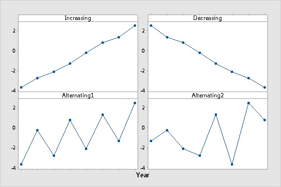
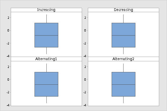
Using a boxplot for this trend data is liking putting on a blindfold. You want to choose a graphical display that illuminates information about data, not obscures it.
In conclusion, a monkey wrench is a wonderful tool. Unless you try to use it as a can opener. Graphs are kind of like that, too.