


What do you see when you look at the image at right?
Do you see a bulging sphere that stretches the checkerboard pattern in the center, causing its lines to curve?
Are you sure? Look again. This time, test any “curved” line by holding a straightedge next to it.
The image is actually composed of small squares and straight lines. Yet, when perceived as a composite whole, it creates a completely different impression.
A similar “illusion” can occur when you analyze your data. It’s called the Yule-Simpson effect—or Simpson’s paradox for short.
When you look at the overall results of all your data, you see one thing. But when you look at its smaller subgroups, your conclusions are reversed.
It's easy to be hoodwinked by this sneaky statistical illusion.
----------------------------------------------------------------------
"When many are reduced to one, to what is the one reduced?" - Zen Koan
Suppose a documentation department records the speed that its proofreaders read each document and the percentage of typos that they find. They display the data using Graph > Scatterplot > Simple in Minitab and add a fit line to show the linear trend.
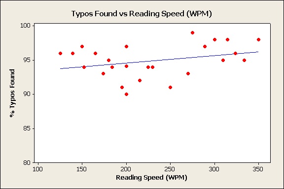
The trend indicates that the faster the proofreaders read, the higher the percentage of typos that they find. The head of the department is delighted with this wonderful result. But could this counterintuitive result simply be an illusion?
Let’s display these same data on a scatterplot again. But this time, let’s add a grouping variable to identify each proofreader (Graph > Scatterplot > With Groups).
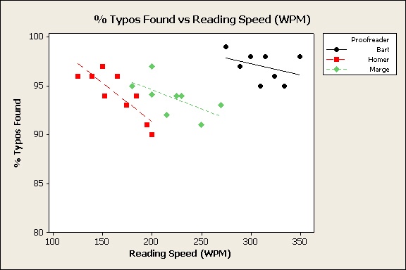
Aha! The trend for each proofreader is the reverse of the trend of the aggregate data. The faster each proofreader reads, the fewer typos each catches.
Same data—opposite conclusions. That’s what can happen when an important grouping variable lurks hidden in your data, incognito.
(To see another example of Simpson’s paradox on a scatterplot, using actual data from U.S. presidential elections, see this post on voter turnout vs outside temperature.)
Paradoxical Proportions: The Yule-Simpson Effect
Using scatterplots with and without groups can make the Yule-Simpson effect easy to see. But the effect can be much more difficult to spot if you’re analyzing data without graphs, or if your overall results are not counterintuitive.
One classic example comes from a published clinical study. The study compared the success rates for two types of surgery to remove kidney stones: 1) open surgery, which uses a traditional incision on the abdomen, and 2) percutaneous nephrolithotomy, which requires a small incision on the back. The study reported the following success rates for each surgery:
Open surgery (273/350) = 78%
Percutaneous nephrolithotomy (289/350) = 83%
Overall, open surgery has a lower success rate than percutaneous nephrolithotomy (although the difference isn’t statistically significant—you can use the Basic Stat > 2-Proportions test in Minitab to check).
But wait. Suppose you look more closely at the study data. When the data are divided into two groups based on the size of the patients’ kidney stones, open surgery actually has better outcomes—for both groups!
Stone Size < 2 cm
Open surgery 93% (81/87)
Percutaneous nephrolithotomy 83% (234/270)
Stone Size ≥ 2 cm
Open surgery 73% (192/263)
Percutaneous nephrolithotomy 69% (55/80)
Hear the sound of one hand clapping? How is this possible?
When the Whole Does Not Equal the Sum of Its Parts
 Frequently, the cause of the Yule-Simpson effect is combining group data of unequal size. It might be data collected from different groups of people, different time periods, different locations, or under different conditions. When that happens, the aggregate data can become “weighted” or biased.
Notice that most of the open surgeries were performed on the patients with larger stones—a more difficult surgery associated with a lower success rate. Conversely, the percutaneous surgery was primarily performed on patients with smaller stones, an easier surgery with a higher success rate.
That imbalance confounds the overall success rates for the two surgeries. To fairly compare the overall rates, you’d need to make sure that the two surgeries were performed on about the same number of patients with each size kidney stone.
Question Reality: What Is the Color of the Wind?
Simpson’s paradox should make you pause to meditate on the true nature of reality any time you read something like this:
“Hospital A has a better overall success rate in performing procedure X than Hospital B”.
Even if the difference in success rates is statistically significant, there’s a lot you need to know before you can determine whether the result is all that it appears to be.
Did both hospitals use the procedure on the same proportion of older patients? Or patients with other health complications? Or patients with the same stage of the disease? Or patients with similar genetic backgrounds? Or over the same time period? And so on.
If the answer is "No," then the results might just be another one of life’s illusions. And a p-value alone won’t make it real.